
This project involved creating the brand identity and designing a scroll-based website to express that mission with clarity, emotion, and structure.
Challenge
- Translate complex Web3 concepts into a clear, inviting user experience.
- Align brand, content, and product into one cohesive narrative.
- Design for multiple audiences — from crypto-curious users to partners and builders.
Results
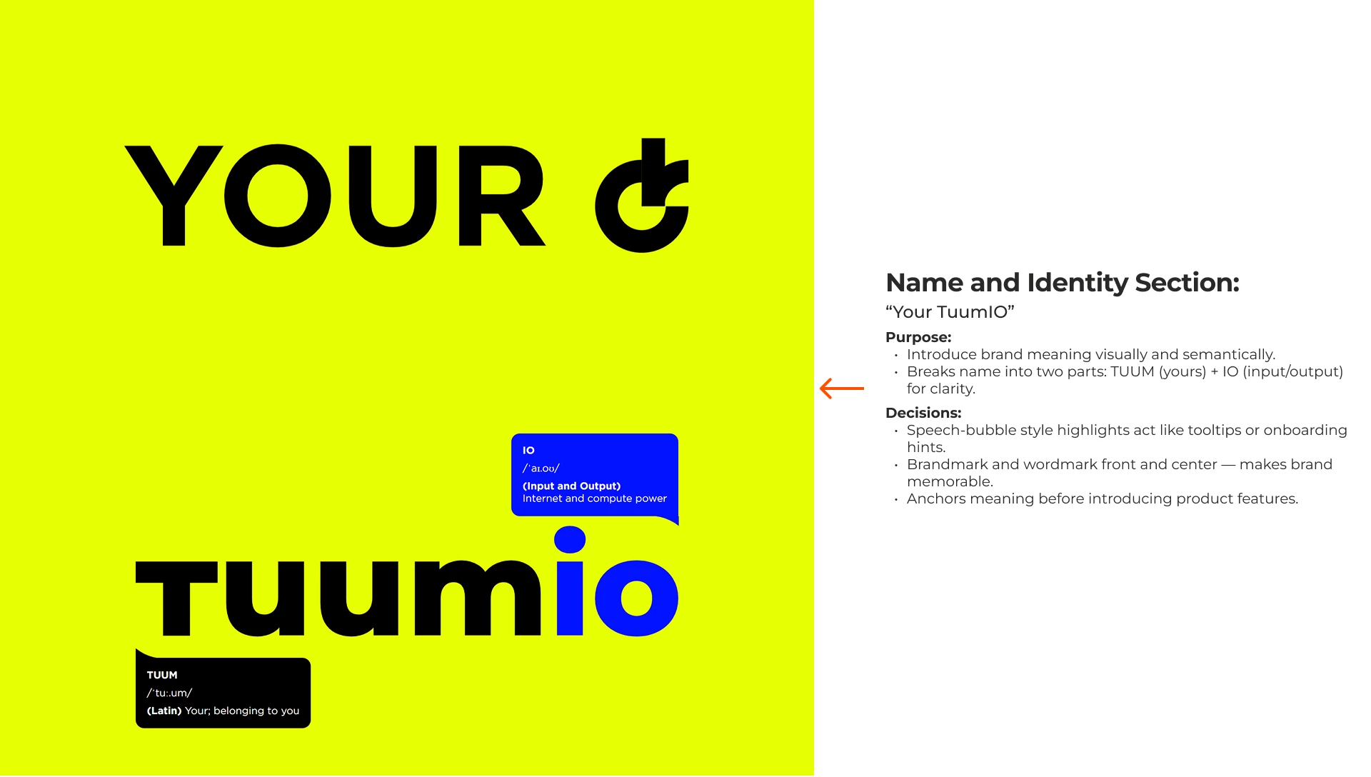
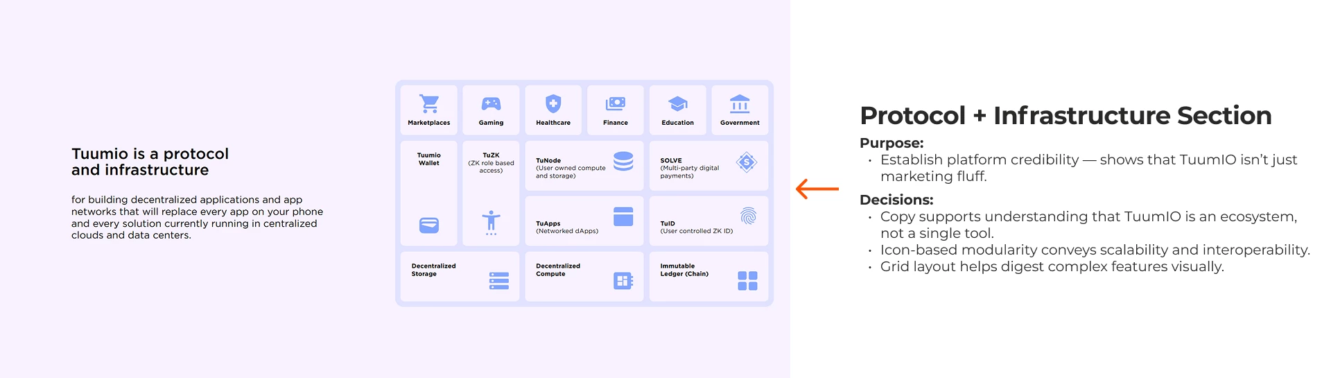
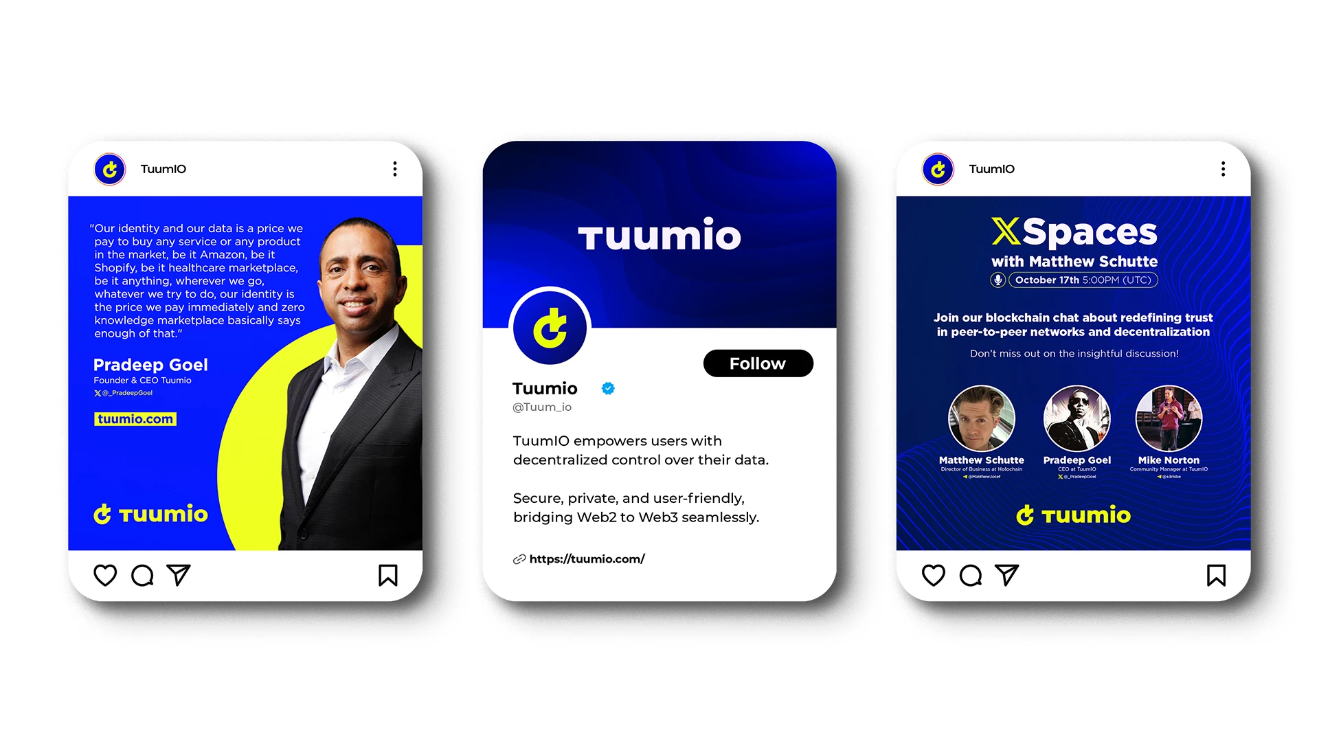
- A name and brand system centered on user ownership: Tuum (yours) + IO (input/output).
- A structured, emotionally-driven landing page that builds trust as you scroll.
- A design foundation that supports onboarding, storytelling, and growth.
Name Concept
The name TuumIO captures the essence of a user-owned internet. It merges two powerful concepts: personal ownership (Tuum) and digital action (IO). Together, they reflect a mission to return control to individuals in the digital world.
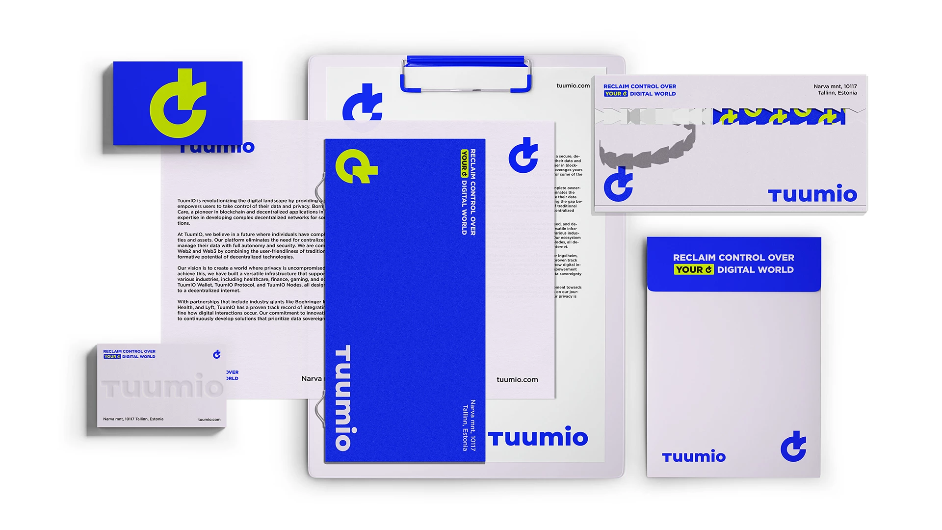
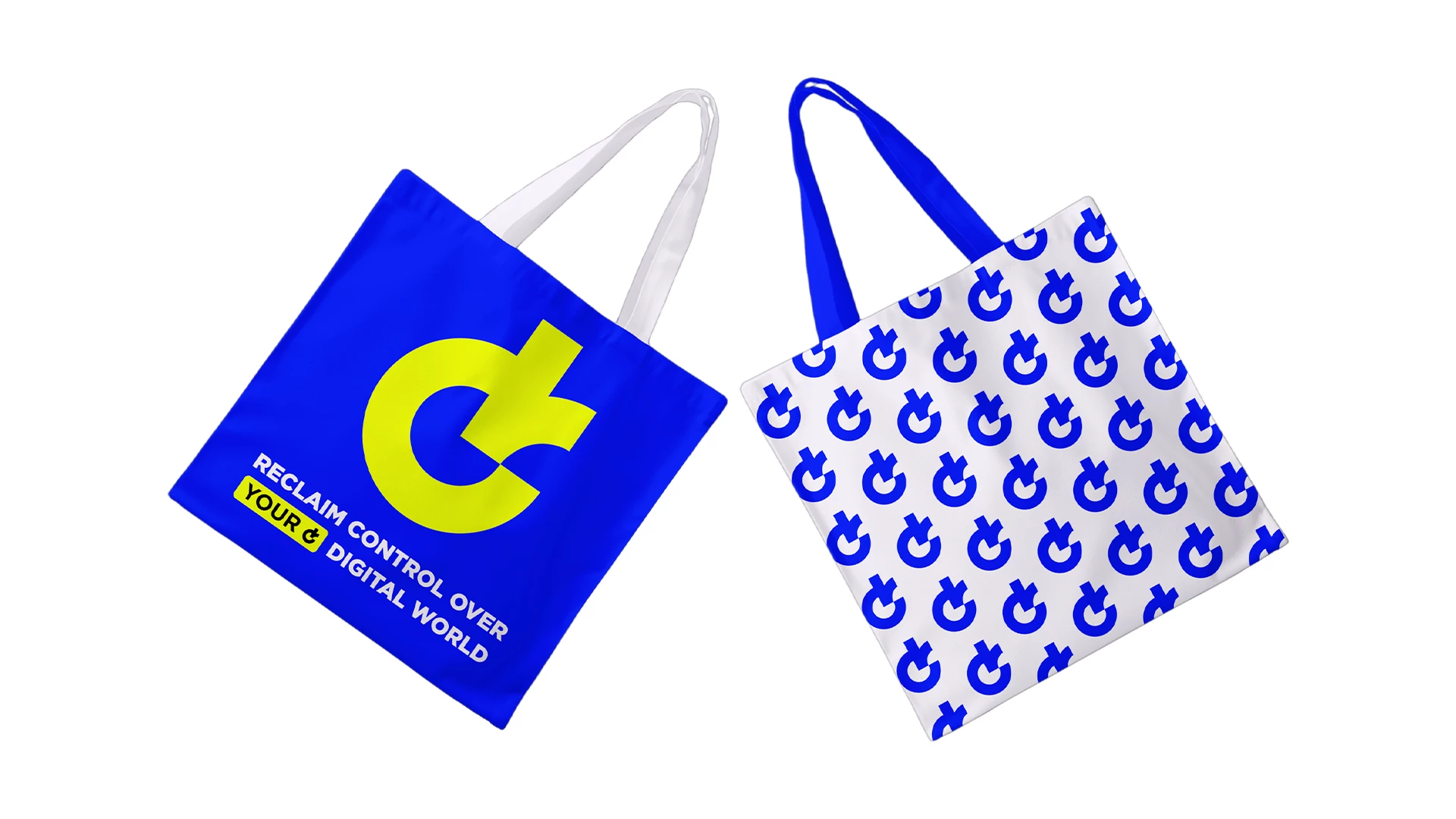
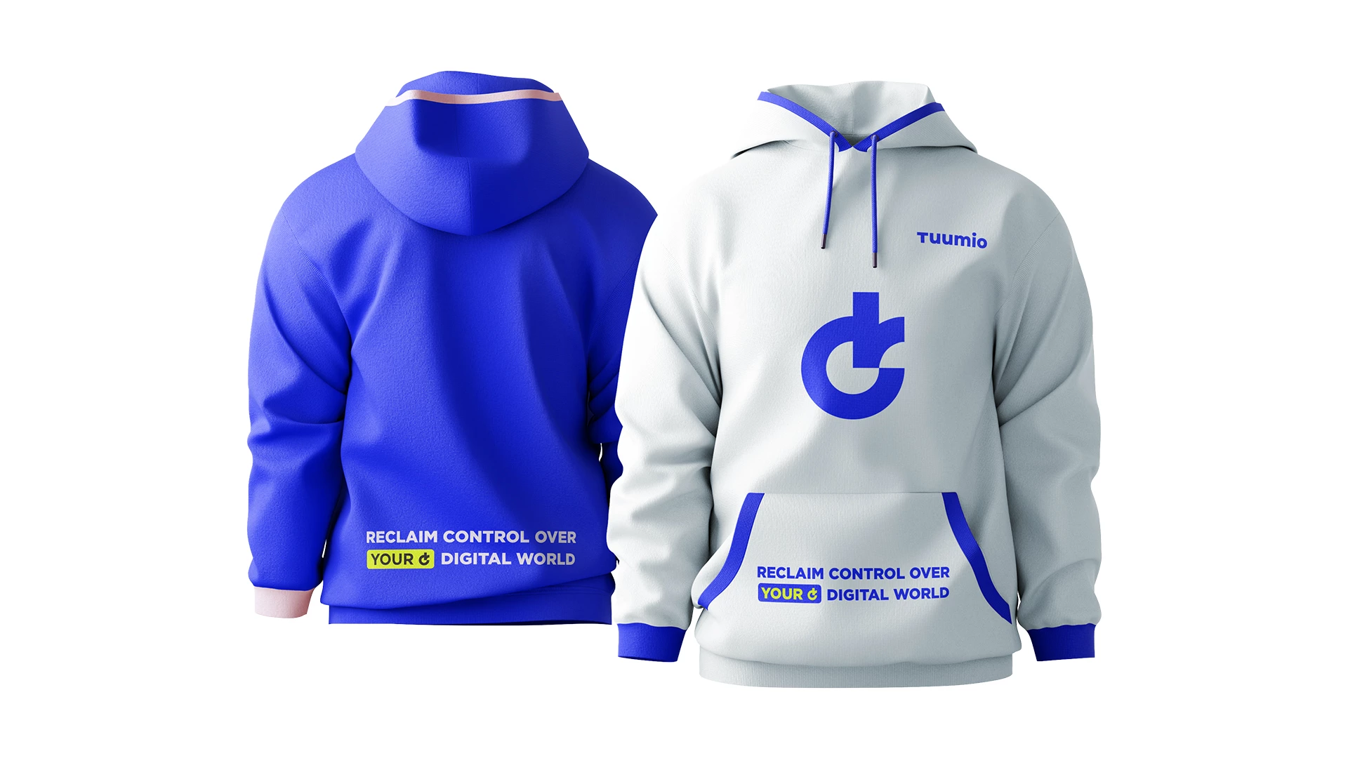
Logo Concept
Every element of this logo was designed with purpose. More than just a symbol, it reflects my personality and design philosophy. From the hang loose gesture to the hidden smile and the subtle letter “J,” each detail adds meaning, blending creativity, confidence, and approachability into a single mark.
Combination Logo
Color Palette & Typography
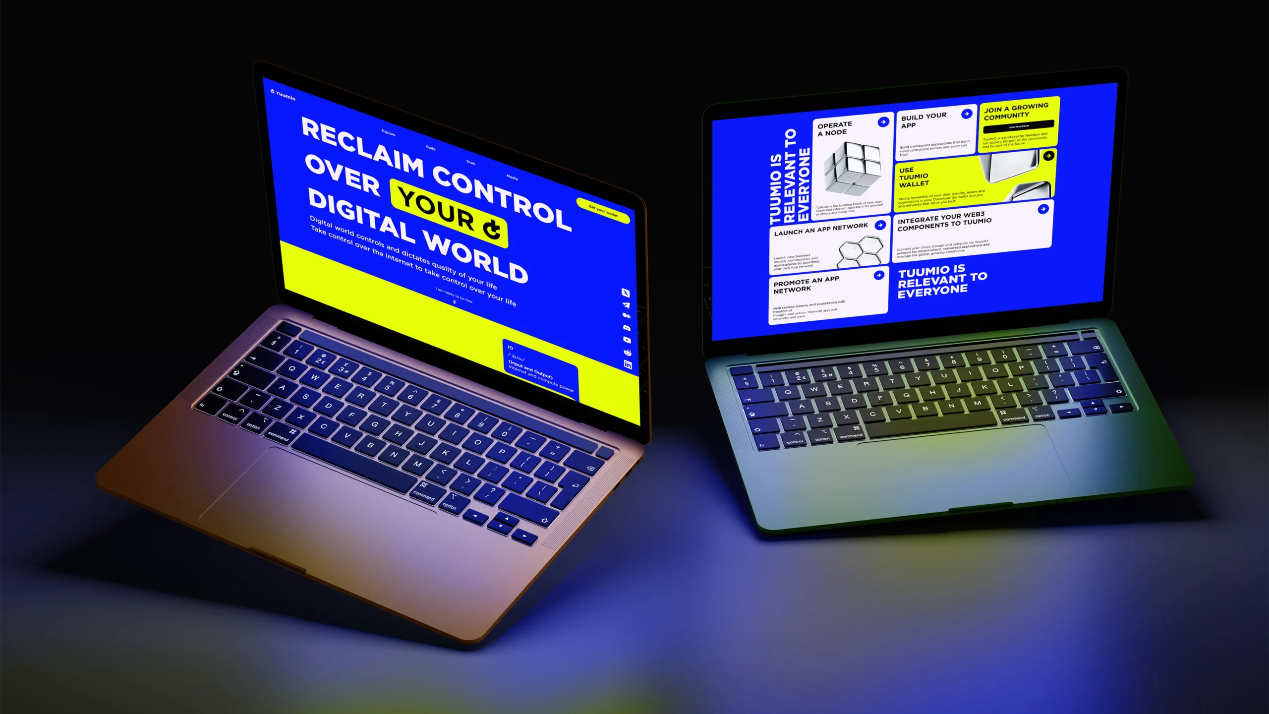
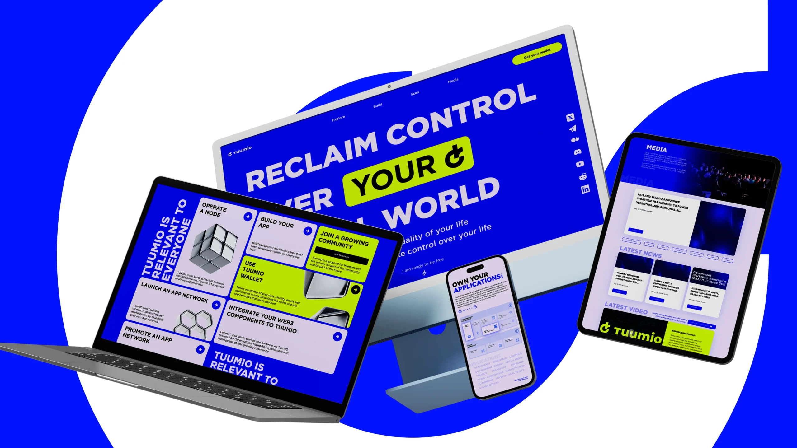
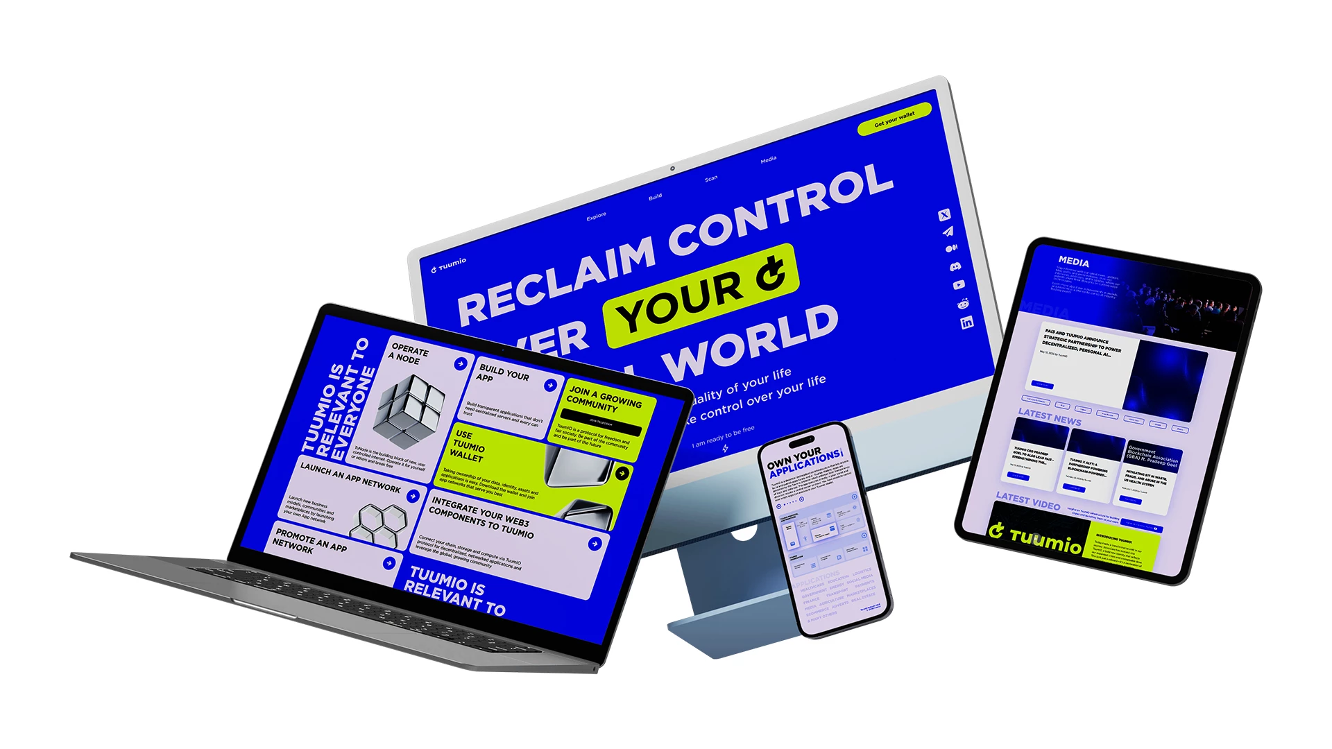
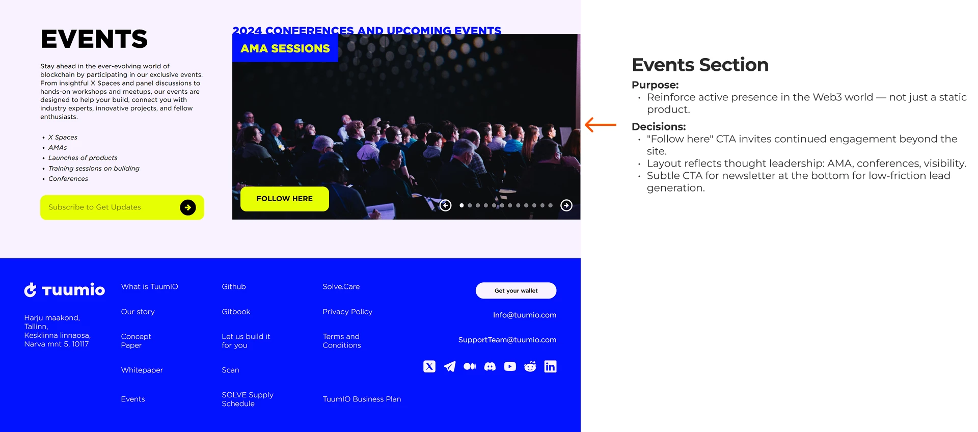
TuumIO Website
Designing for Web3 Clarity, Purpose, and Power
This presentation breaks down the strategy, UX thinking, and design decisions behind TuumIO’s one-page website — built to inform, engage, and activate users in the decentralized internet.
The Challenge
How do we communicate a powerful Web3 mission clearly, simply, and emotionally — without overwhelming the user?
- Web3 suffers from complexity, jargon, and scattered messaging.
- TuumIO needed to feel inviting, confident, and human.
- The site had to inspire belief, explain key tech, and guide users to take action — all within a single scroll.
Discovery & Insights
What We Found
- Content Audit: Mapped out all messages from the team — from deep tech features to high-level mission and emotional tone.
- Competitive Review: Most Web3 sites felt either overly technical or too vague — failing to build emotional trust.
- User POVs Identified:
Curious newcomers
Builders and devs
Privacy-conscious users
Partners, VCs, and ecosystem stakeholders
Strategy
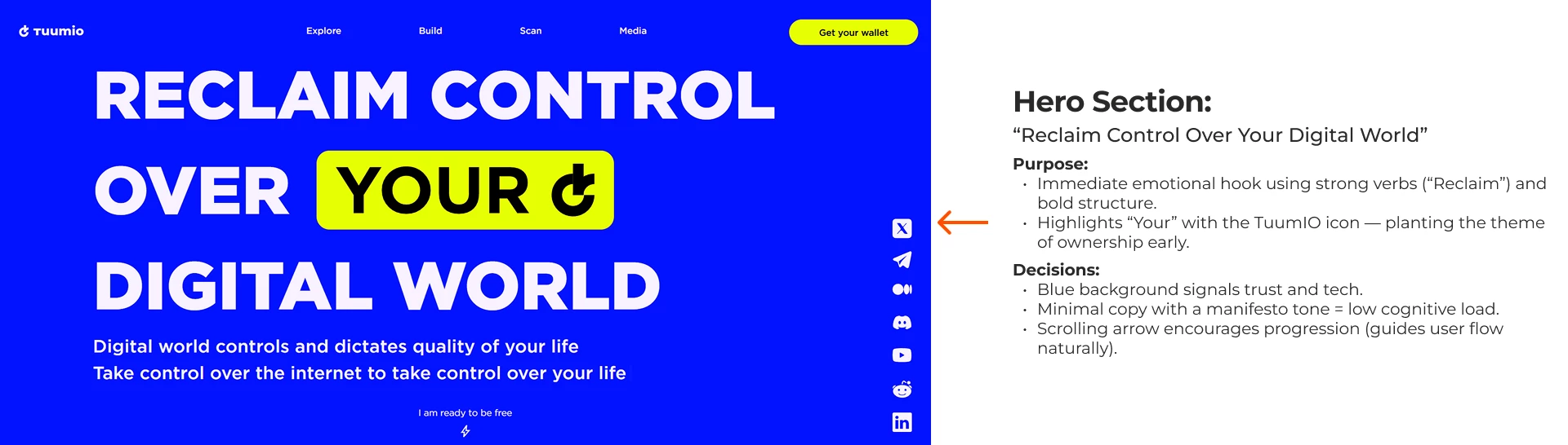
We designed the site as a narrative scroll, with clear visual anchors and a structured reveal of ideas.
Key Goals:
- Open strong with ownership + mission (hero and brand meaning)
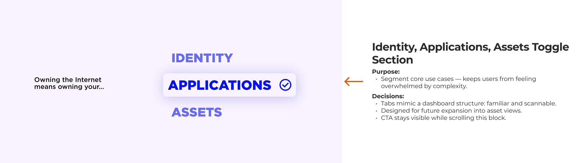
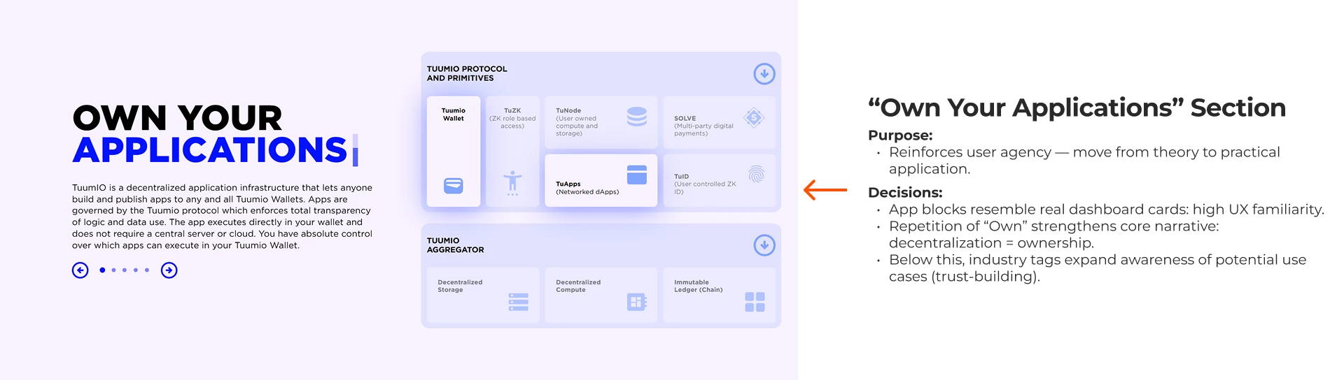
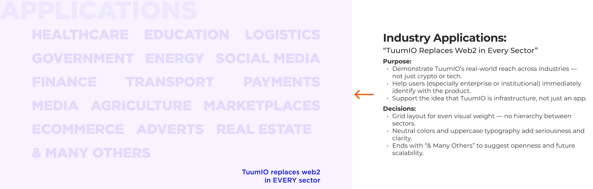
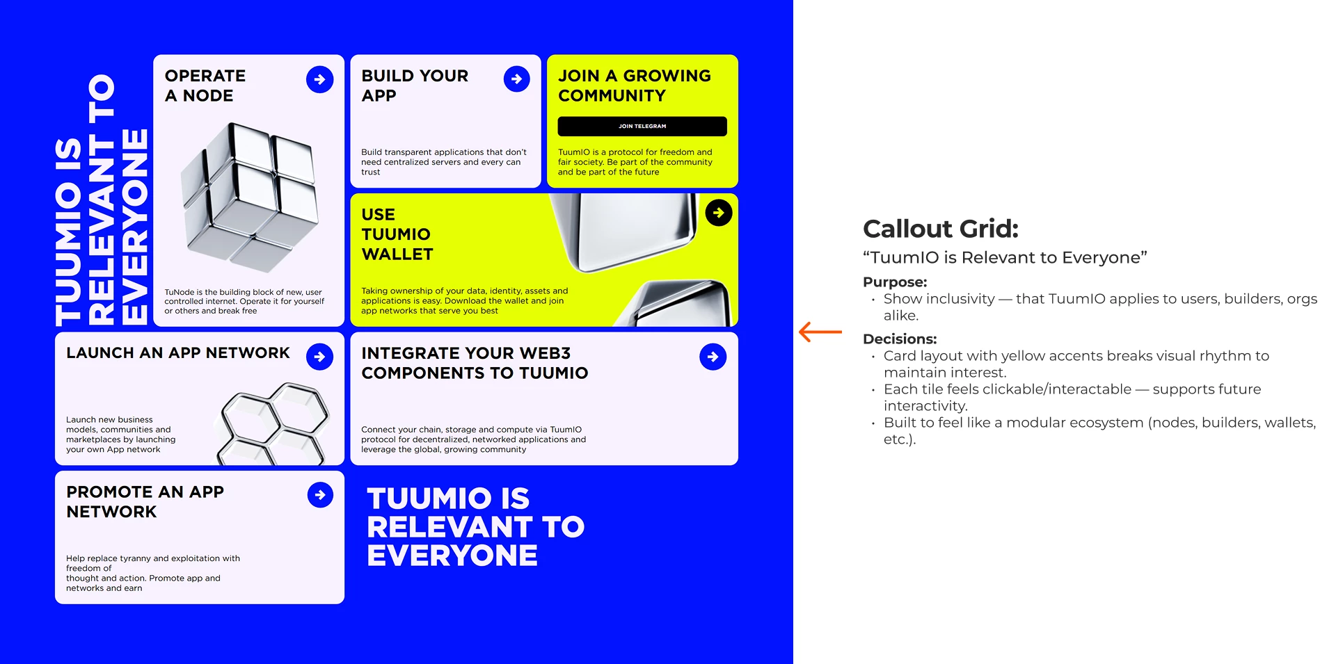
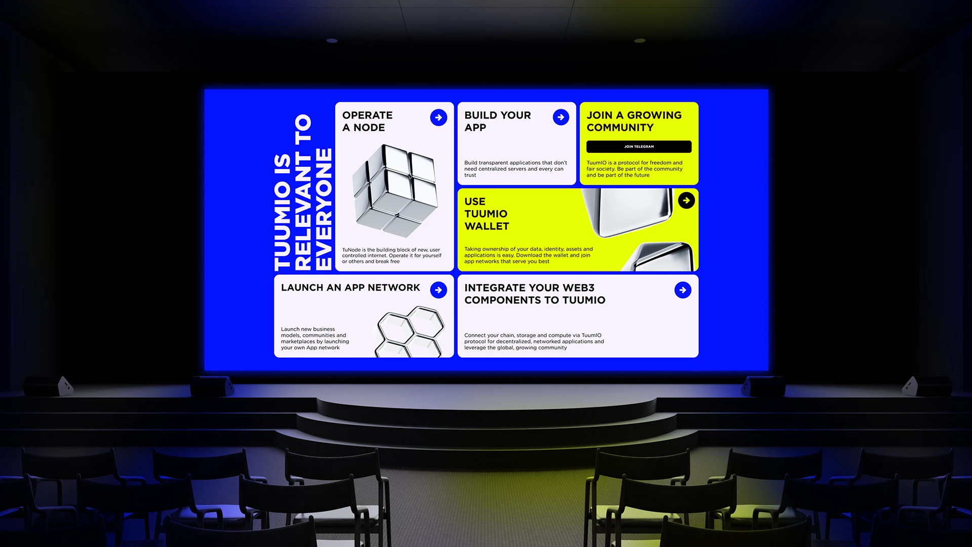
- Break down features via tabs and modular UI (identity, applications, assets)
- Showcase wide applicability (grid of use cases + industry examples)
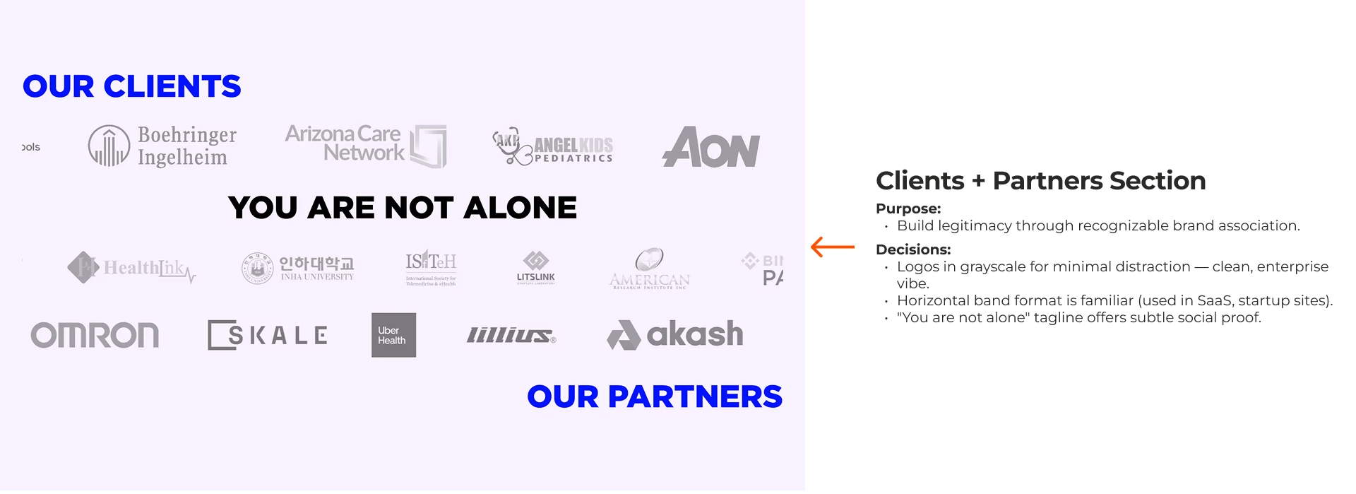
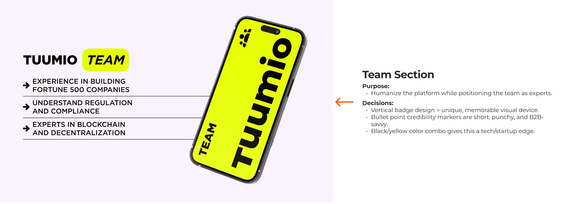
- Highlight credibility through partners, events, and team
- Guide to action: scan, build, explore, join, follow
- UI/UX Designer Jean Soto