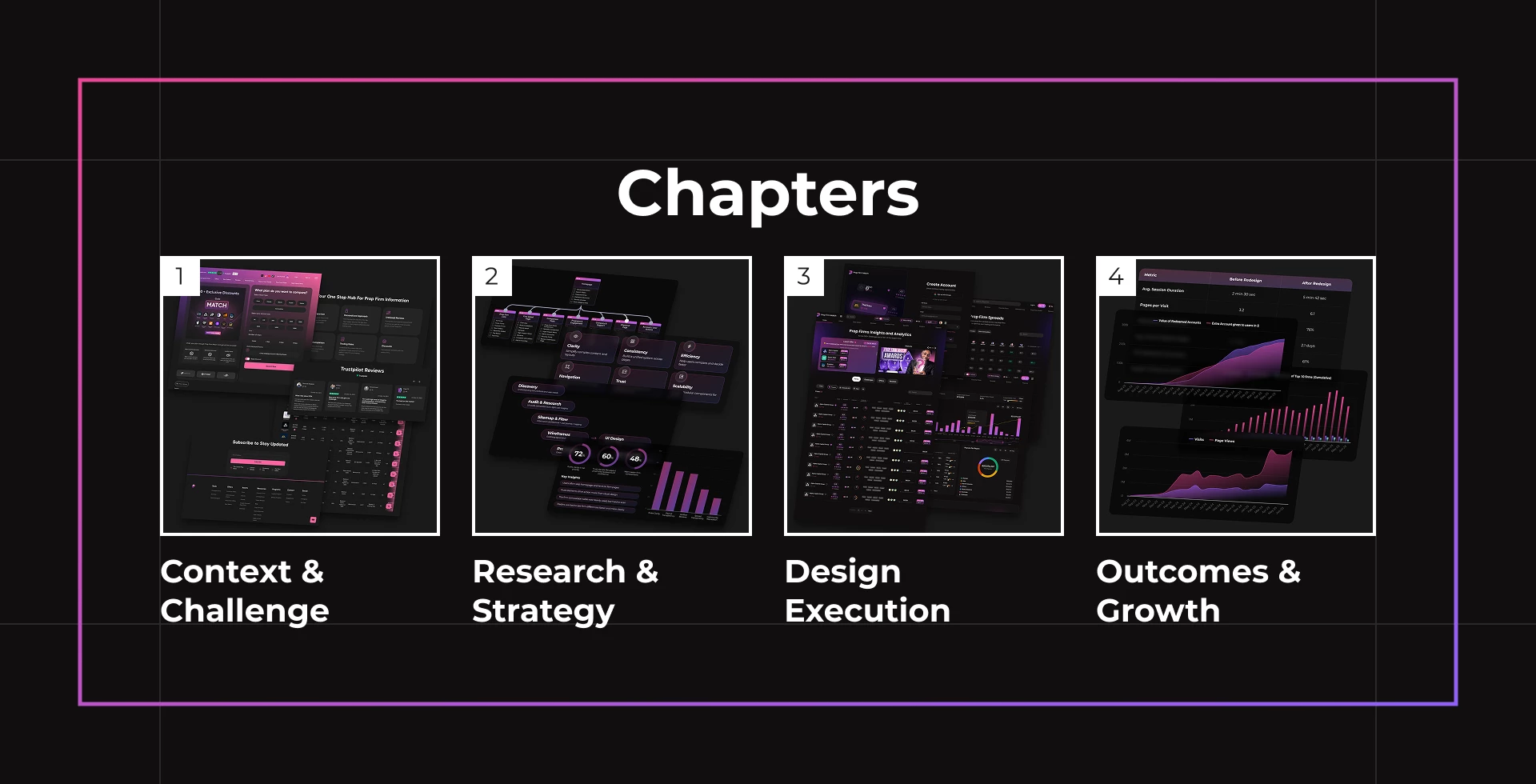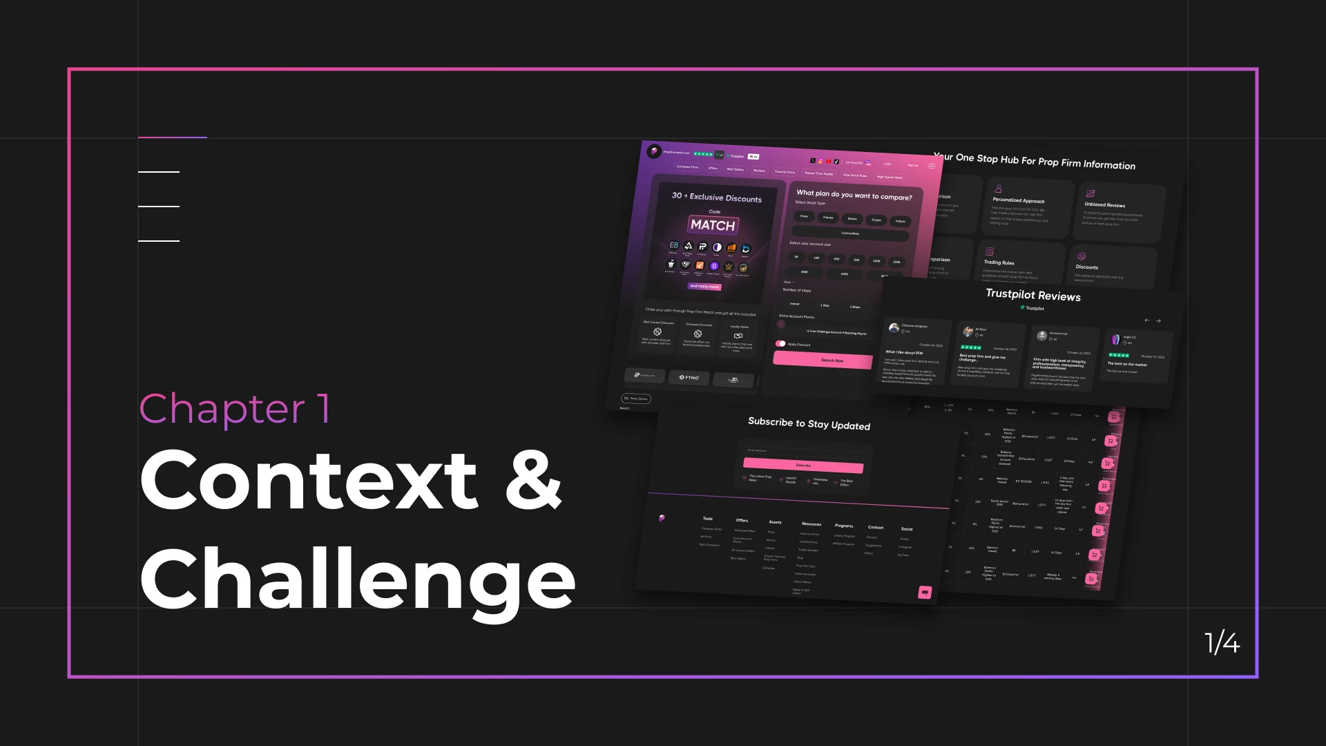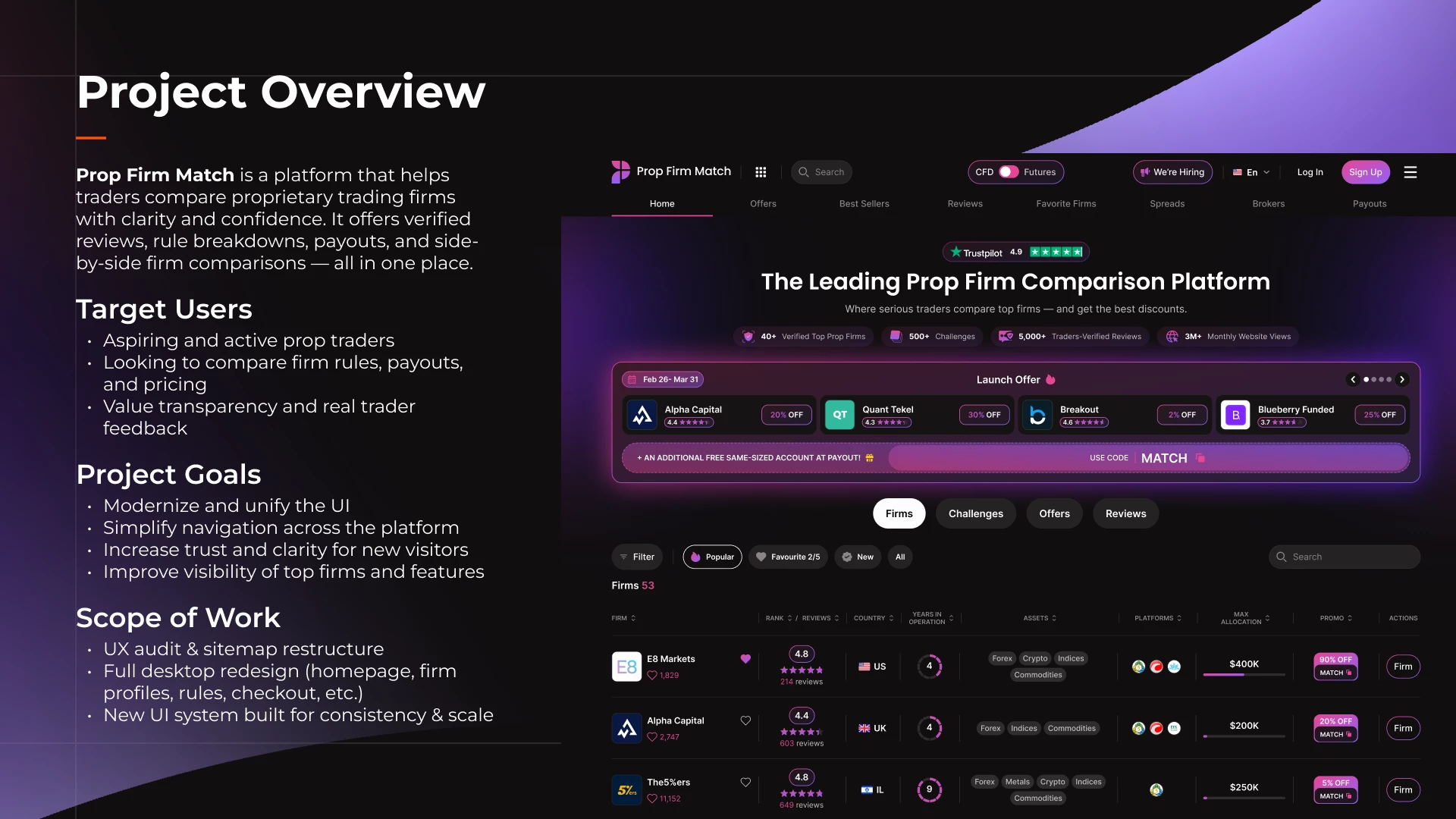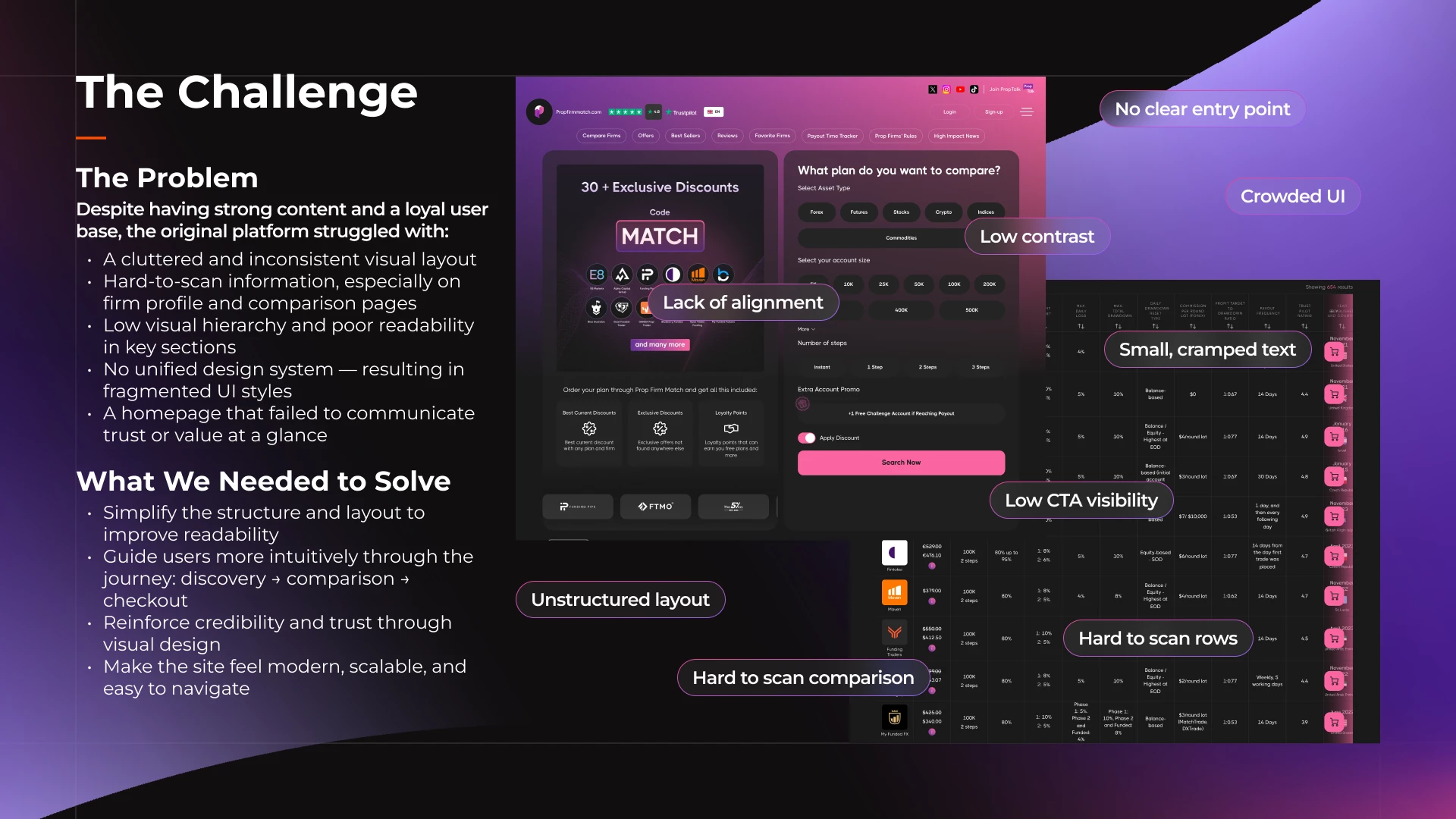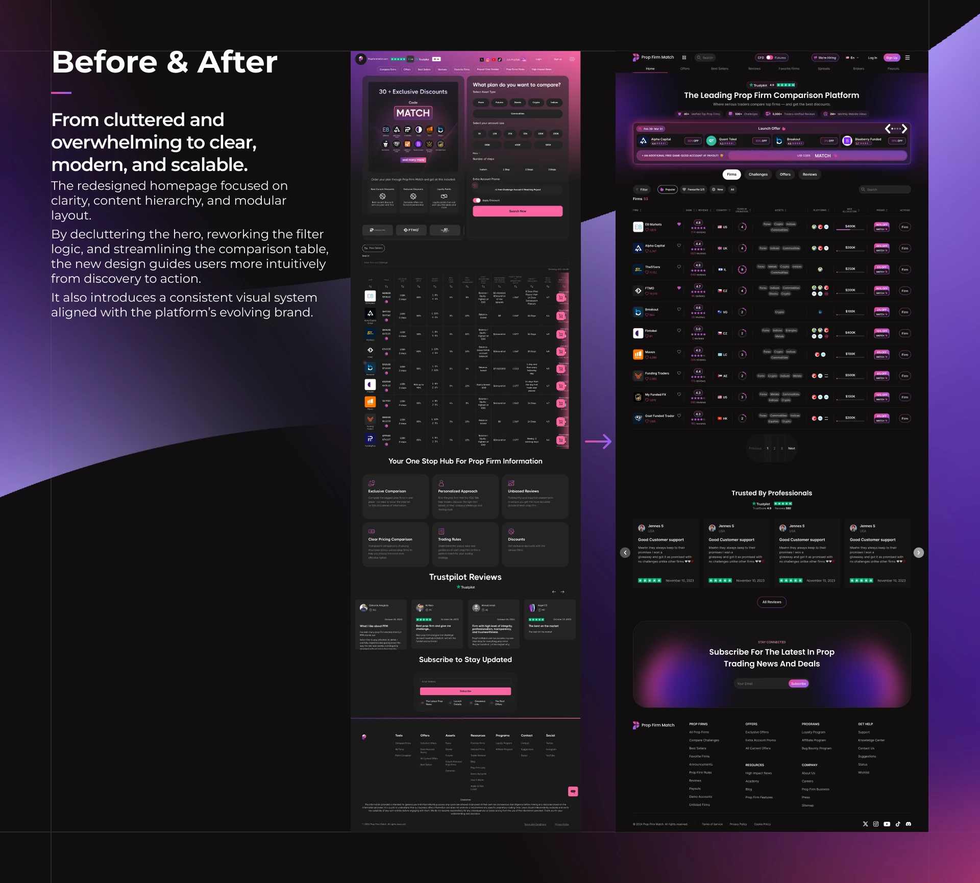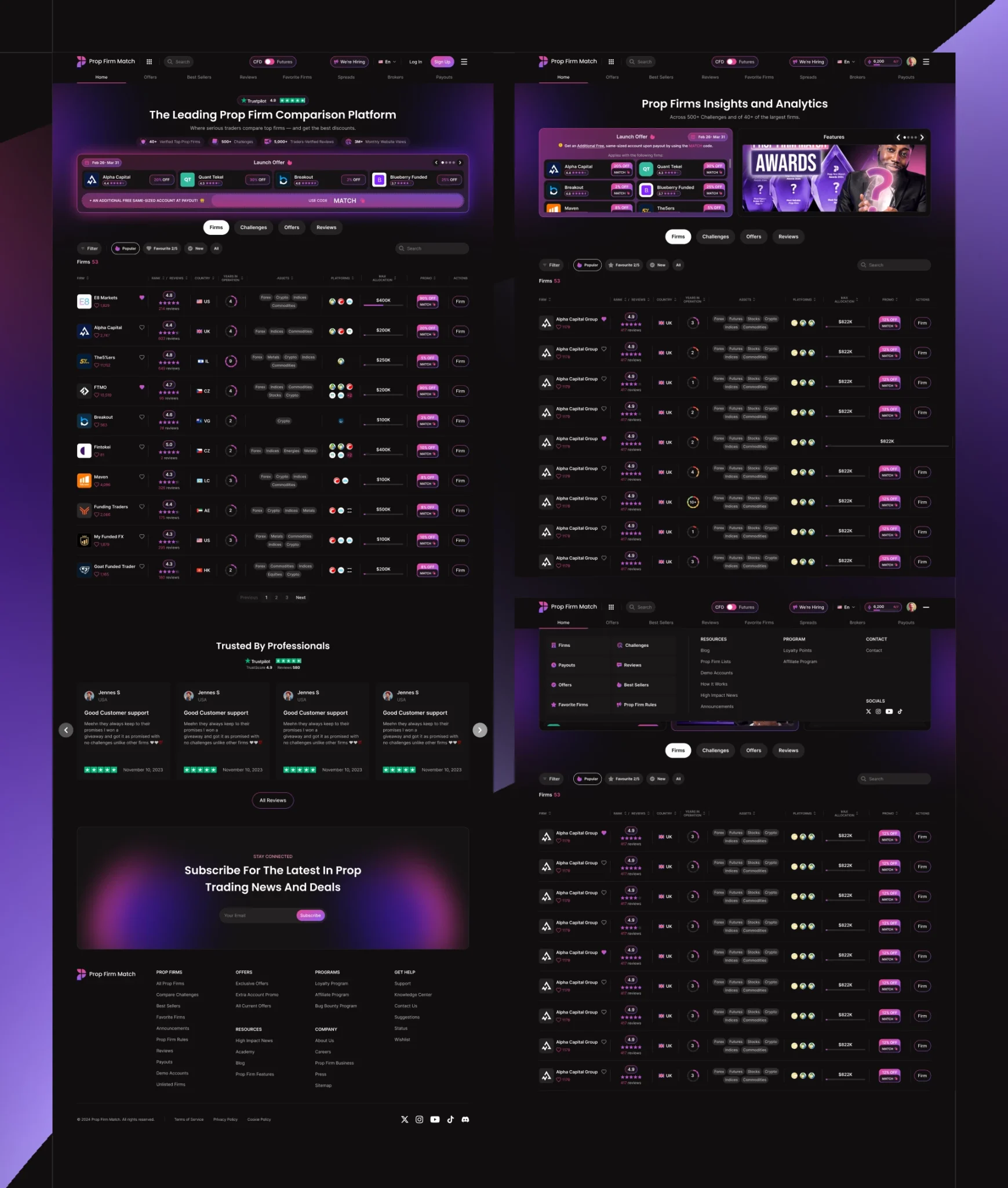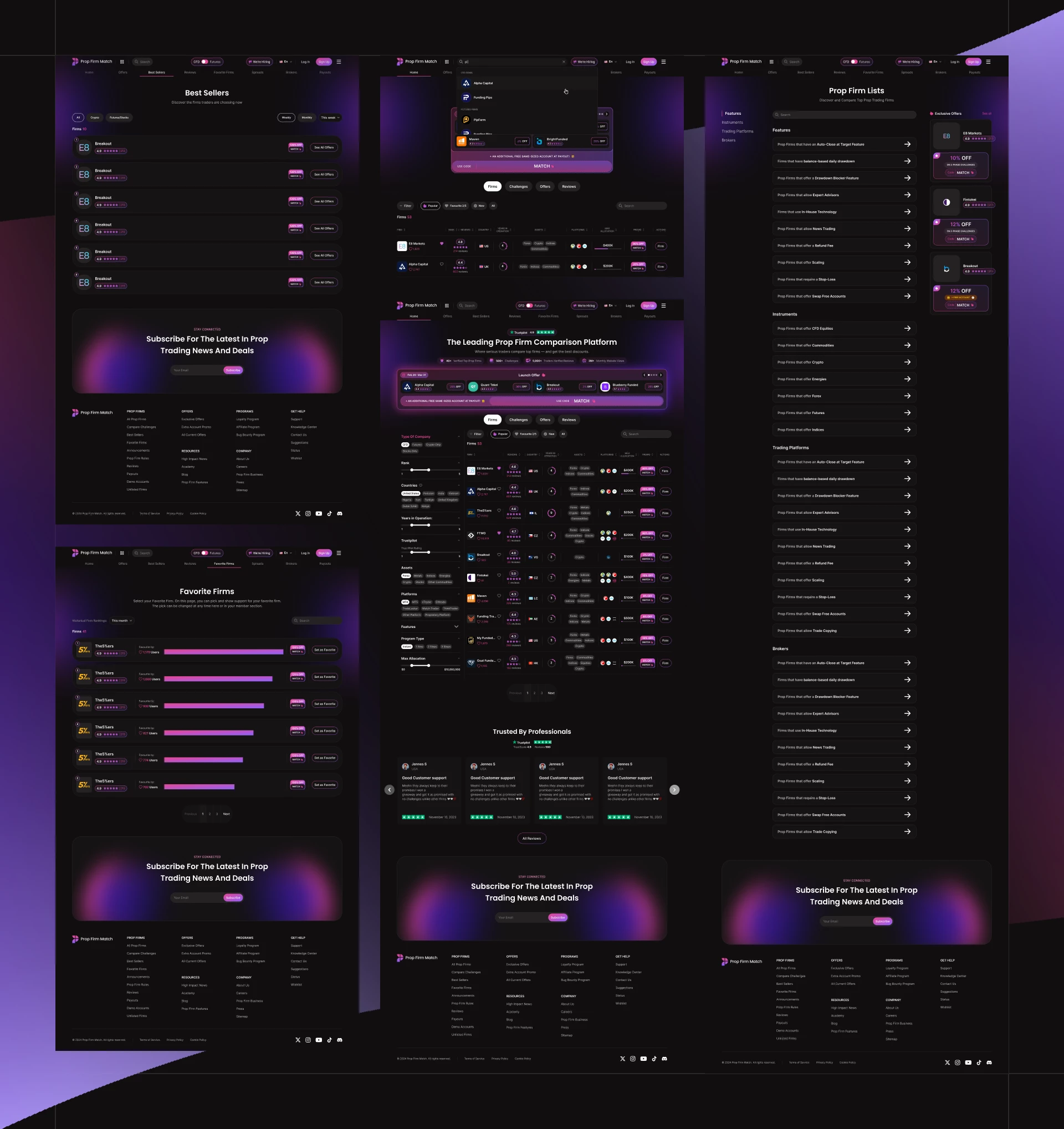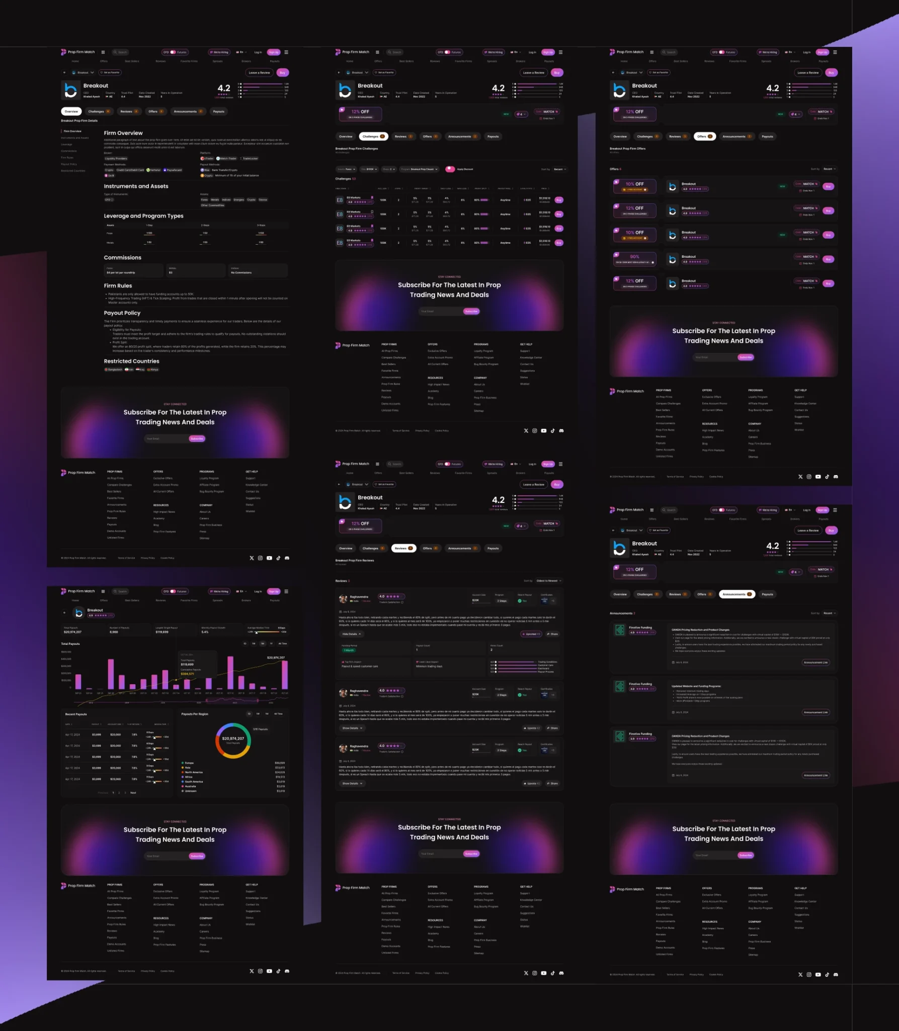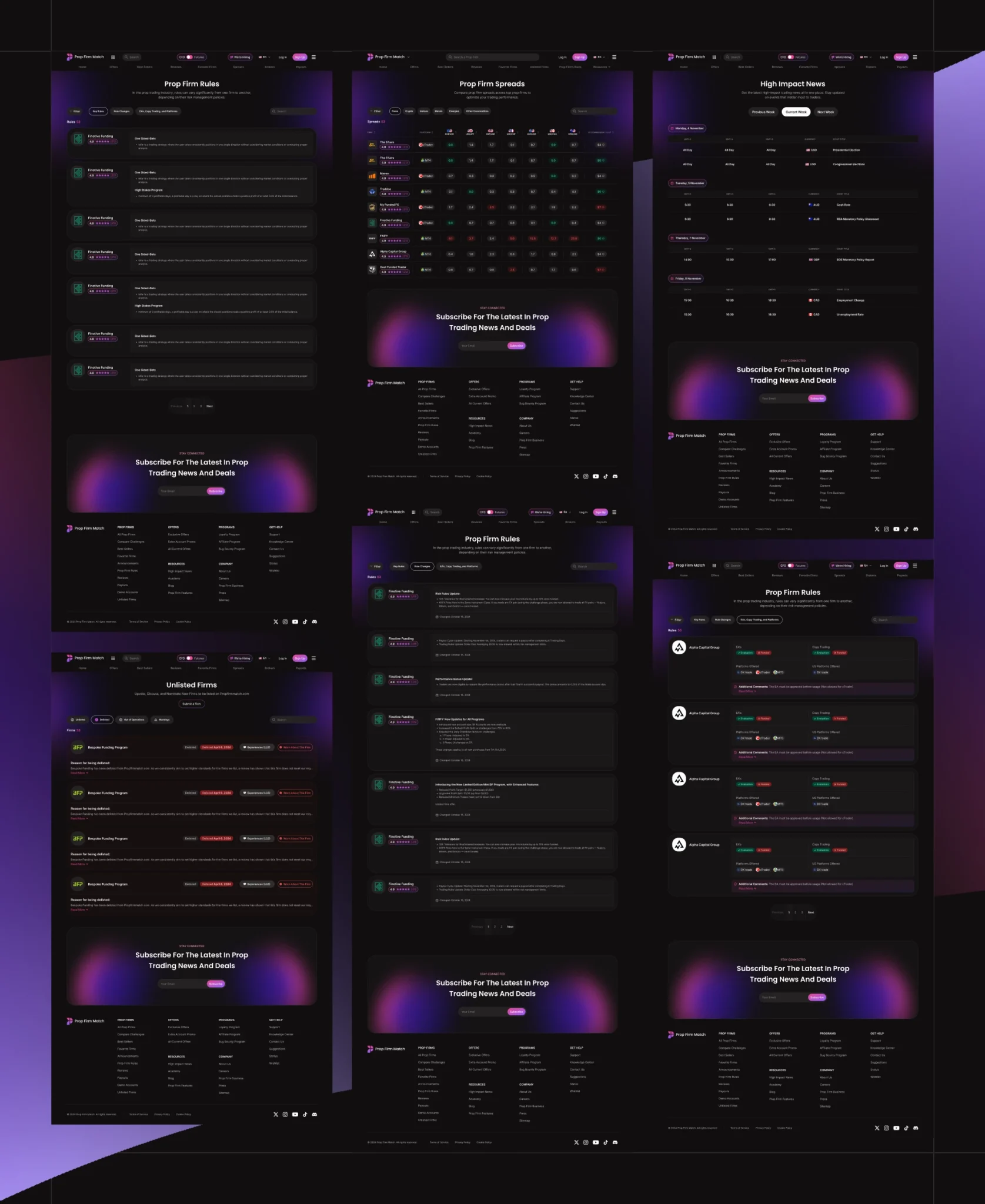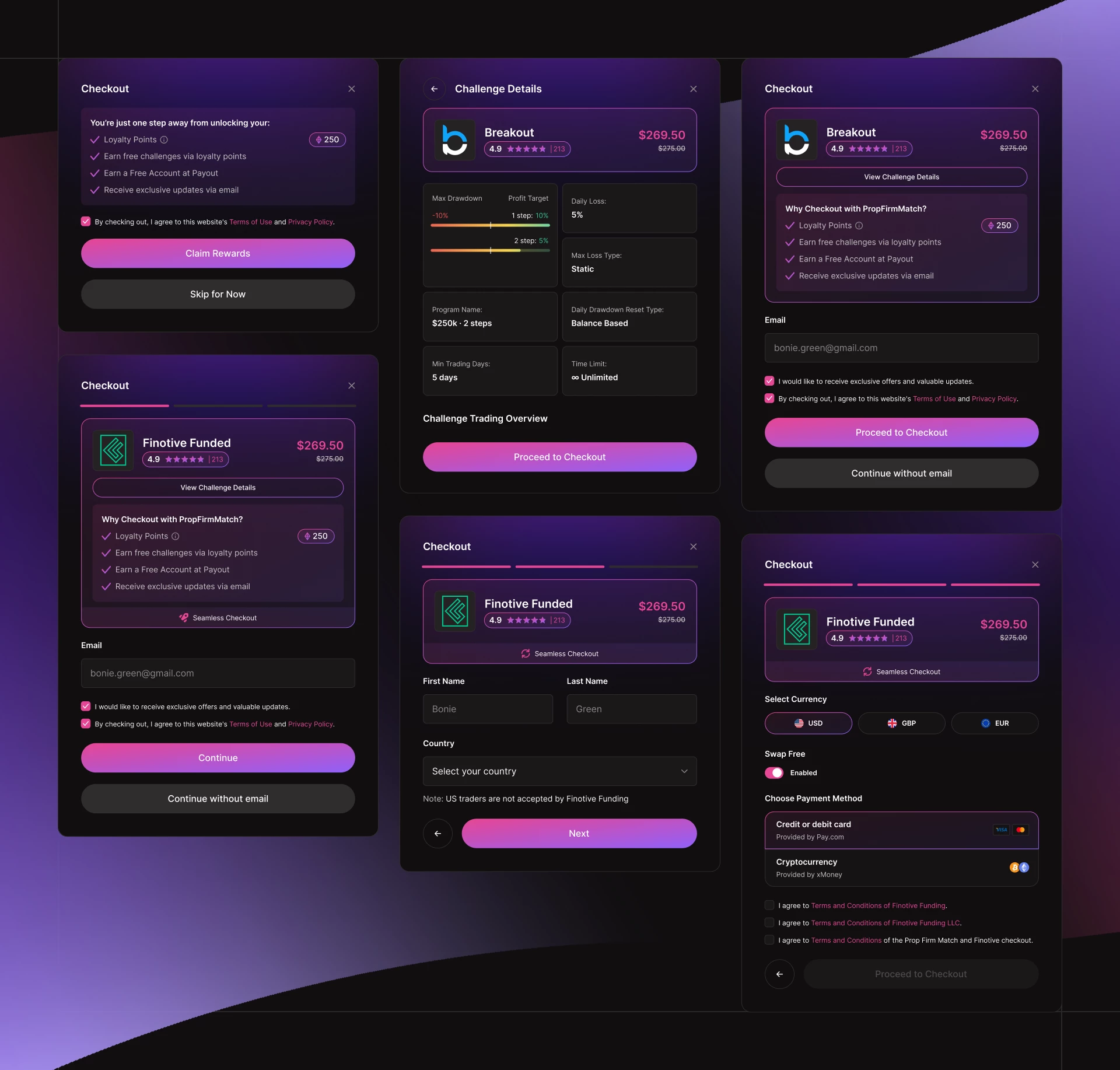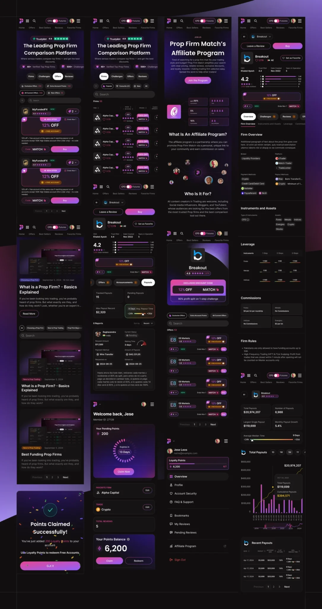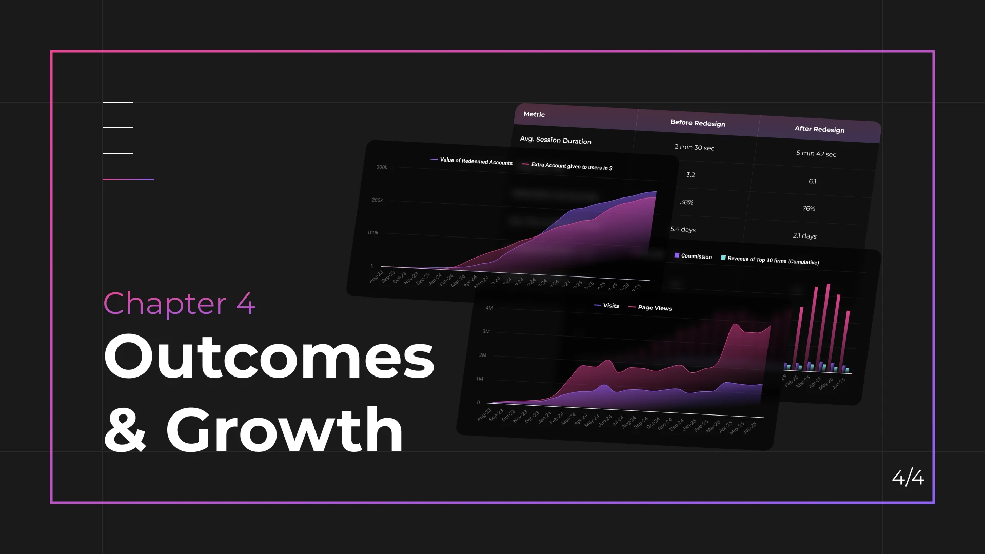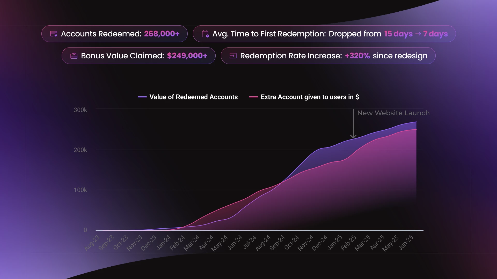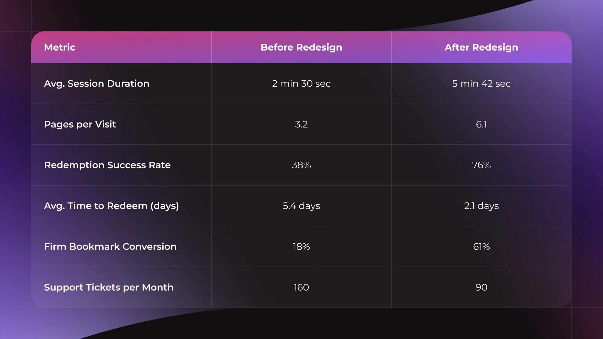
A complete redesign of Prop Firm Match’s desktop platform, focused on elevating visual clarity, improving usability, and creating a scalable design system for growth. The new interface simplifies navigation, highlights firm transparency, and enhances the overall experience for traders comparing proprietary trading firms.
Homepage
The homepage was restructured to highlight value, improve visual hierarchy, and guide users into firm discovery quickly and confidently.
- Simplified hero and filters for faster access
- Clear sections for reviews, discounts, and firm types
- Modular cards for easy updates and scaling
- Improved CTA focus and trust signals above the fold
Firm Discovery & Filtering
Discovery is streamlined through curated lists, dynamic filters, and the ability to save firms for later comparison.
- Filter UI designed for fast narrowing by platform, account size, and firm type
- Firm cards show rating, discount, and funding type
- Favorites system allows users to shortlist firms for later
- Discovery flows built to scale with new categories
Firm Detail Experience
Designed to build trust and guide decision-making through clear structure, verified reviews, and payout transparency.
- Modular layout for firm data, rules, and stats
- Payout proof and rating shown above the fold
- Clean review section with sorting and tagging
- Sticky CTA and trust signals support conversion
Comparison & Research Tools
Built to help traders evaluate key metrics quickly — from firm rules to market spreads — without overwhelming visual noise.
- Structured comparison tables with sticky headers
- Scrollable data blocks for side-by-side insights
- Spread and rule tags with visual hierarchy
- Unified patterns across all research tools
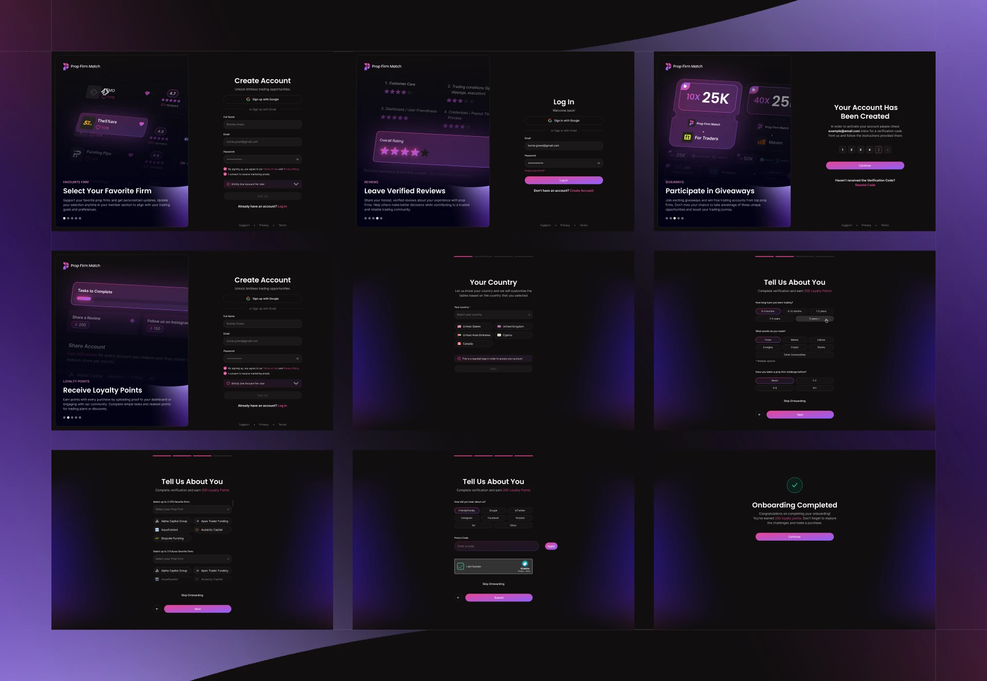
Signup & Onboarding
A lightweight onboarding experience designed to help traders get started quickly — with minimal friction and clear CTA focus.
- Clean login/signup flow with focused layout
- “Get Started” page introduces core platform benefits
- CTA-first design encourages firm discovery
- Designed to support loyalty activation after login
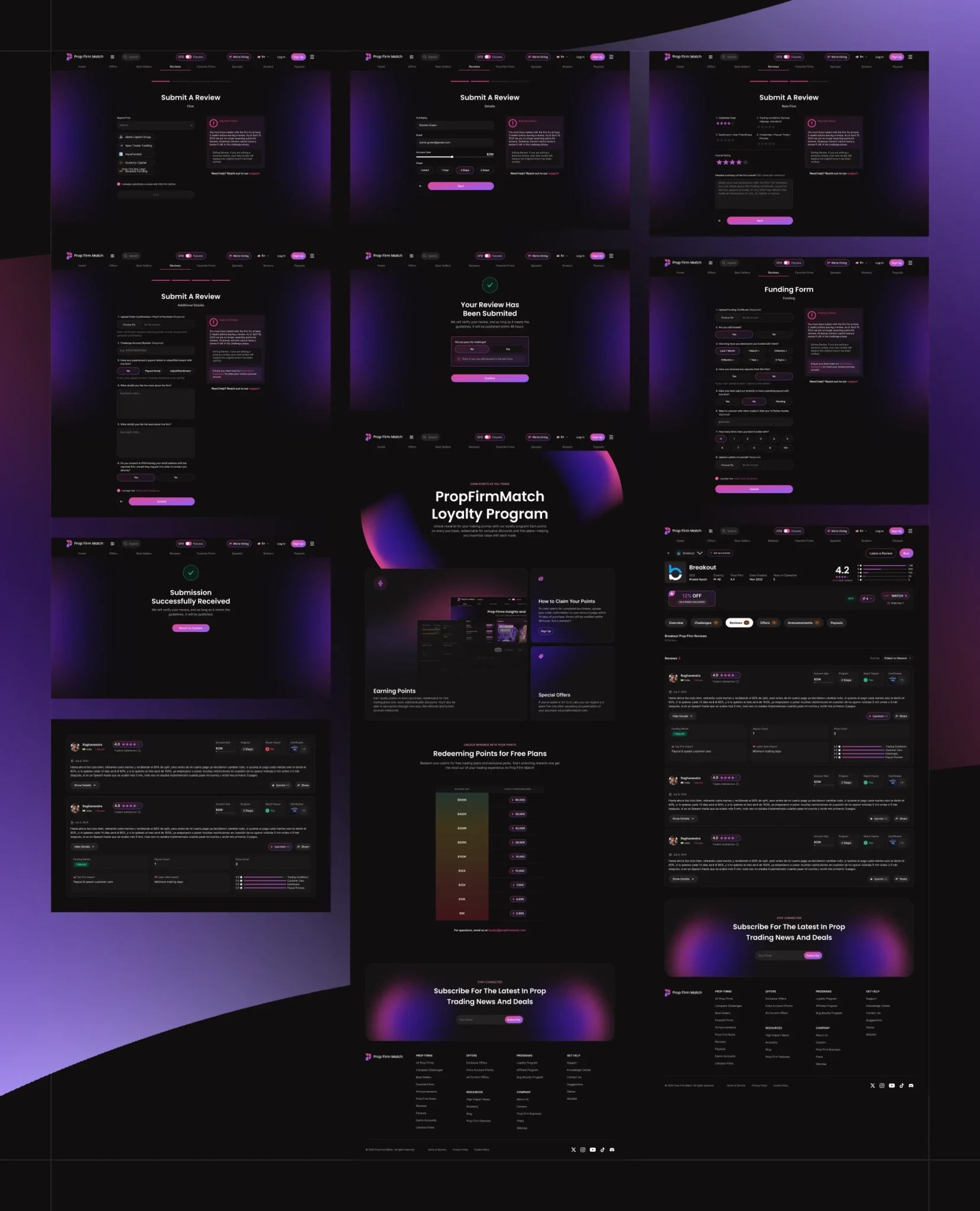
Review & Loyalty
Designed to encourage user participation through a reward system tied to reviews, shares, and firm engagement.
- Points system tied to real actions (review, share, signup)
- Dashboard view for progress and history
- Submission flow is clean and trust-focused
- Redemption and claim logic integrated into UI
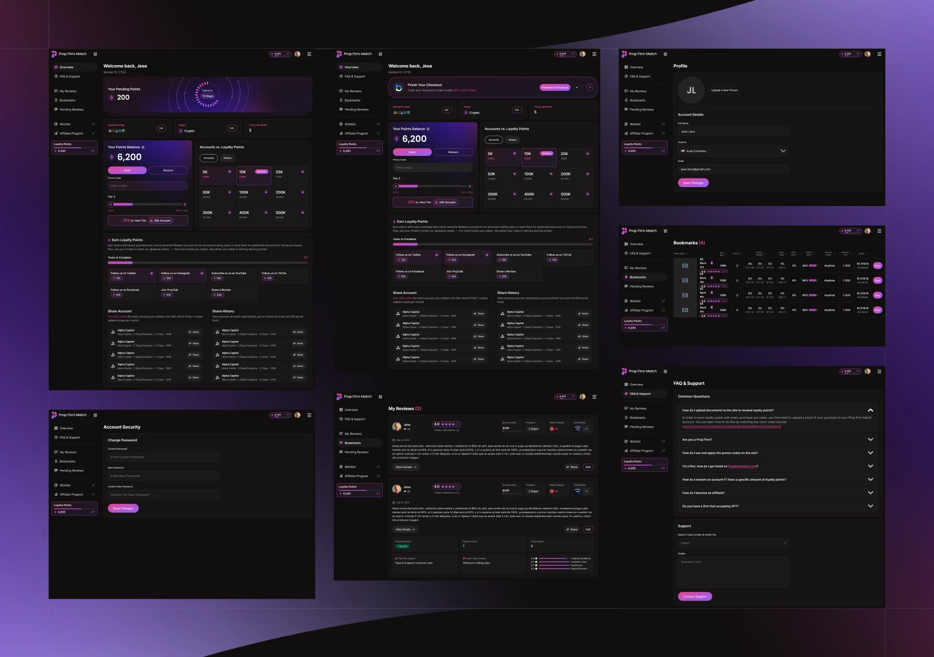
User Dashboard
A centralized user hub designed for loyalty progress, review tracking, and actionable engagement — all within a scalable UI system.
- Modular layout for account tools, activity, and rewards
- Personalized task tracking and point progression
- Redeem system tied to platform actions
- Clean UX hierarchy for logged-in navigation
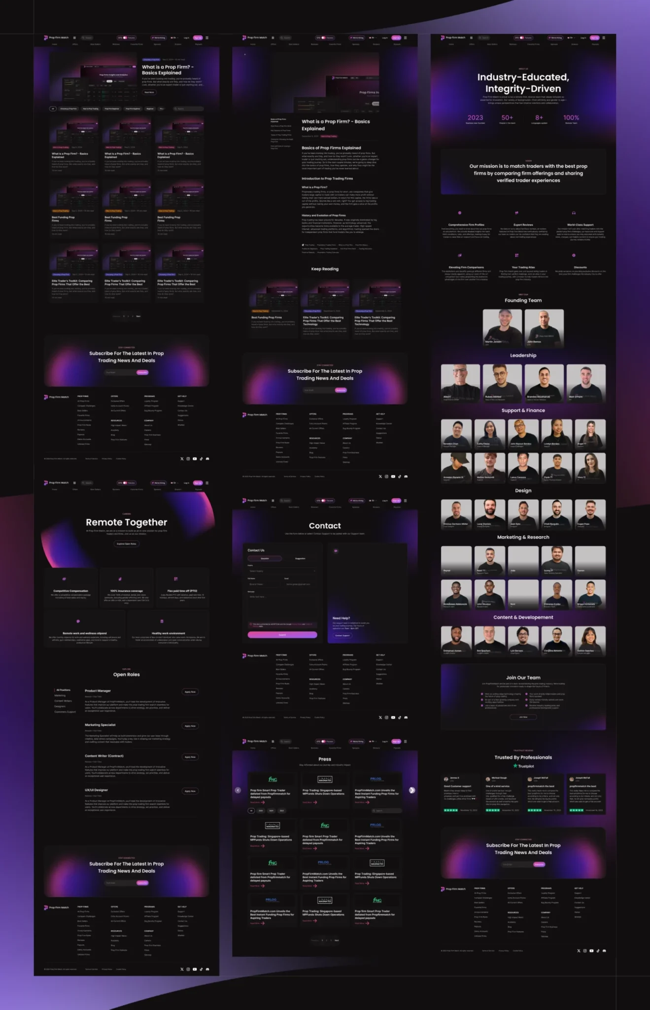
Supporting Pages
Even secondary pages follow the same design principles — clear hierarchy, accessible layout, and a consistent visual language.
- Consistent spacing and typography across all pages
- Designed for trust and utility, not just visuals
- Scalable layouts for future content expansion
- Templates used for Blog, About, Contact, and FAQ
Mobile Experience
The responsive system adapts seamlessly across mobile — preserving clarity, structure, and functionality on smaller screens.
- Touch-optimized filters and navigation
- Stacked content blocks for vertical flow
- Firm cards and reviews adapted for scroll consumption
- Sticky CTAs and nav for mobile-first UX
Reflection & Learnings
What I learned from redesigning a high-impact trading platform
Redesigning Prop Firm Match was a challenge of scale, clarity, and user trust. The project pushed me to think beyond visuals — into how structure, flow, and transparency shape real user decisions.
I learned how to turn complexity into clarity, and how a modular system can support future growth without visual debt. Most importantly, I saw how thoughtful UX directly impacts engagement, loyalty, and business outcomes.
- Built a scalable design system for real-world use
- Balanced UI consistency with flexibility across screens
- Learned to shape flows around trust and decision-making
Saw how lean research can still drive strong strategy - Gained experience collaborating with devs for execution
- Art Director Jean Soto

