

Description


Details
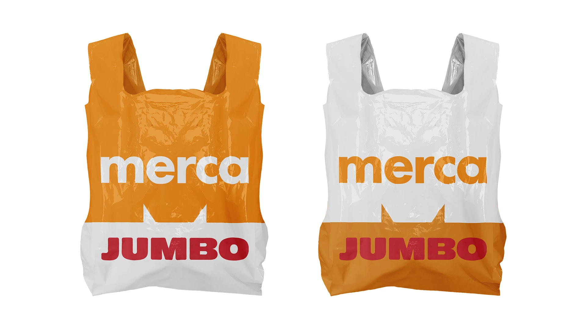
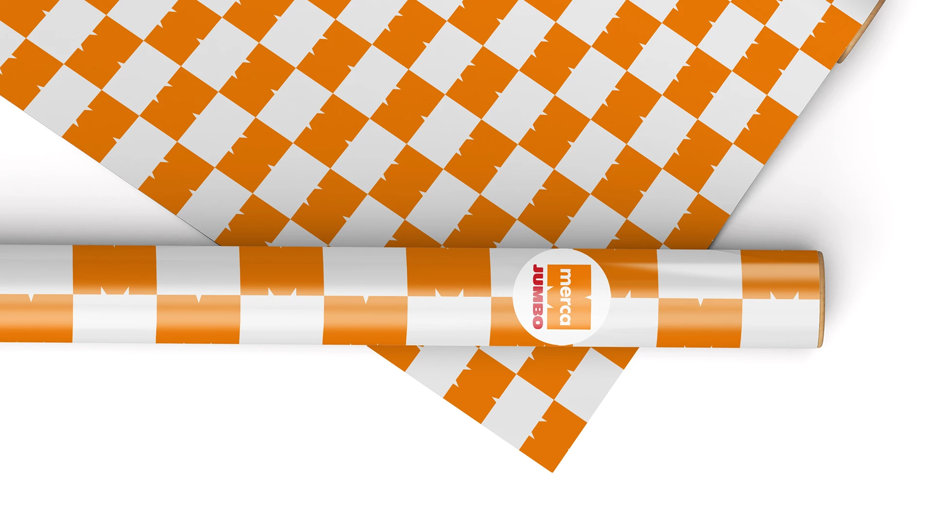
- Brand Merca Jumbo
- Client Madelyn Martinez Moya, Aicnecony Taveras
- Agency Ogilvy RD
- Creative Direction Katherine Yuen & Juan Daniel Suárez Beltrán
- Project Managers Brigitte Rinkel & Kleyner Tapia
- Art Director Jean Soto
- Motion Graphics Julio Rodriguez