
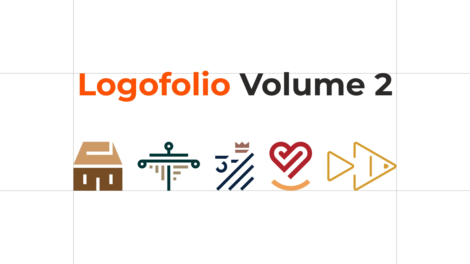
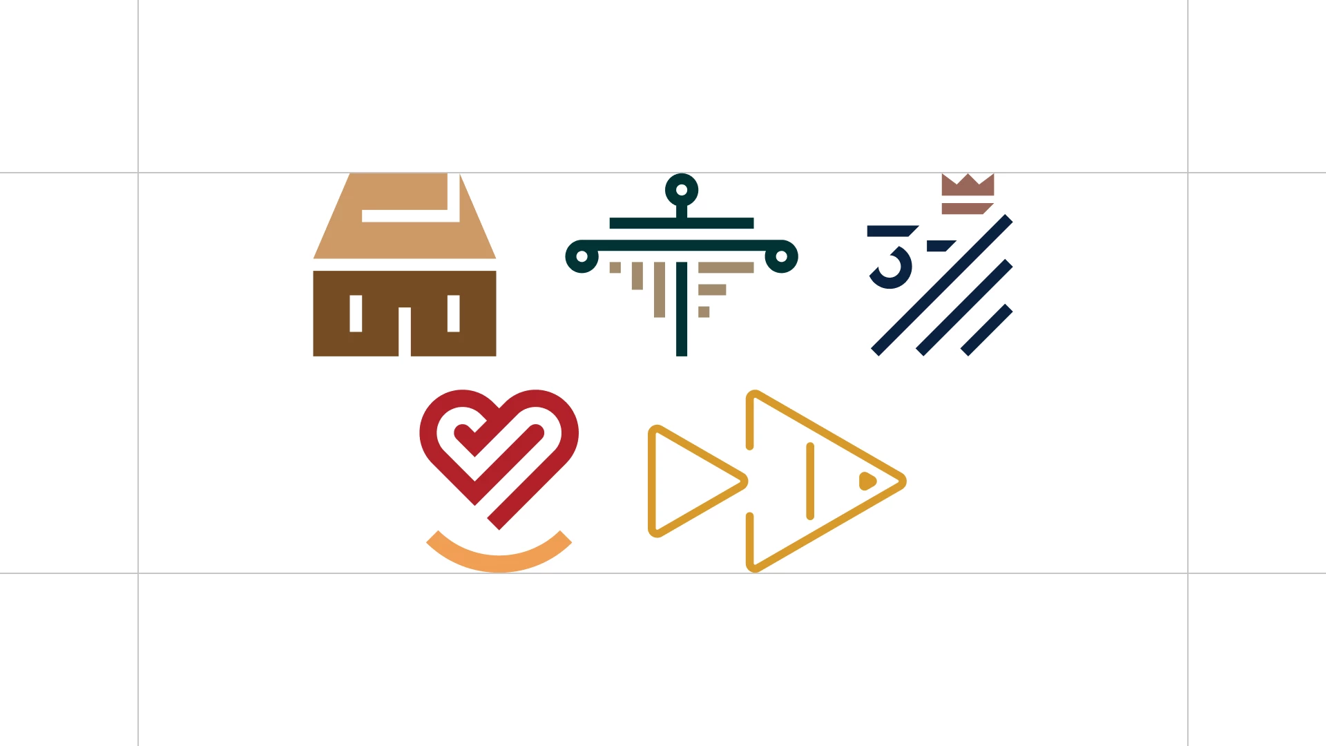
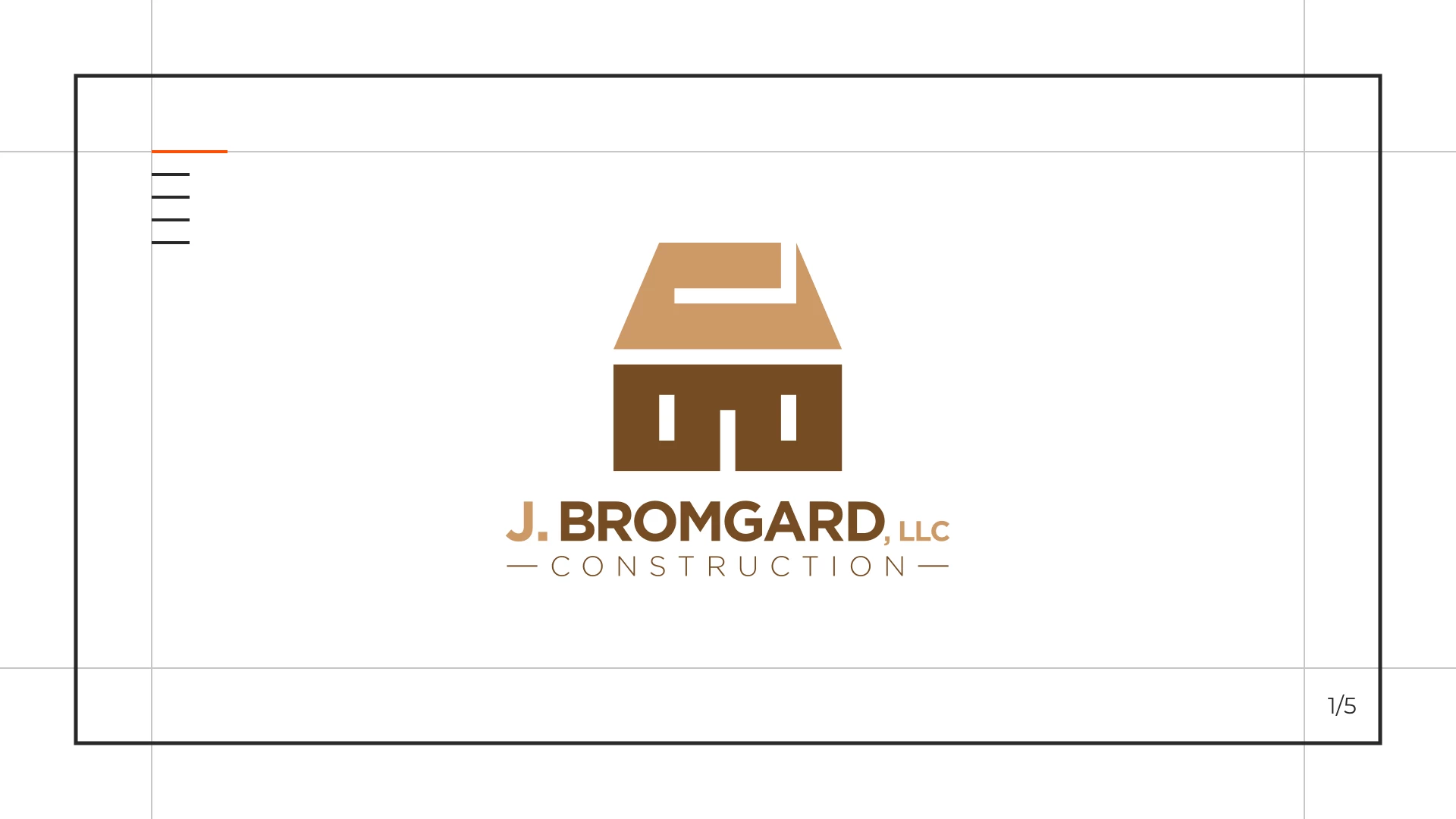
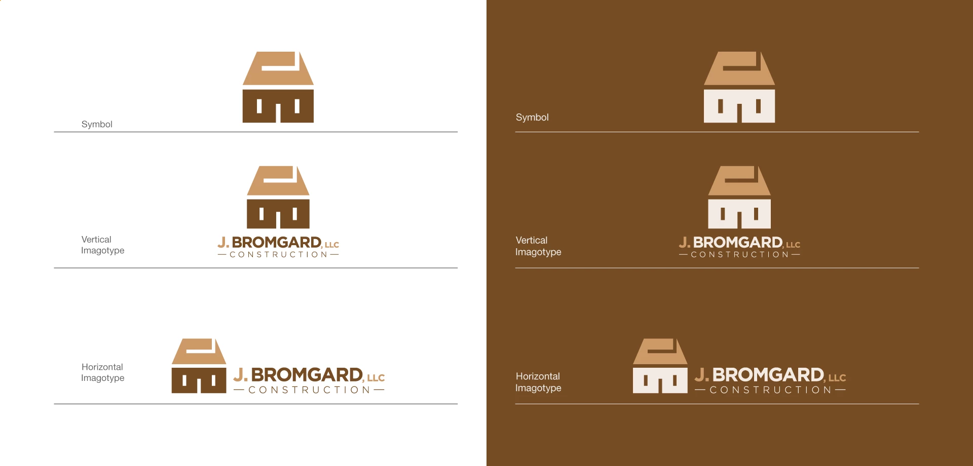
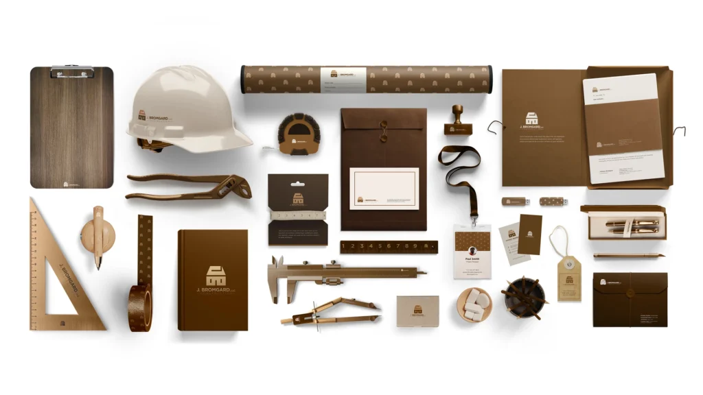
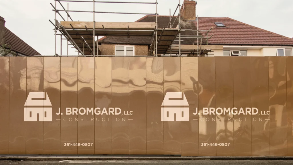
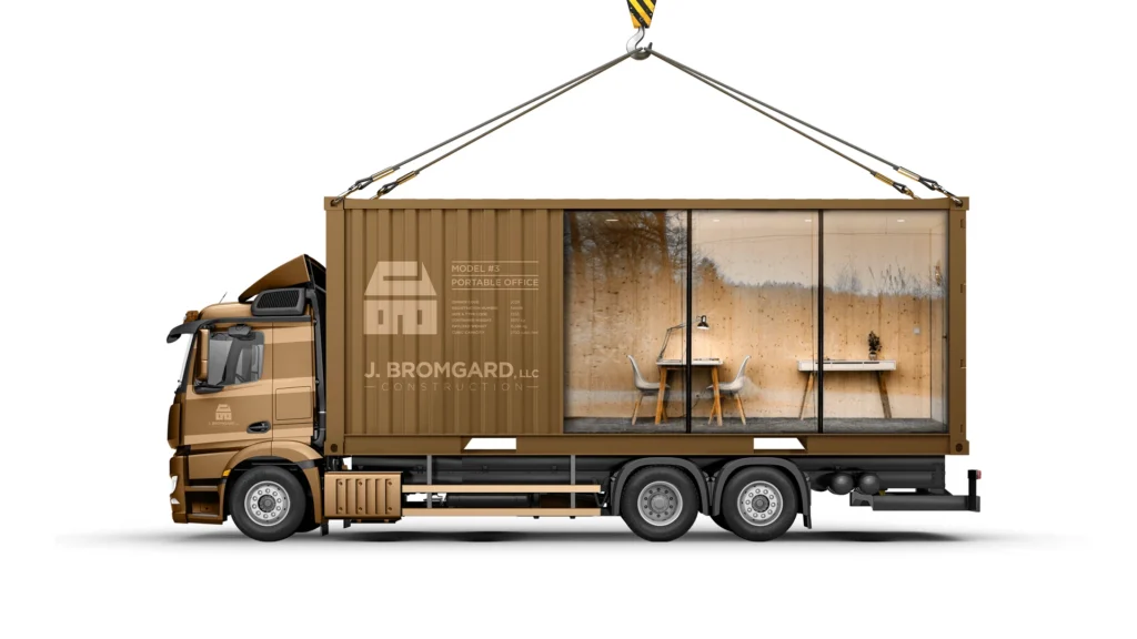
1 – J. Bromgard
Construction Company Branding
An identity for a growing construction firm in Austin, Texas—focused on home remodeling and expanding into full-scale residential development.
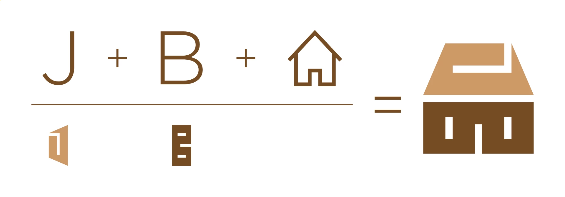
Logo Concept
The logo is a geometric construction of the initials JB, inspired by architectural blueprints and the shape of a house.
Applications
Color Palette & Typography


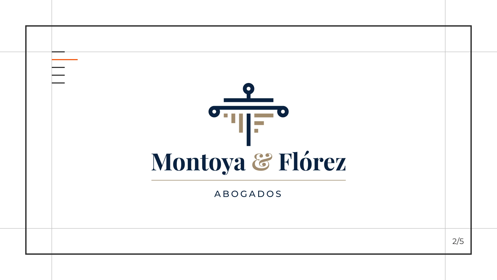
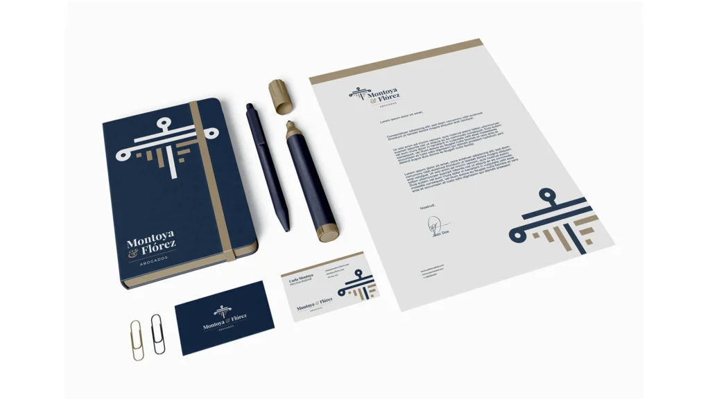
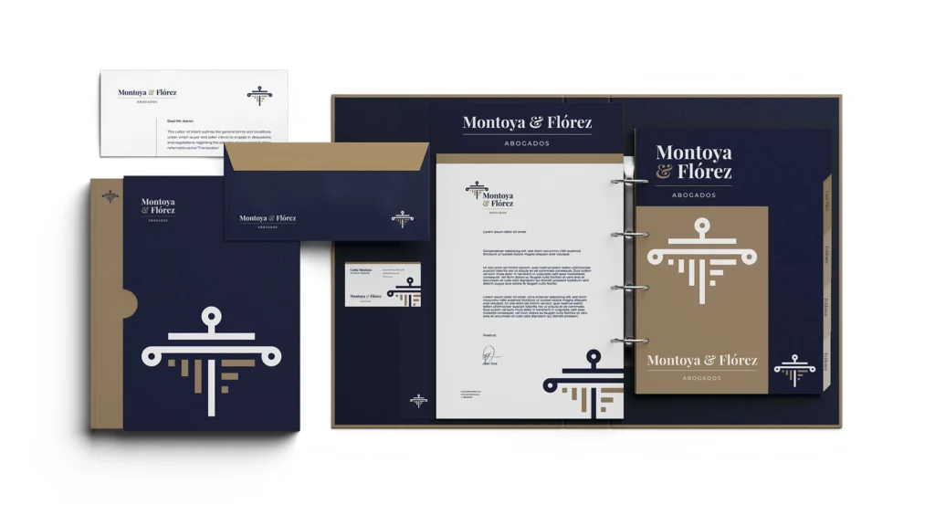
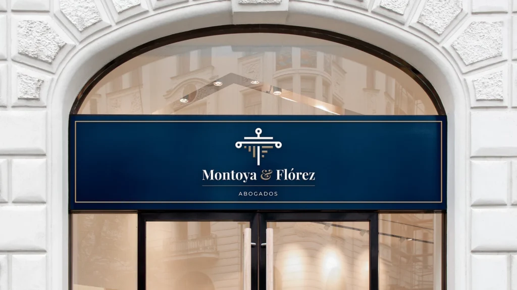
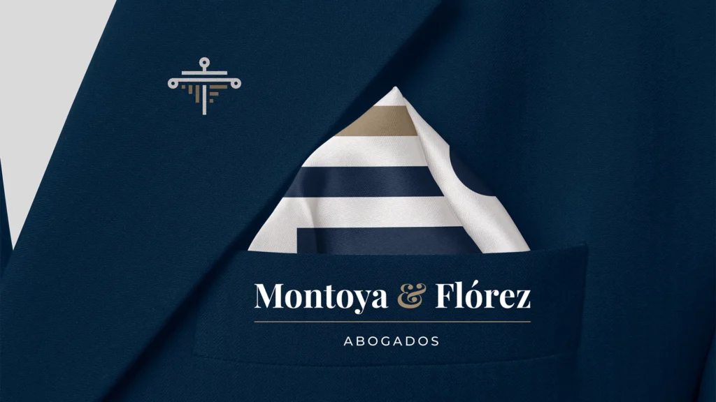
2 – Montoya & Florez
Law Firm Branding
A law firm dedicated to fairness and human-centered justice, merging tradition with integrity, reason, and respect for fundamental rights.
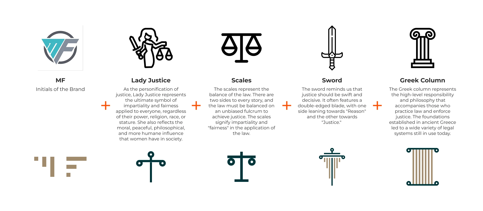
Logo Concept
A FAIRER JUSTICE: Aiming for justice systems that are fair, efficient, and humane, this approach respects fundamental rights and considers each case’s specifics. It seeks solutions with a moral and humane sense, incorporating crucial elements of legal practice in societies based on human rights and the rule of law.
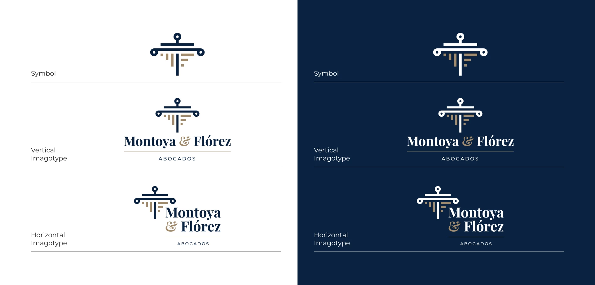
Applications
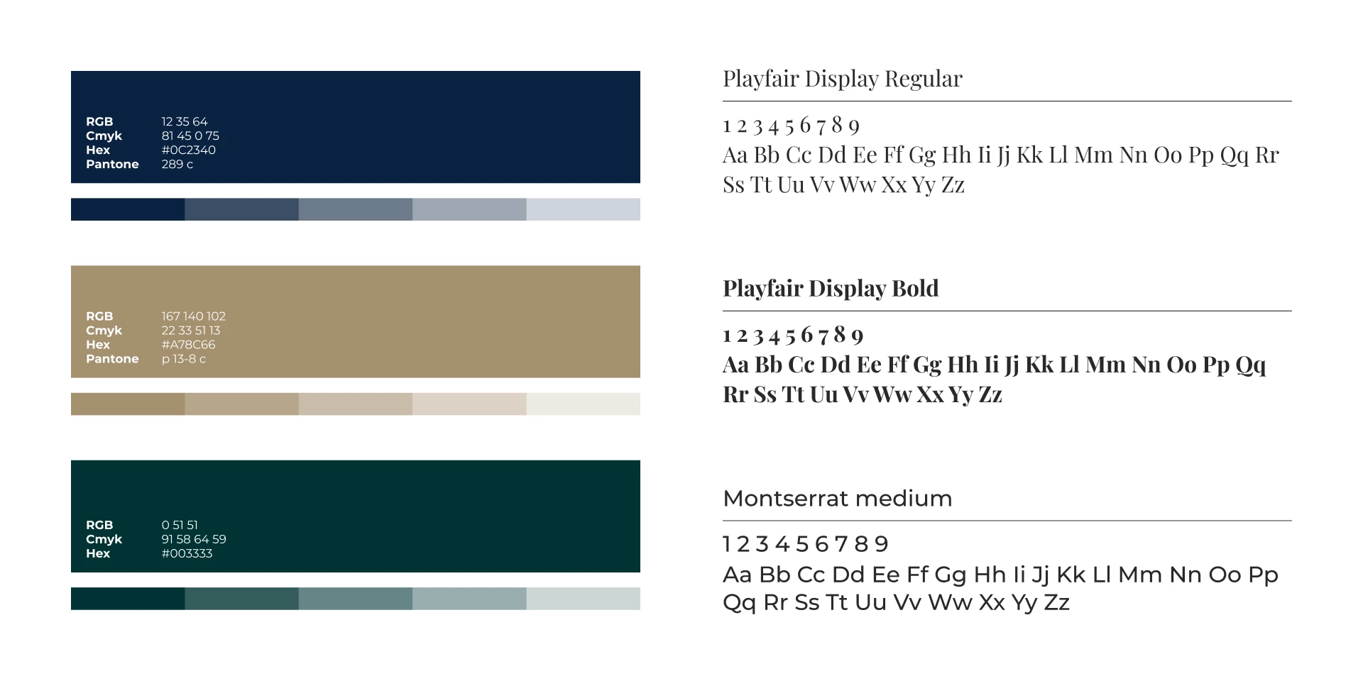
Color Palette & Typography
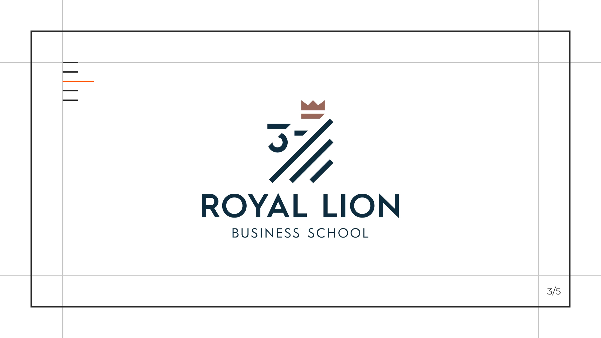
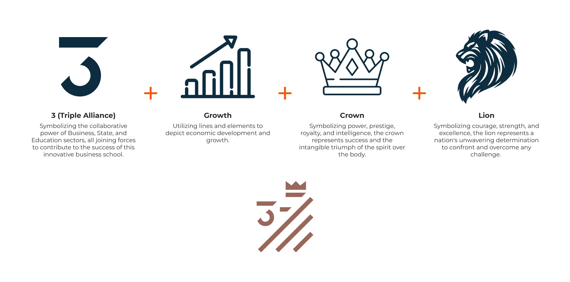
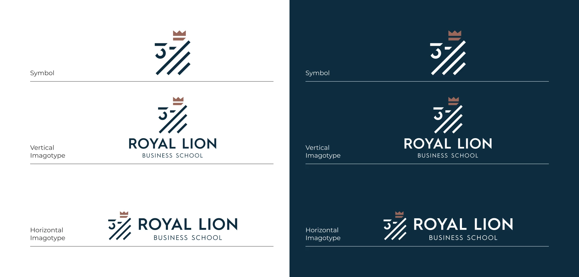
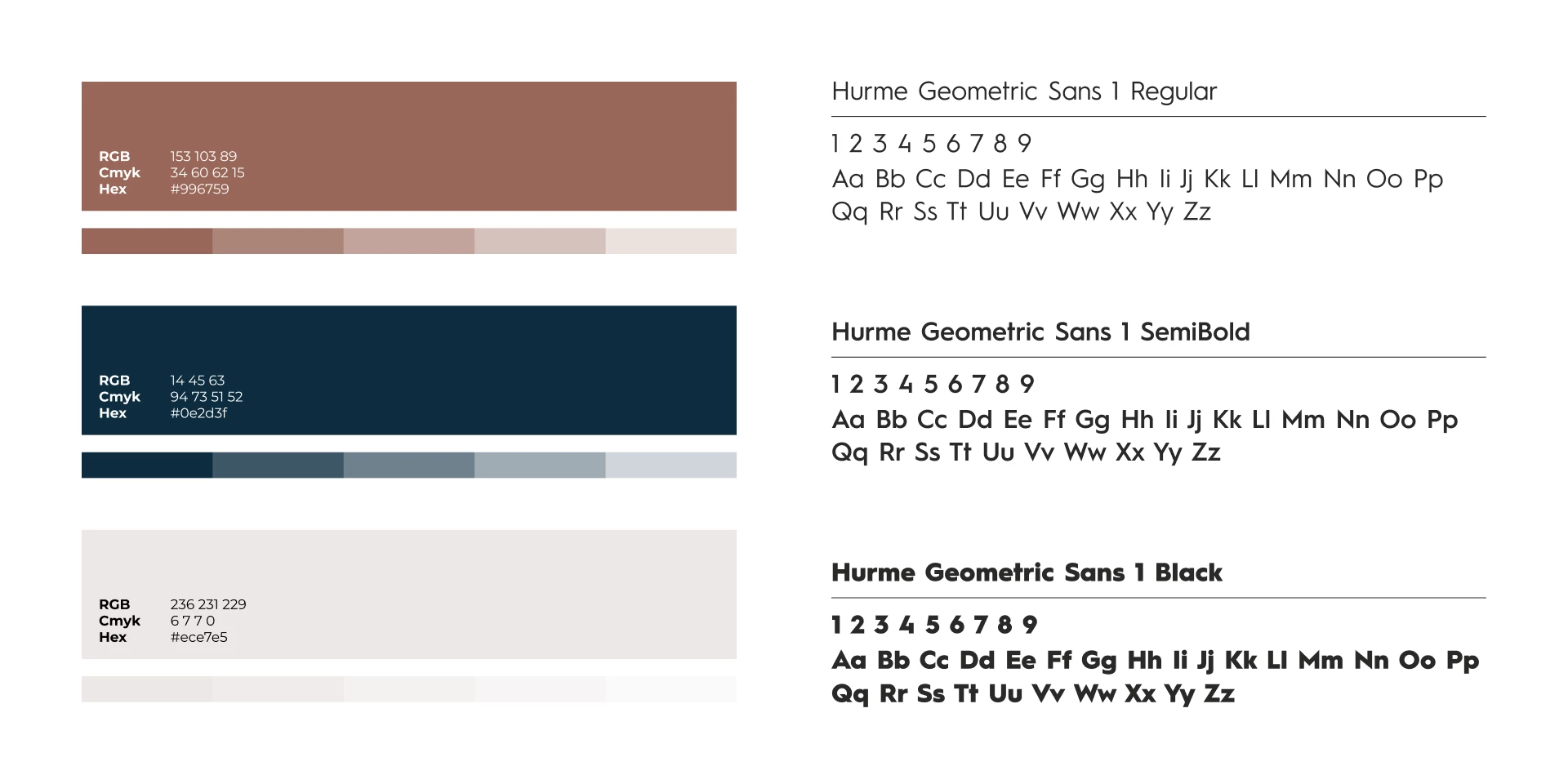
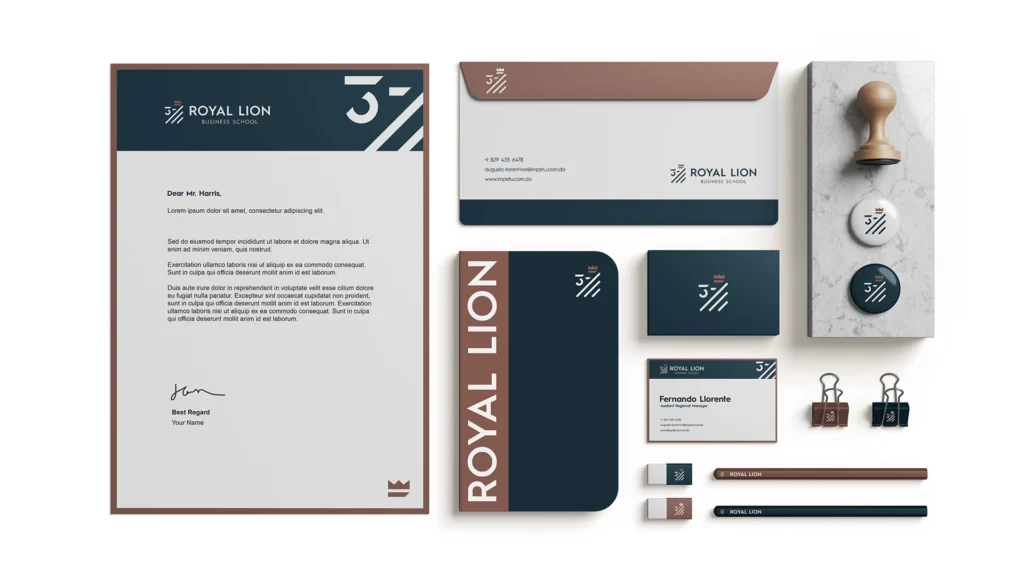
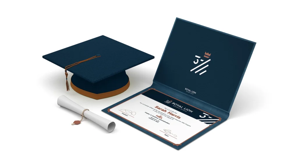
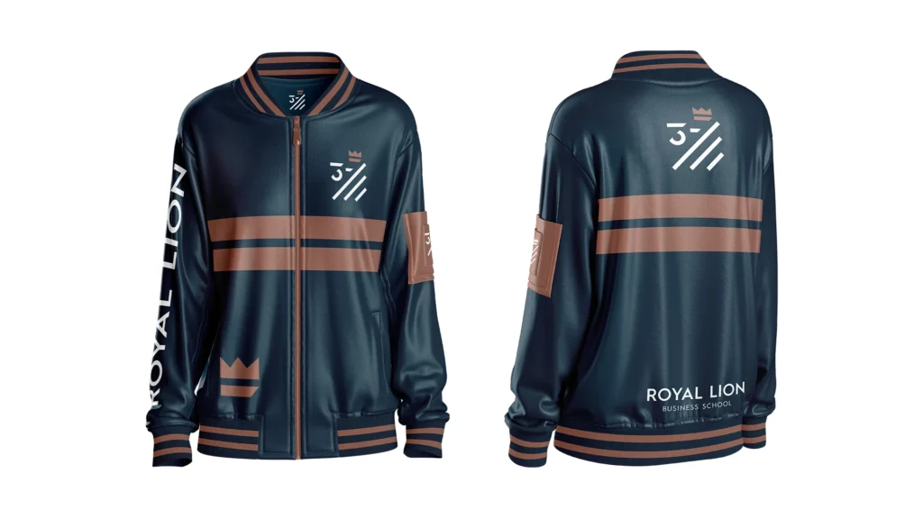
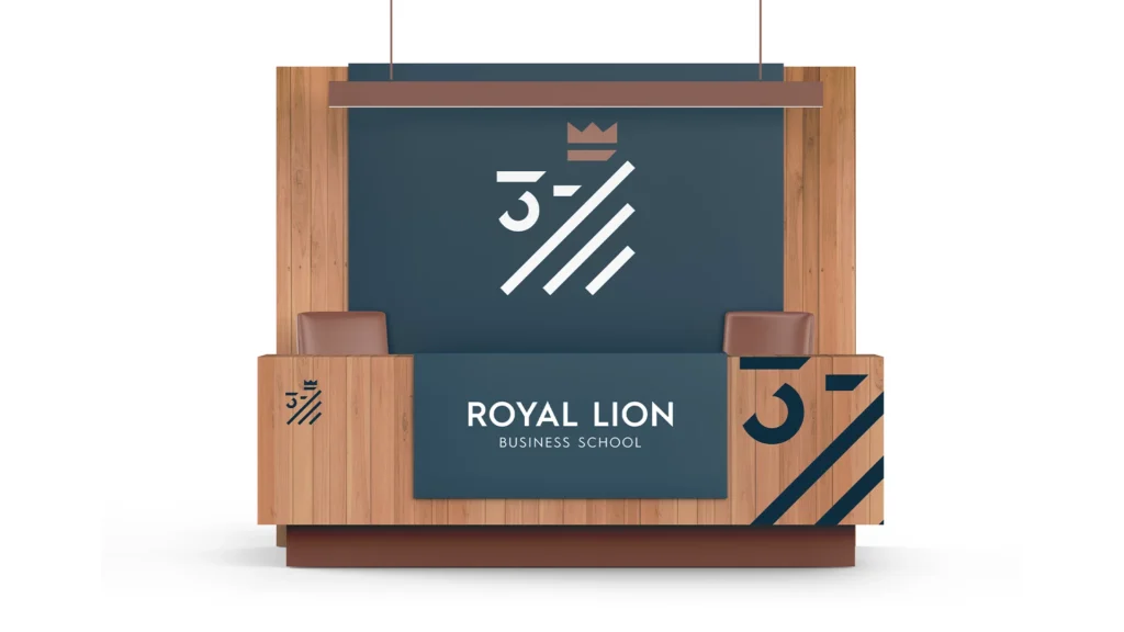
3 – Royal Lion
Business School Branding
A brand built on strength and excellence, representing the alliance between business, education, and state—symbolized by the lion’s courage and leadership.
Logo Concept
Applications
Color Palette & Typography
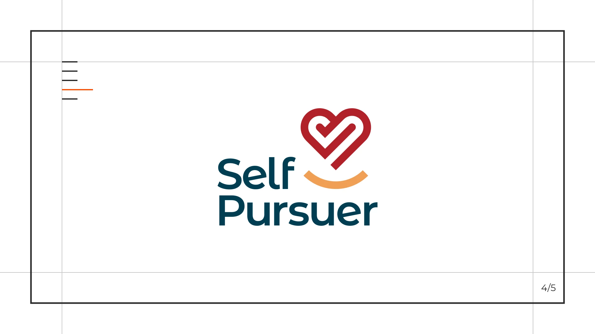
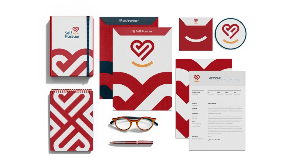
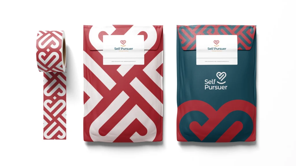
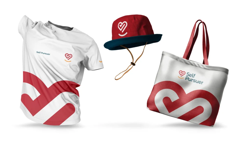
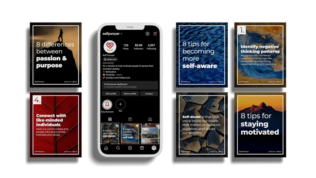
4 – Self Pursuer
Motivational Brand Identity
A personal growth brand designed to inspire self-discovery, helping people pursue their ideal lives through motivation and reflection.
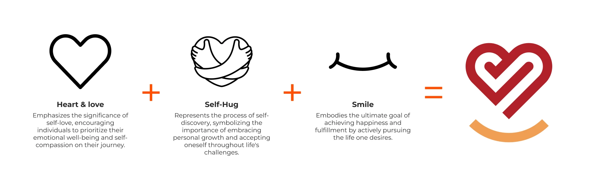
Logo Concept
These elements encapsulate the brand’s commitment to inspiring and guiding people on transformative self-discovery journeys that lead to enriched, authentic lives.
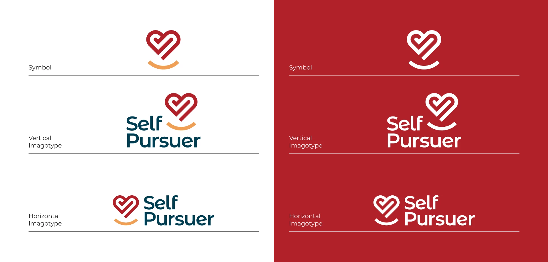
Applications
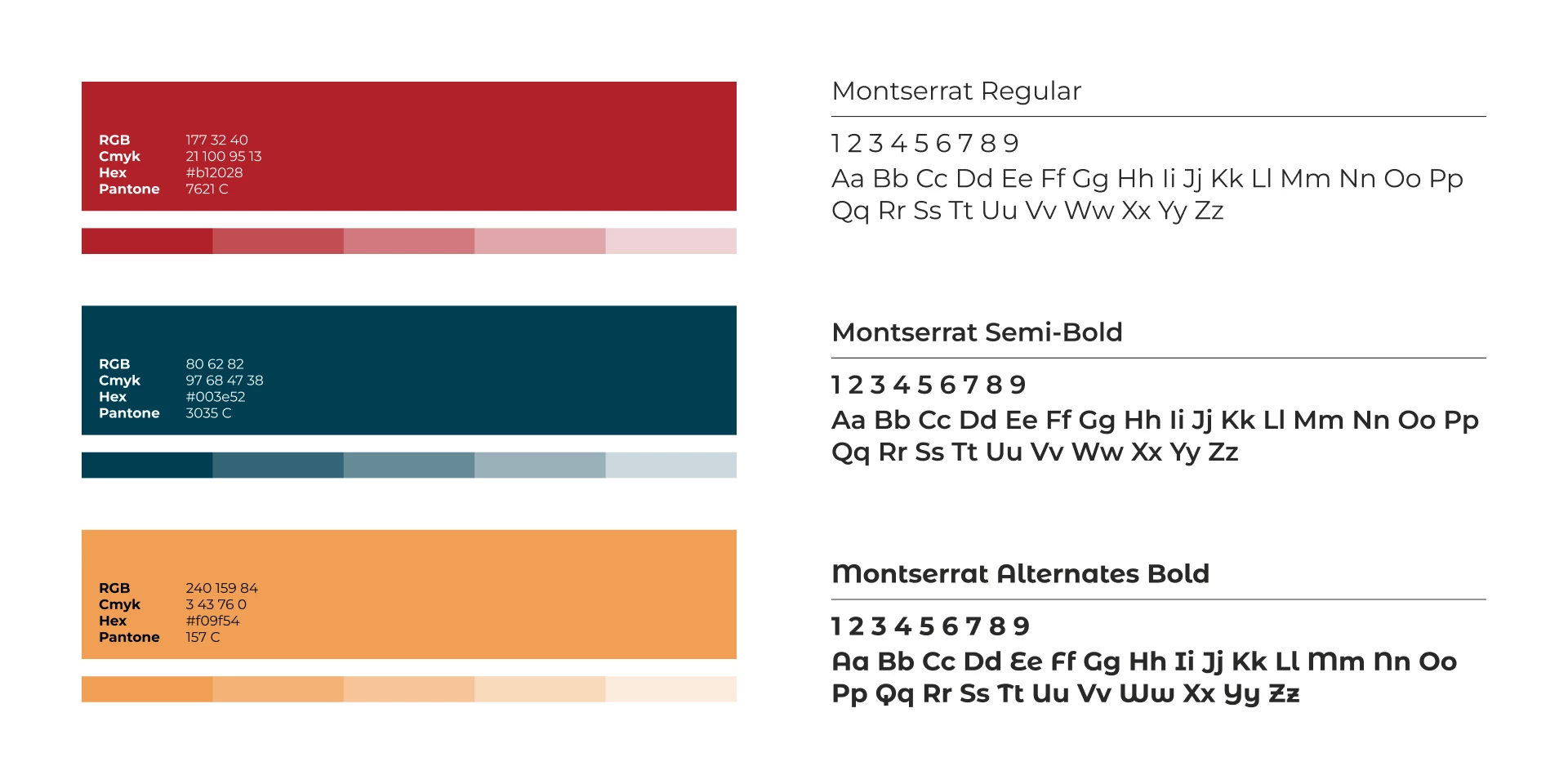
Color Palette & Typography
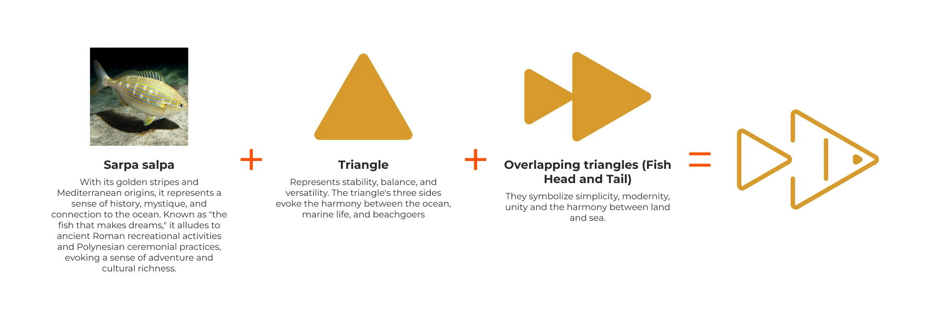
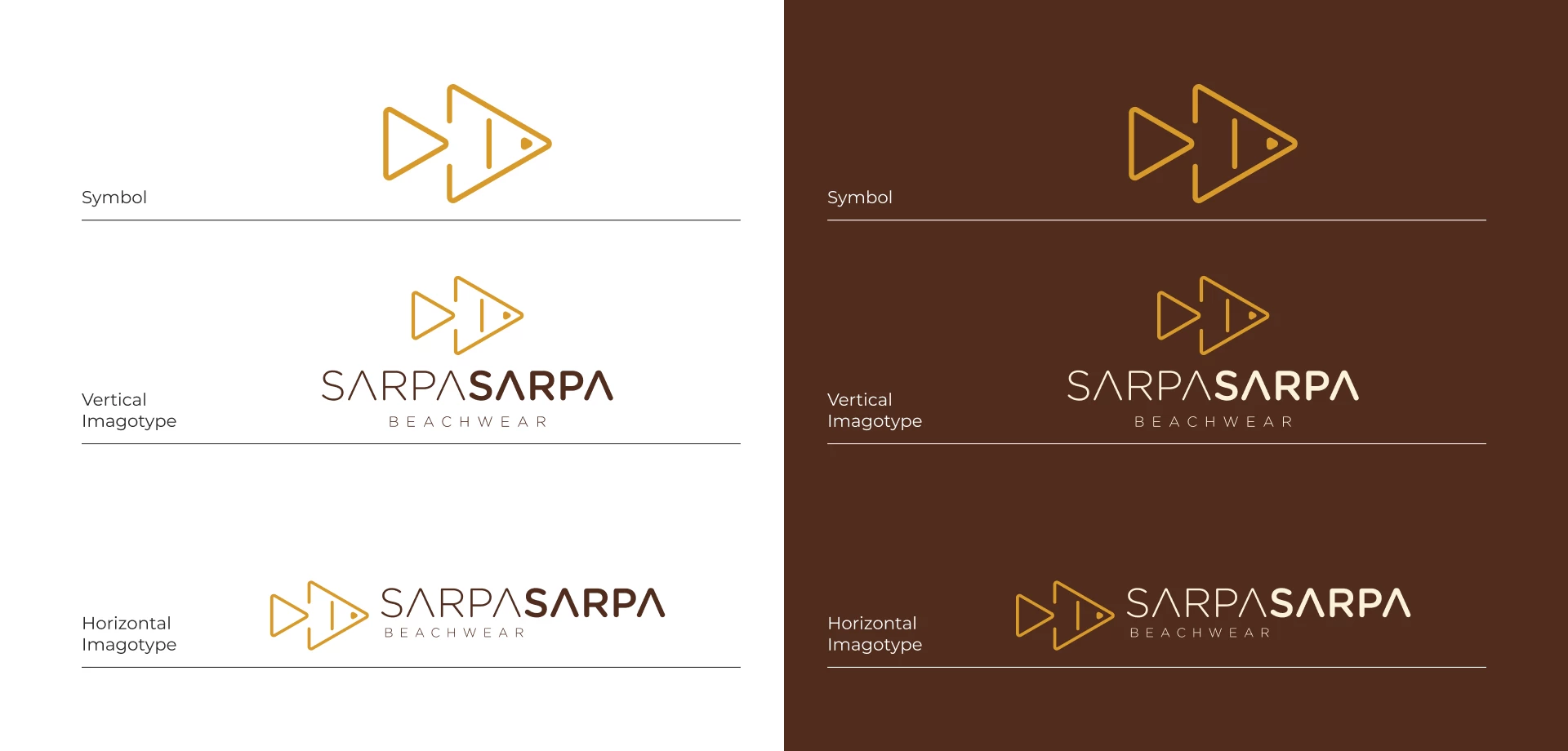
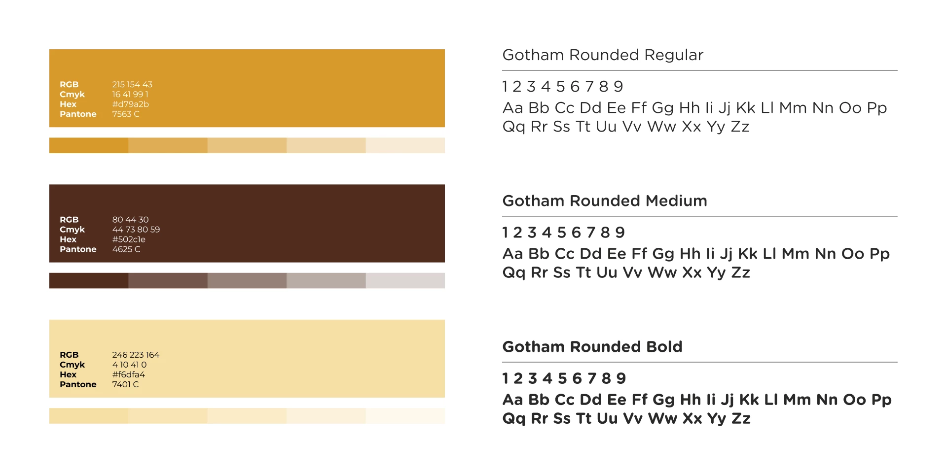
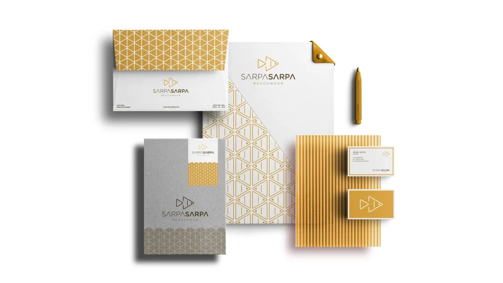
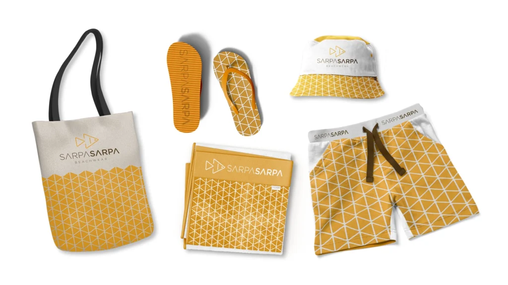
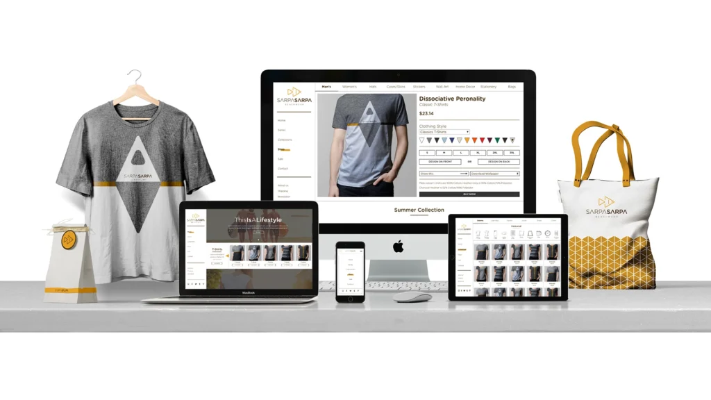
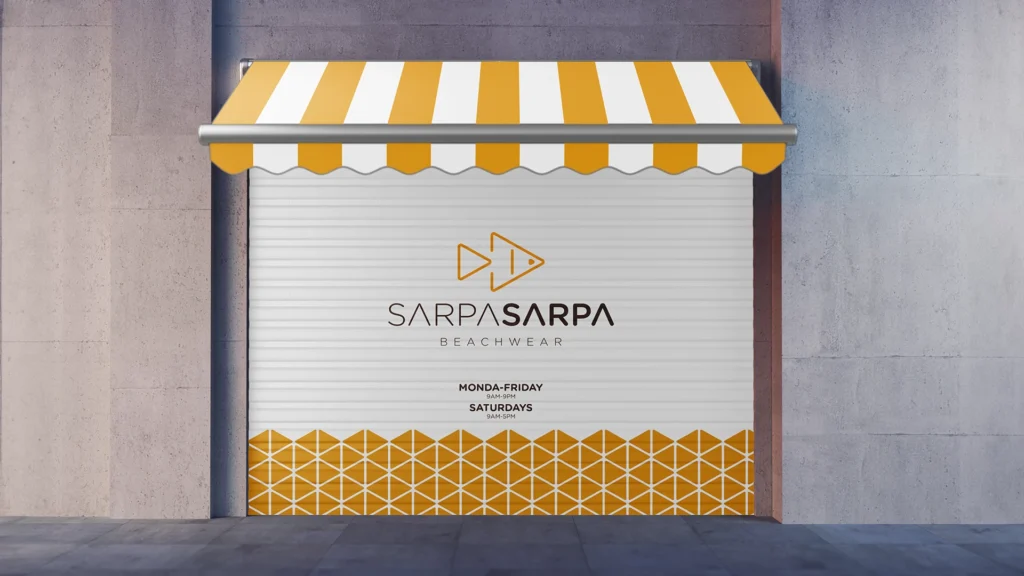
5 – Sarpa Sarpa
Beachwear Apparel Branding
A minimalist, nature-inspired beachwear brand reflecting harmony between land and sea, with clean, modern aesthetics.
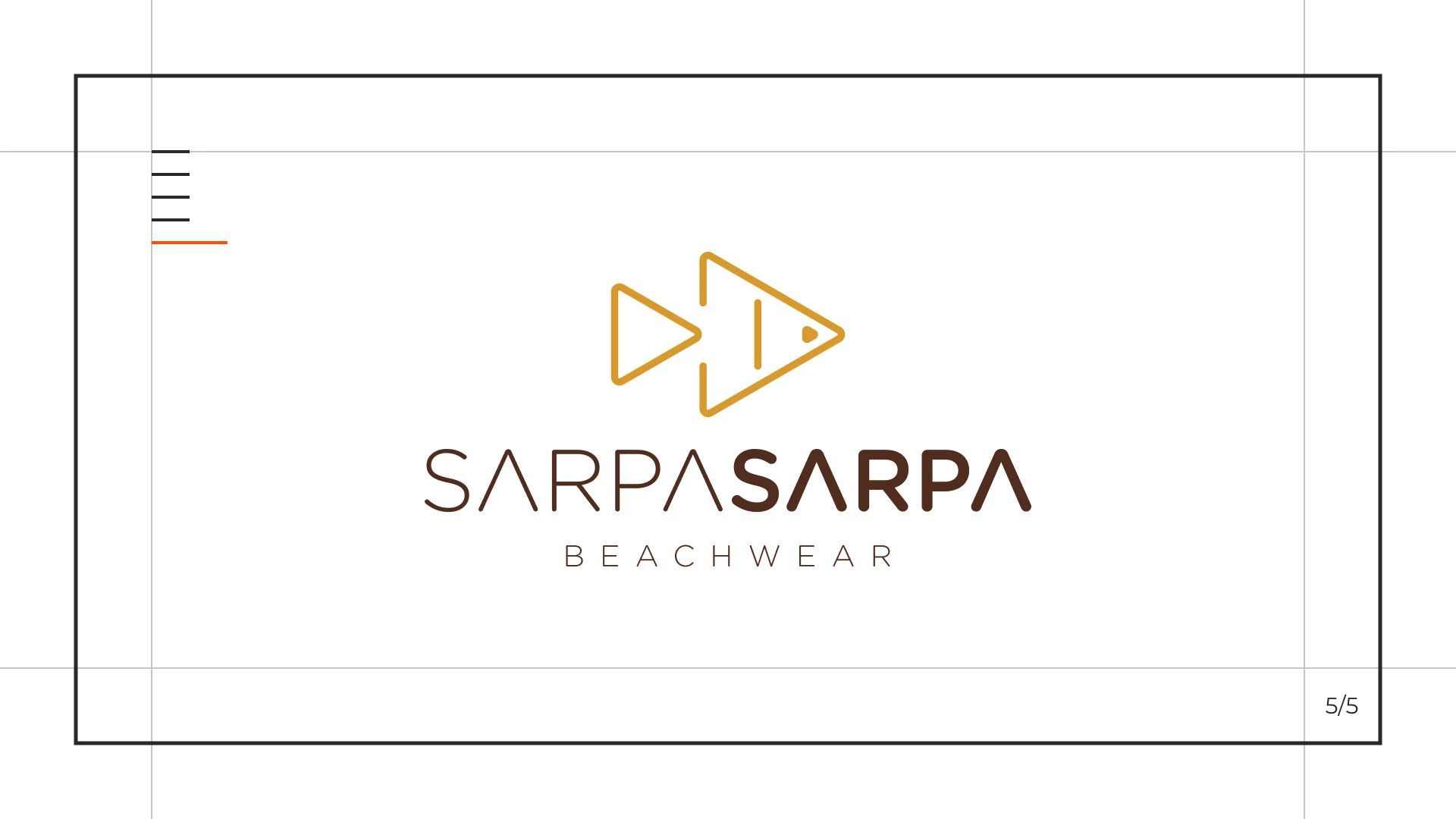
Logo Concept
It combines geometric triangles to form a fish, symbolizing simplicity, modernity, harmony between land and sea, and the connection to ocean life, reflecting the brand’s contemporary and stylish identity.
Applications
Color Palette & Typography
- Art Director Jean Soto