Logo Proposal
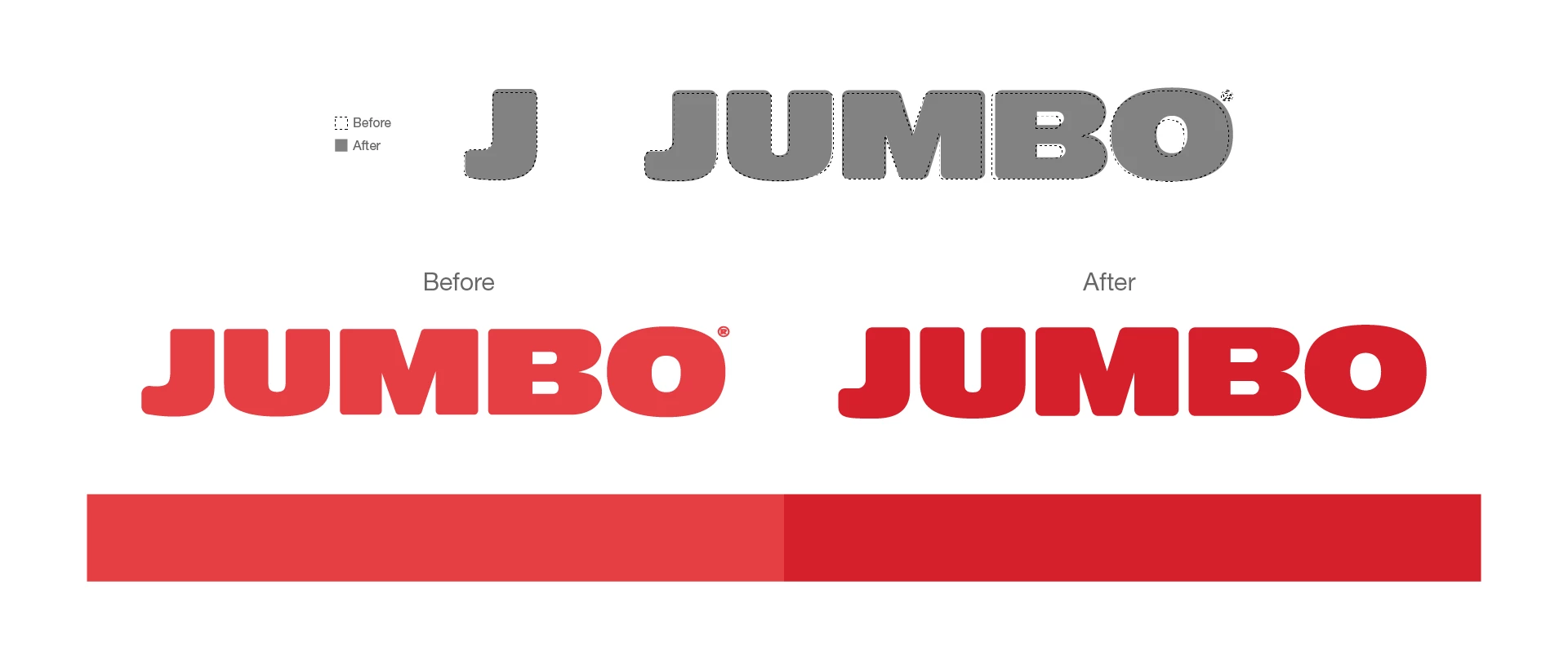
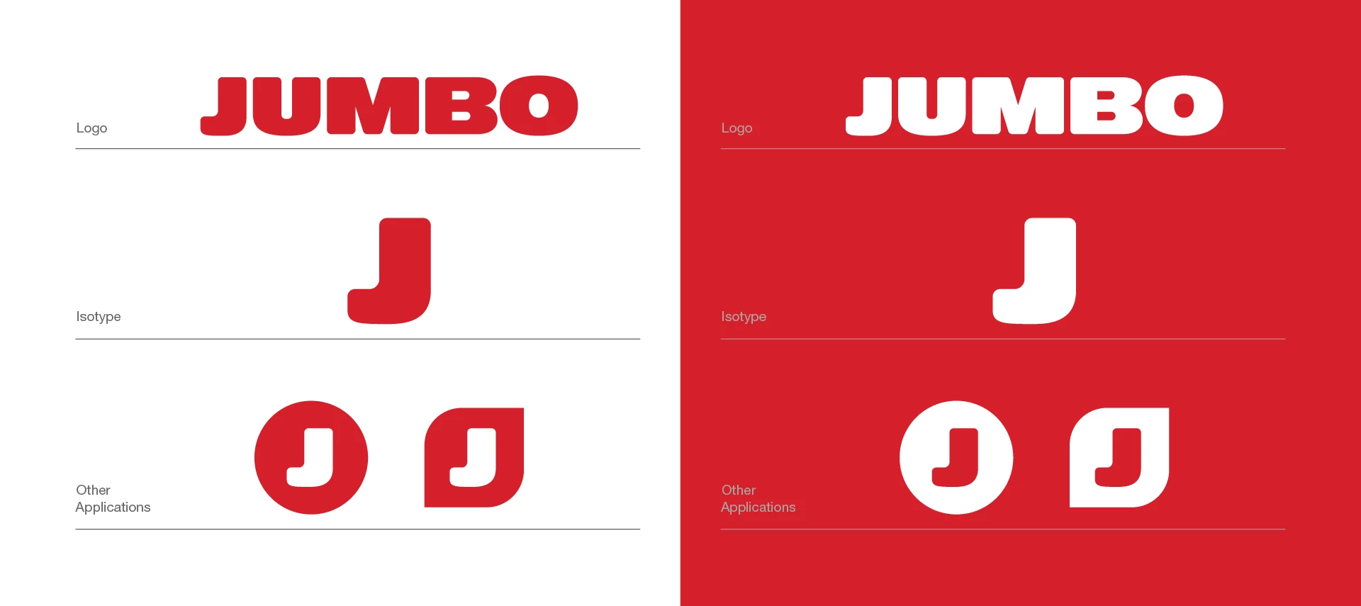
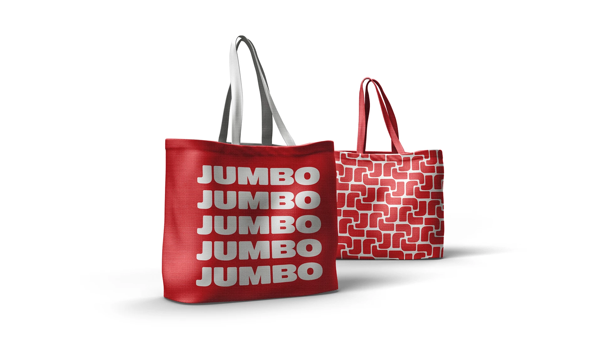
Following an in-depth analysis, we concluded that Jumbo’s brand positioning and future objectives necessitate the preservation of its core identity, embodied by its bold red letters. Armed with this insight, we proposed two options for Jumbo’s future logo, each thoughtfully designed to uphold the essence of the brand while steering it towards its envisioned future.
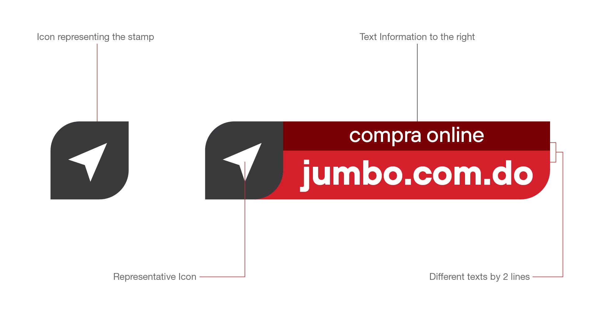
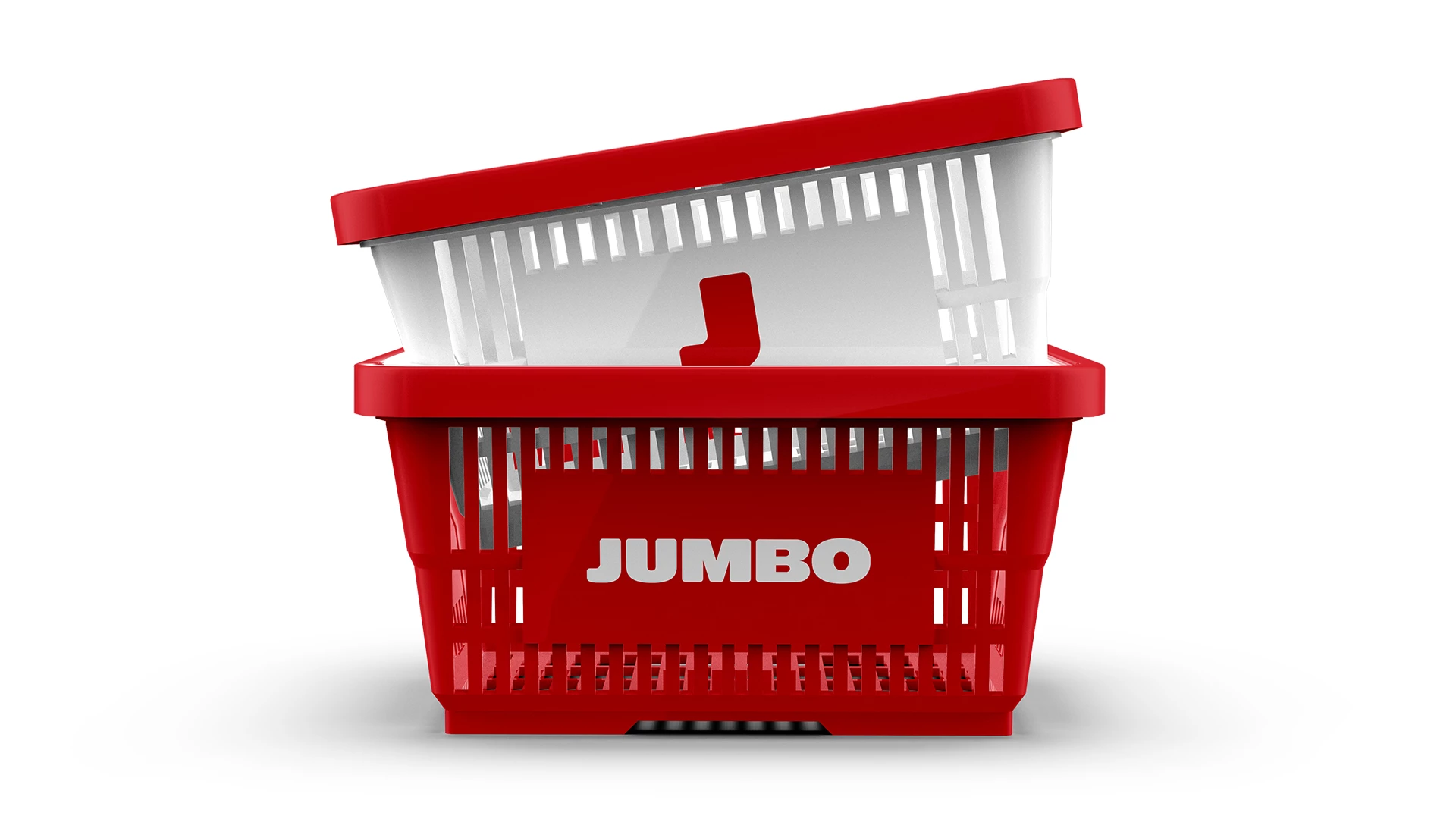
Inspired by the initial letter of our brand, ‘J’, we crafted a design centered around a rounded diagonal corner. This design choice is more than just aesthetic; it carries substantial strategic implications. It mirrors our brand’s dynamism and forward-thinking approach, embodying our commitment to innovation and progress. The blend of sharp corners with their curved counterparts creates a unique visual harmony that is both captivating and visually pleasing. The angular edge of the corner signifies boldness and precision, while the gentle curve represents our modern and vibrant spirit. Together, they form a balanced composition that perfectly encapsulates our brand’s character – dynamic, bold, relatable, and daring.
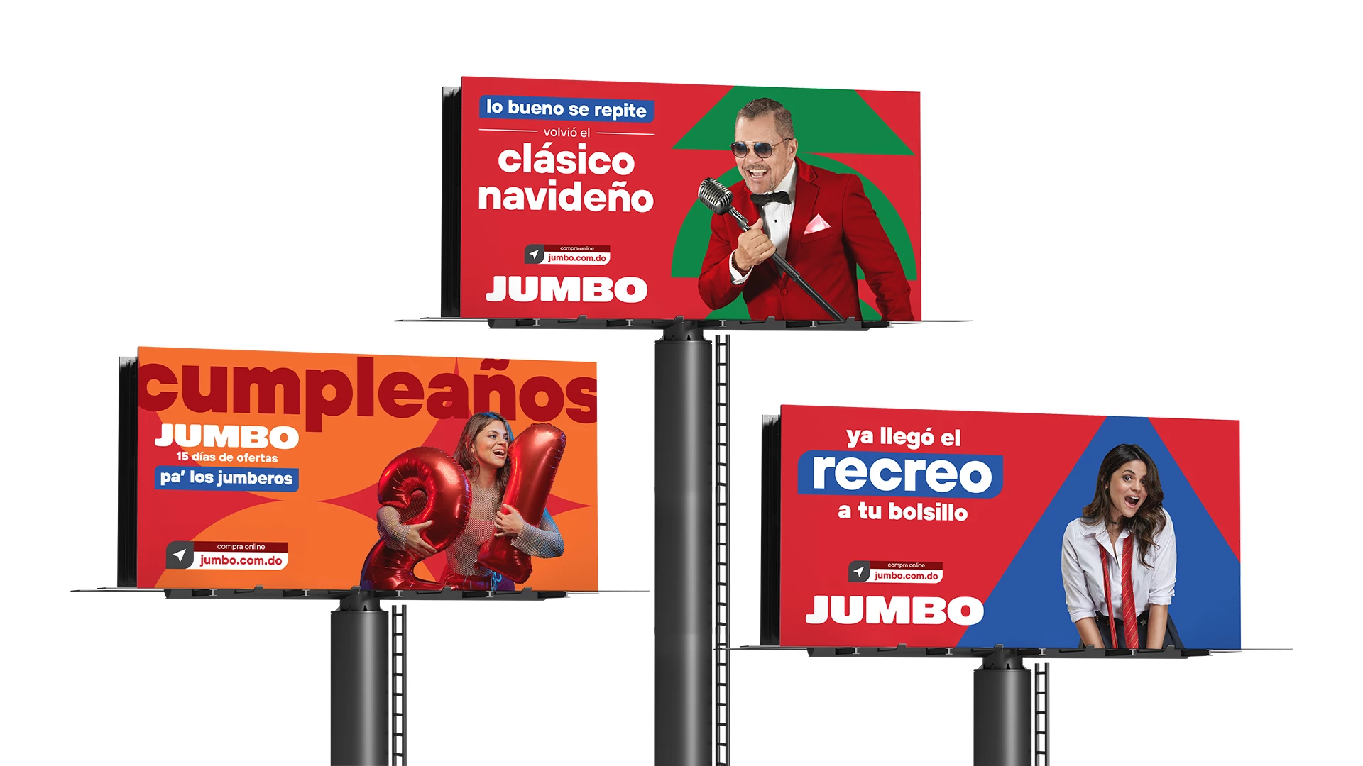
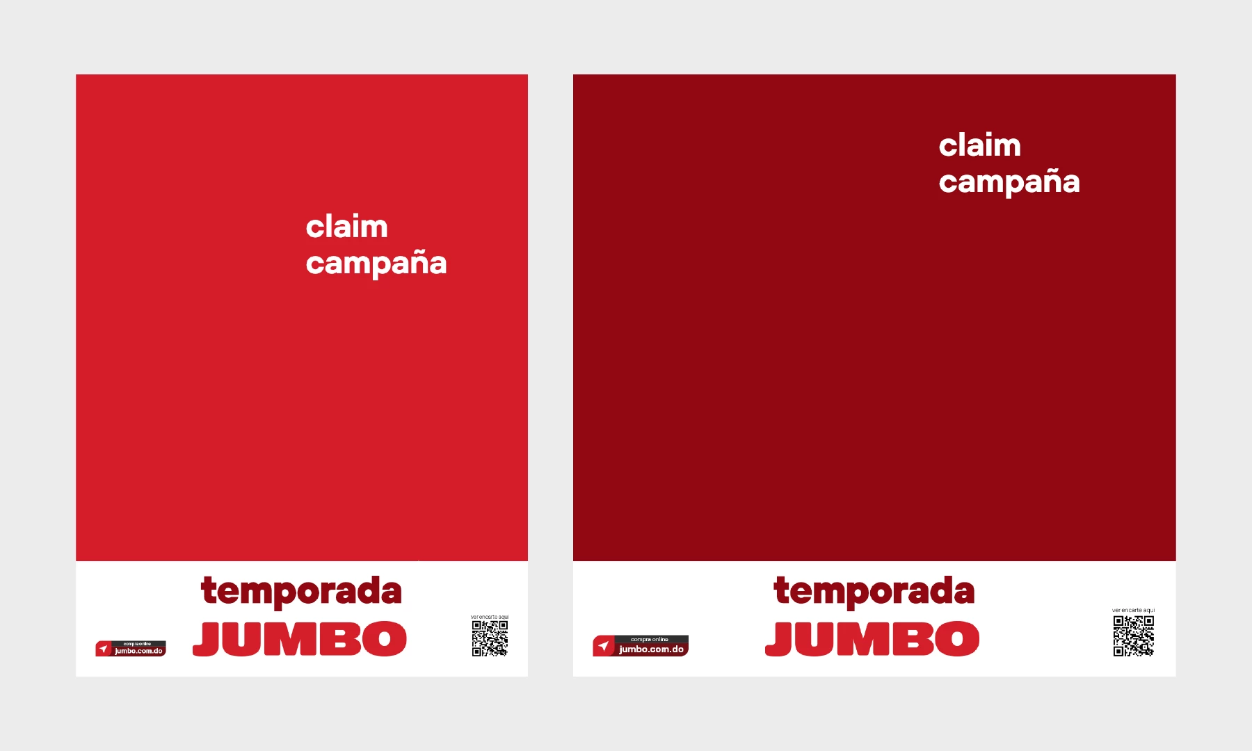
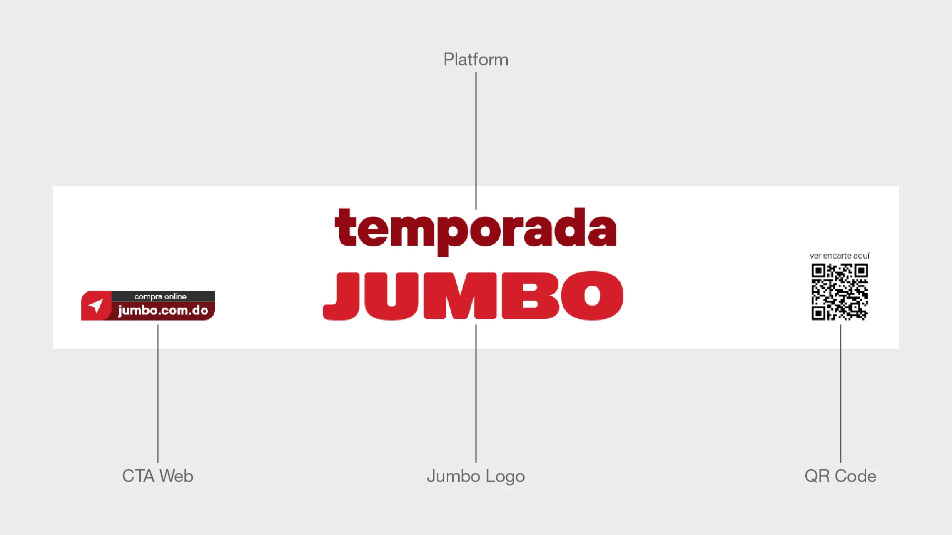
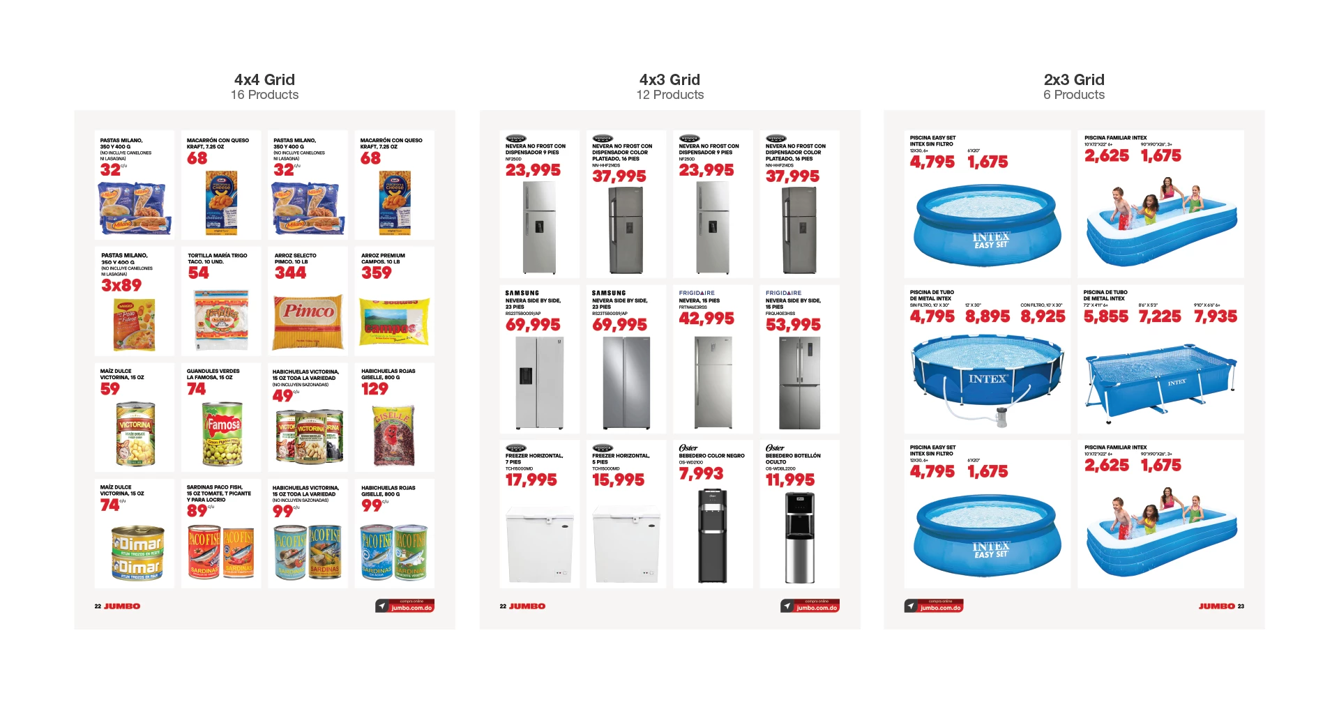
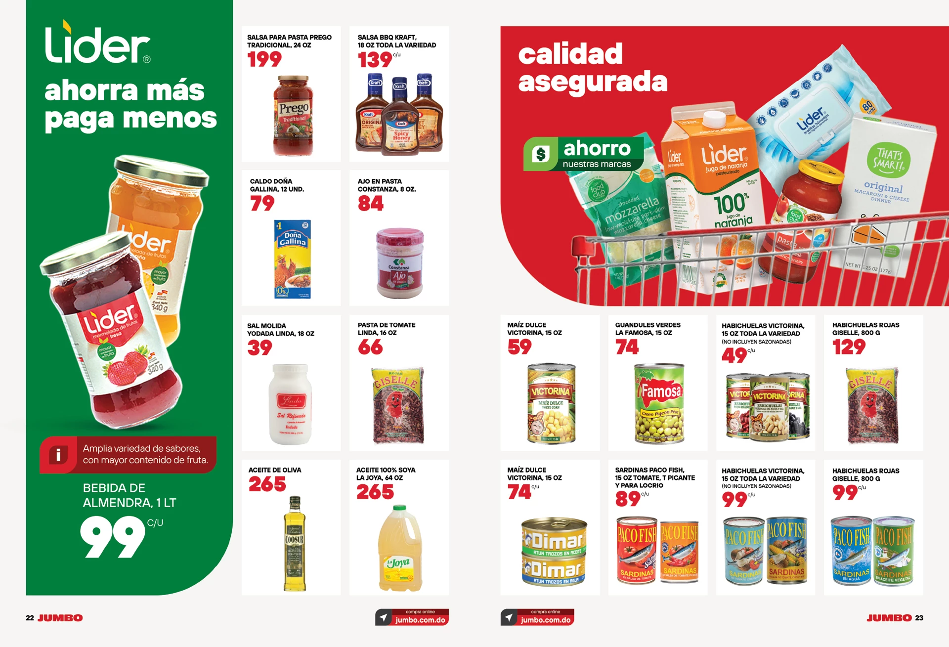
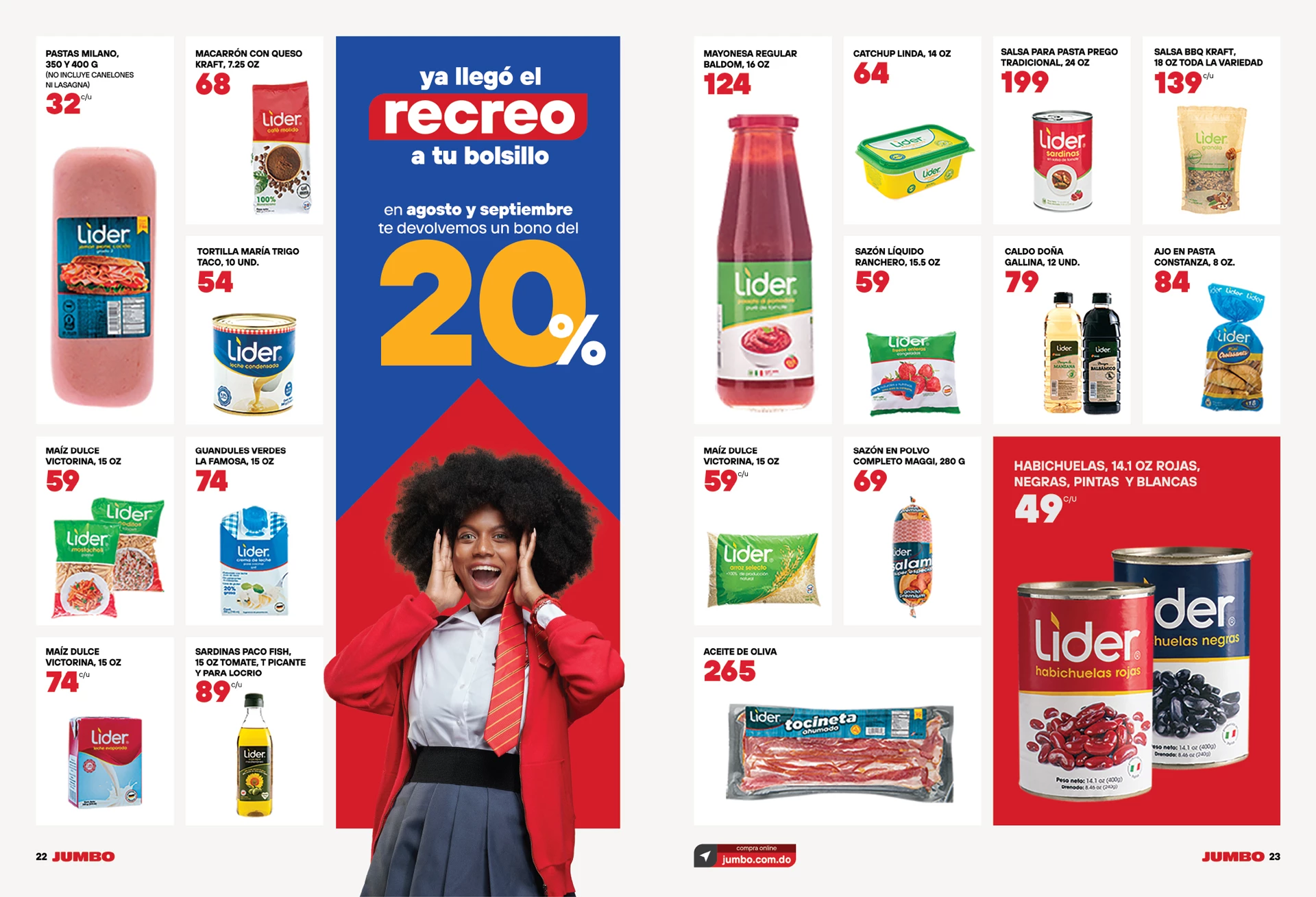
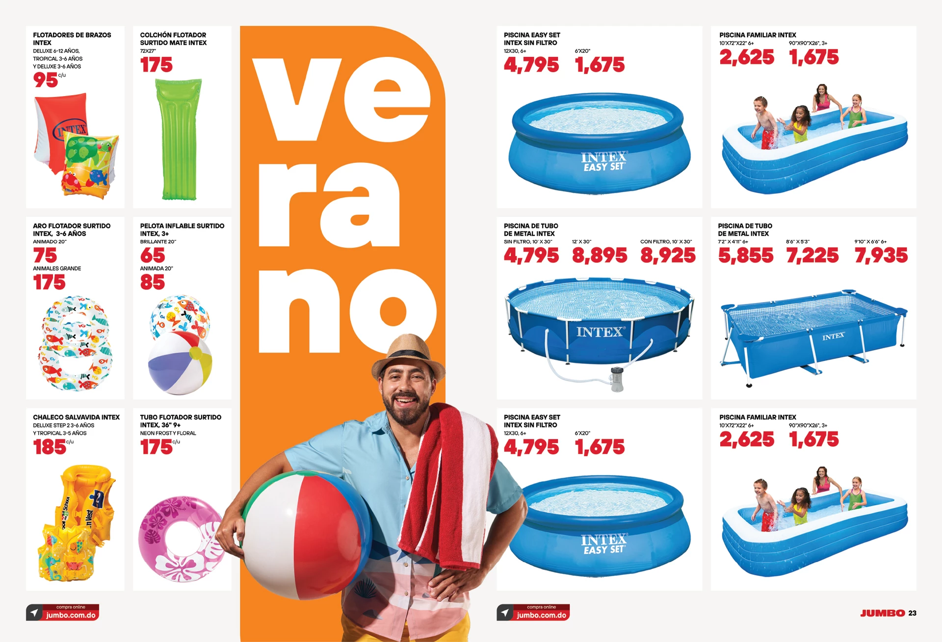
Leveraging the rounded diagonal corner as the foundation of our design, we crafted a modular, functional, and adaptable visual identity. This versatile design can be seamlessly integrated across various platforms, all while preserving the brand’s essence. The result is a more modern, minimalist, and clean aesthetic.
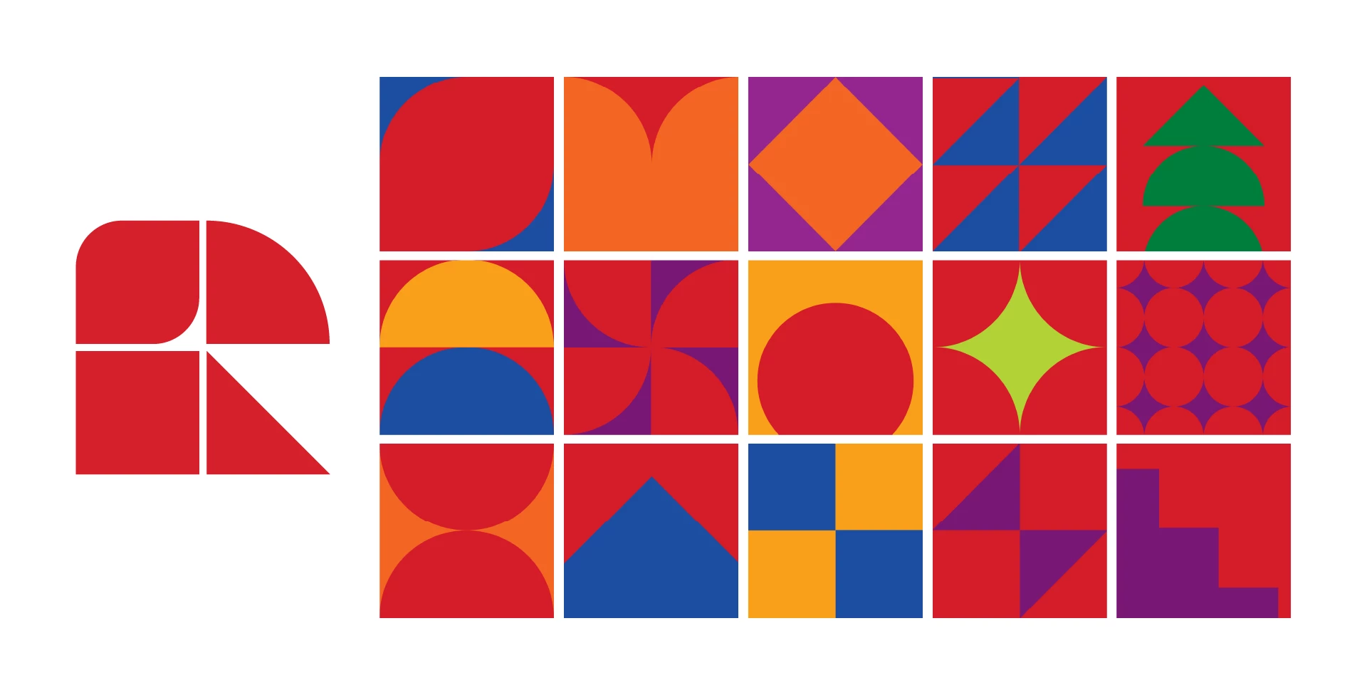
Minimalist Visual Language
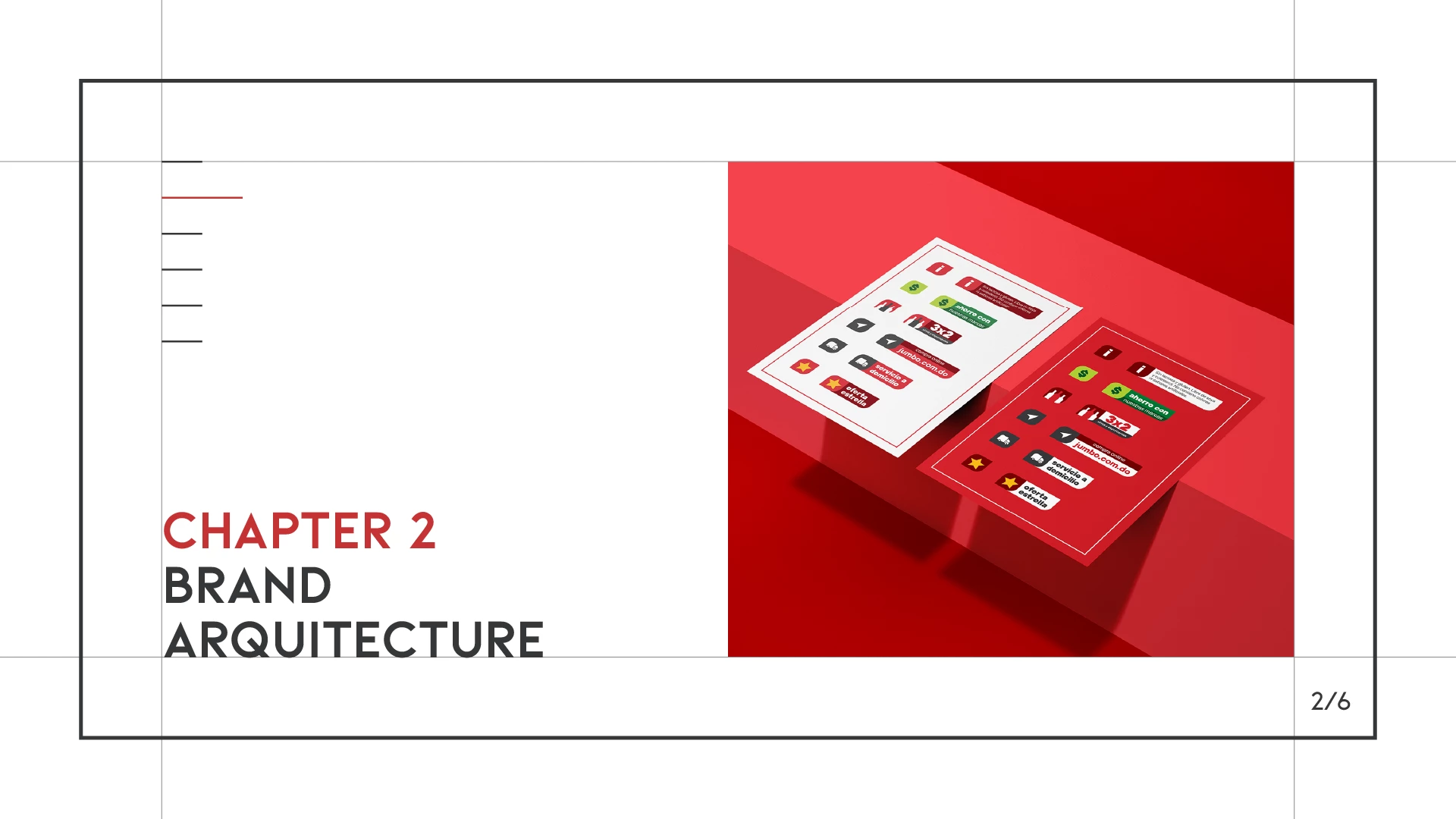
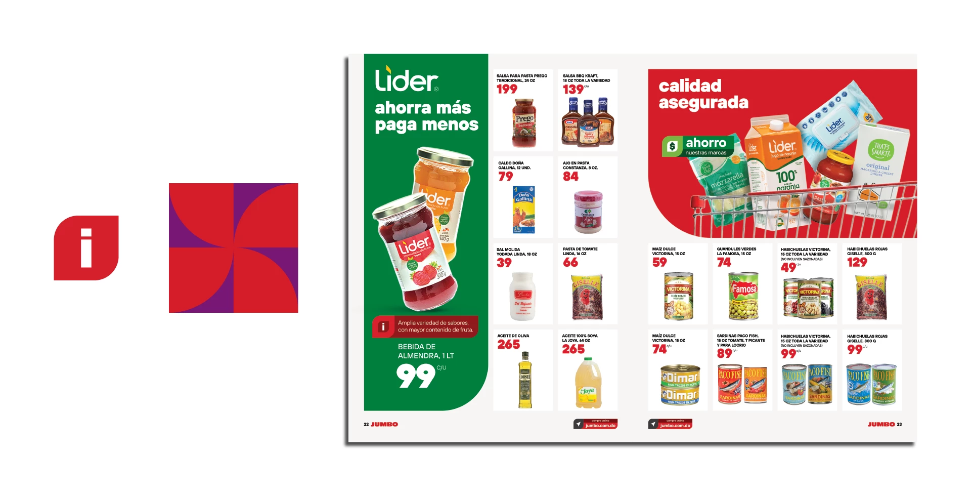
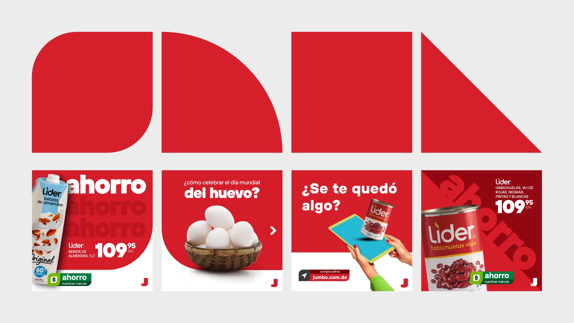
We’ve distilled Jumbo’s visual language into four simple shapes, forming the foundation of a minimalist design system. This streamlined approach paves the way for cleaner, more modern visual communication, aligning with the brand’s ethos while ensuring its message is conveyed effectively and elegantly.
Social Media
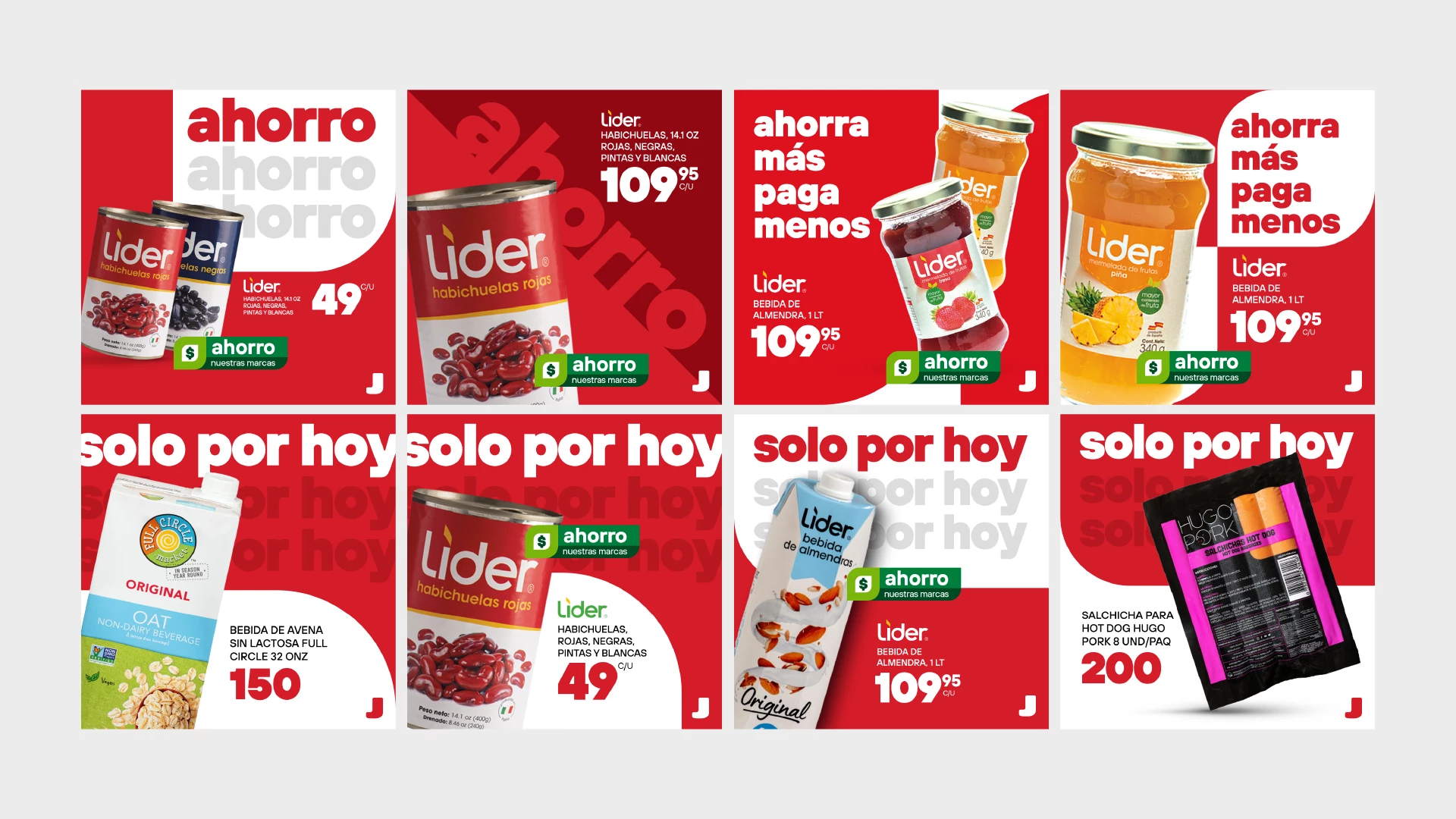
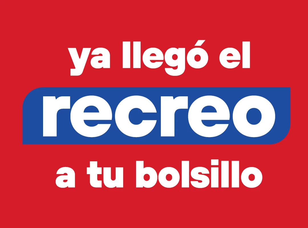
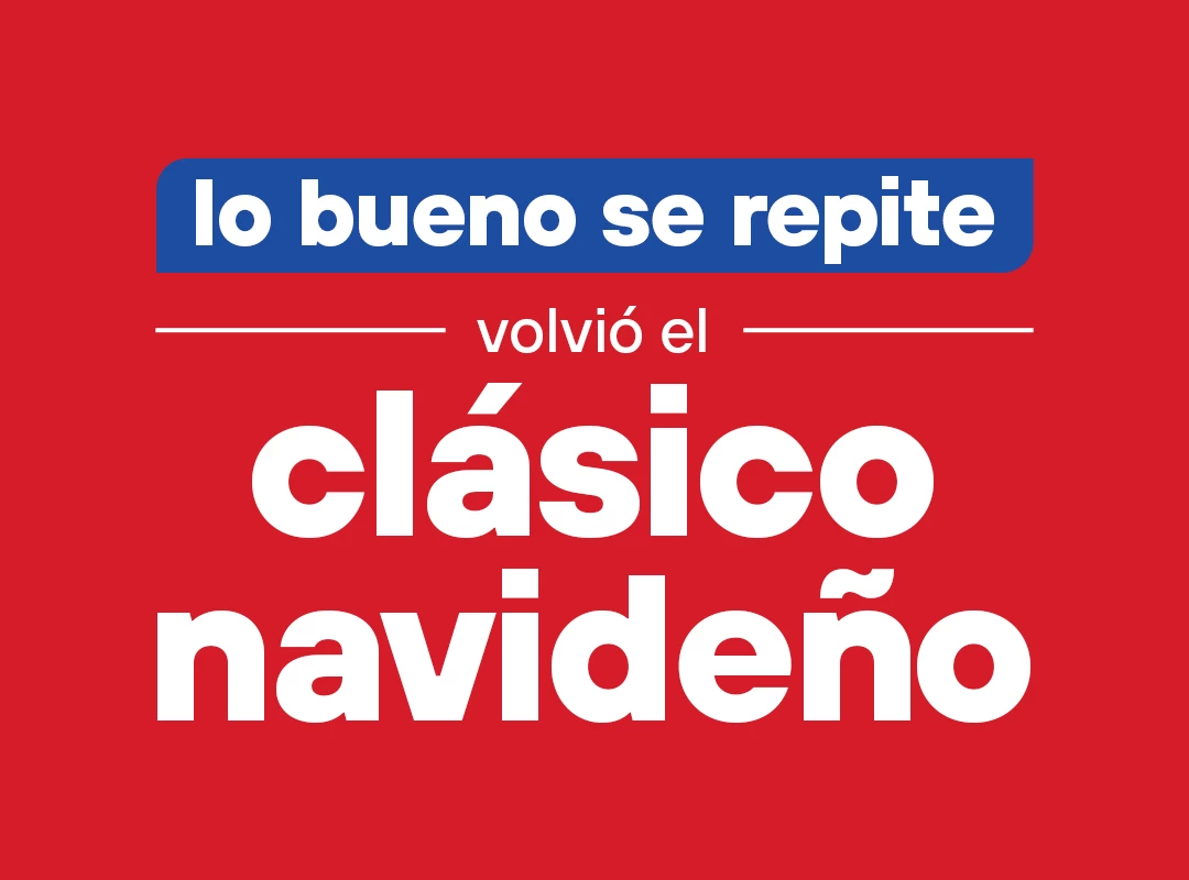
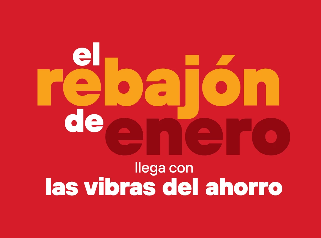
Some examples of typical social media posts, encompassing themes such as savings promotions, ‘only for today’ specials, and showcases of our exclusive brand collections.
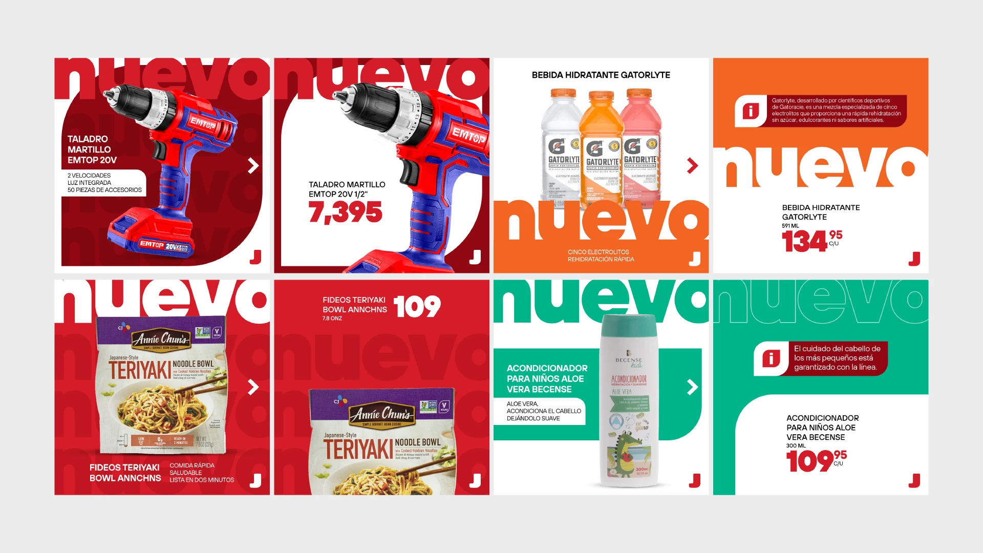
Presented here are additional examples of posts highlighting new product arrivals. Each post adheres to our visual aesthetic, utilizing the four primary shapes and creatively integrating large fonts with product images for a cohesive and engaging posts.
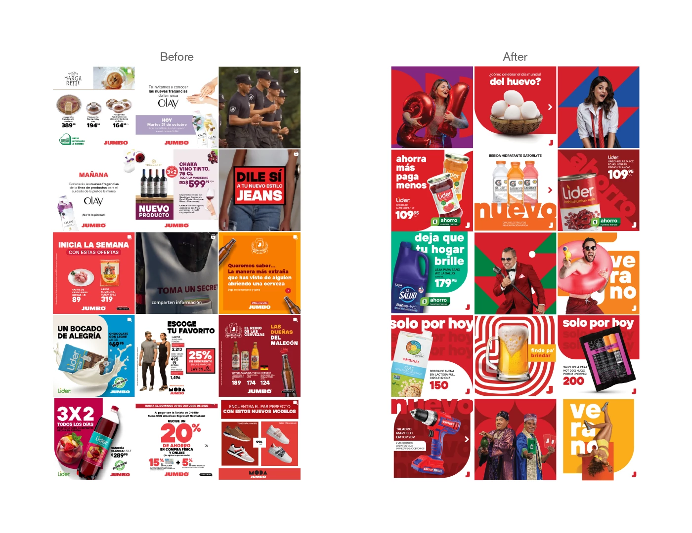
Instagram Feed Before & After
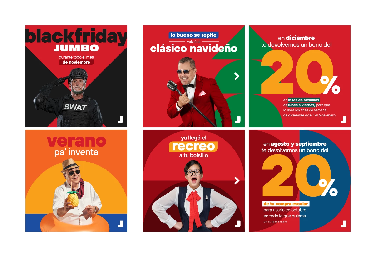
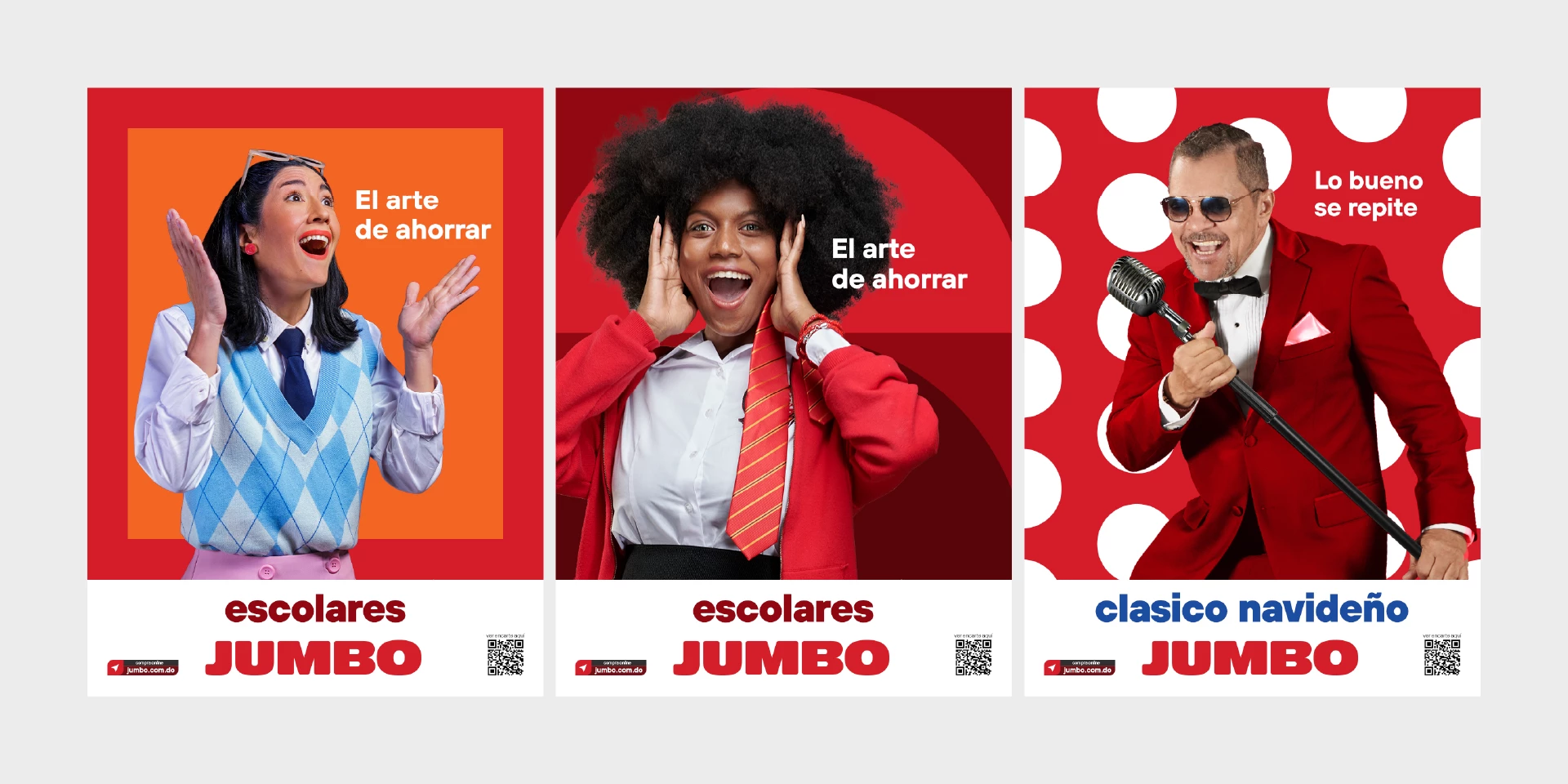
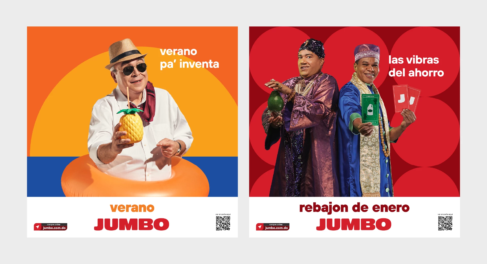
Displayed here are additional interpretations of how these campaigns can be represented on social media. Regardless of the variation, the use of the four basic shapes remains consistent, serving as the building blocks for all our creative expressions.
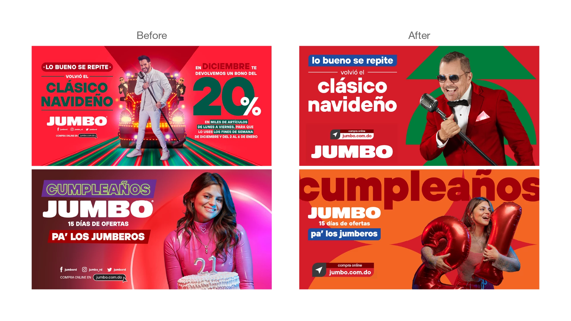
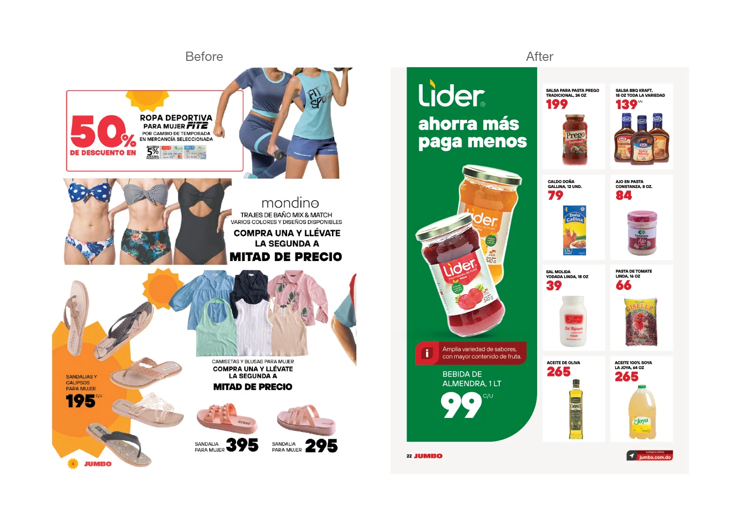
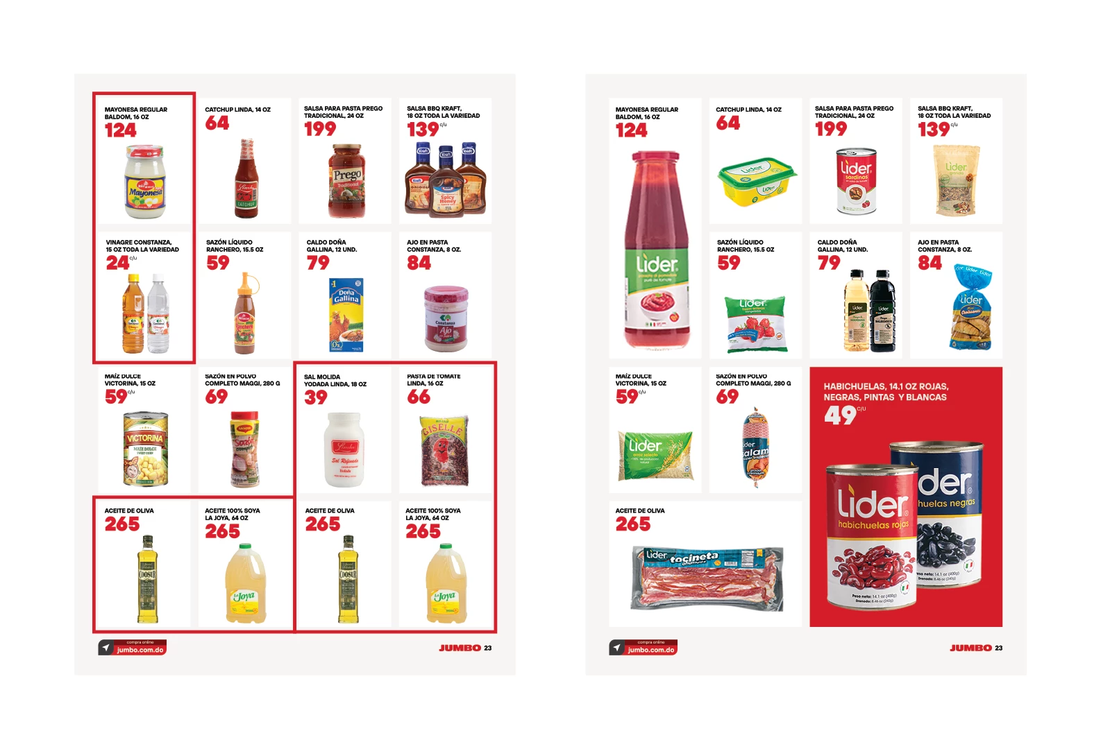
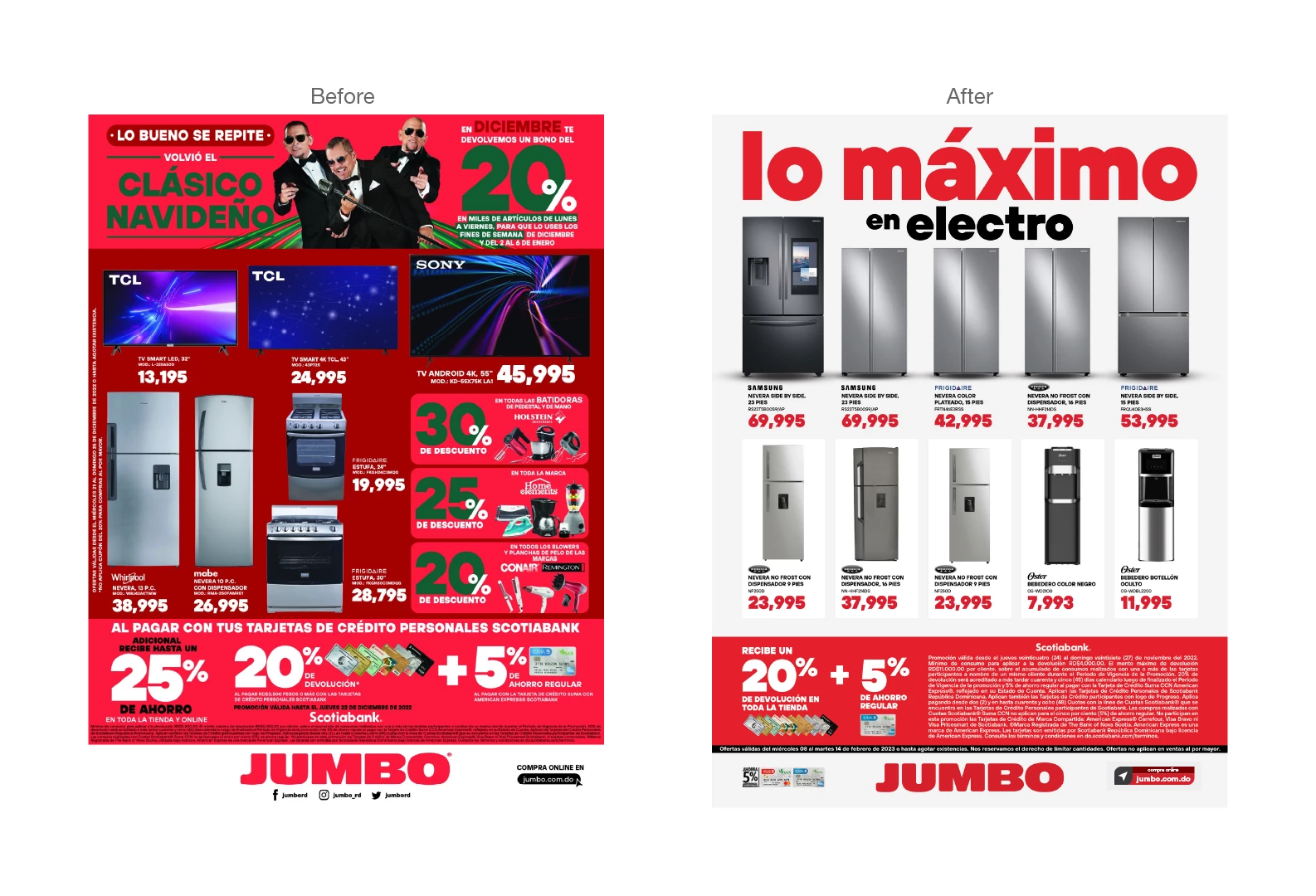
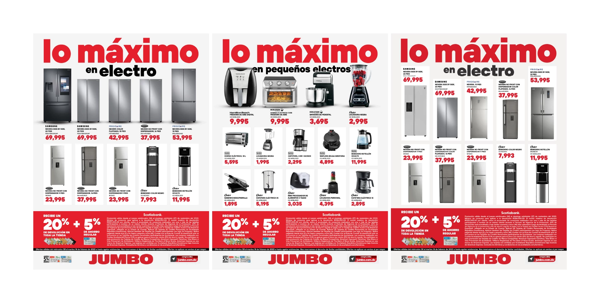
Displayed here are ‘before’ and ‘after’ comparisons of various campaigns. The transformation is dramatic, effectively illustrating the objectives driving this brand evolution.
- Brand Jumbo
- Agency Ogilvy RD
- Client Madelyn Martinez, Aicnecony Taveras
- Creative Directors Katherine Yuen, Juan Daniel Suárez
- Account Director Brigitte Rinkel
- Account Executive Kleyner Tapia
- Art Director Jean Soto
