
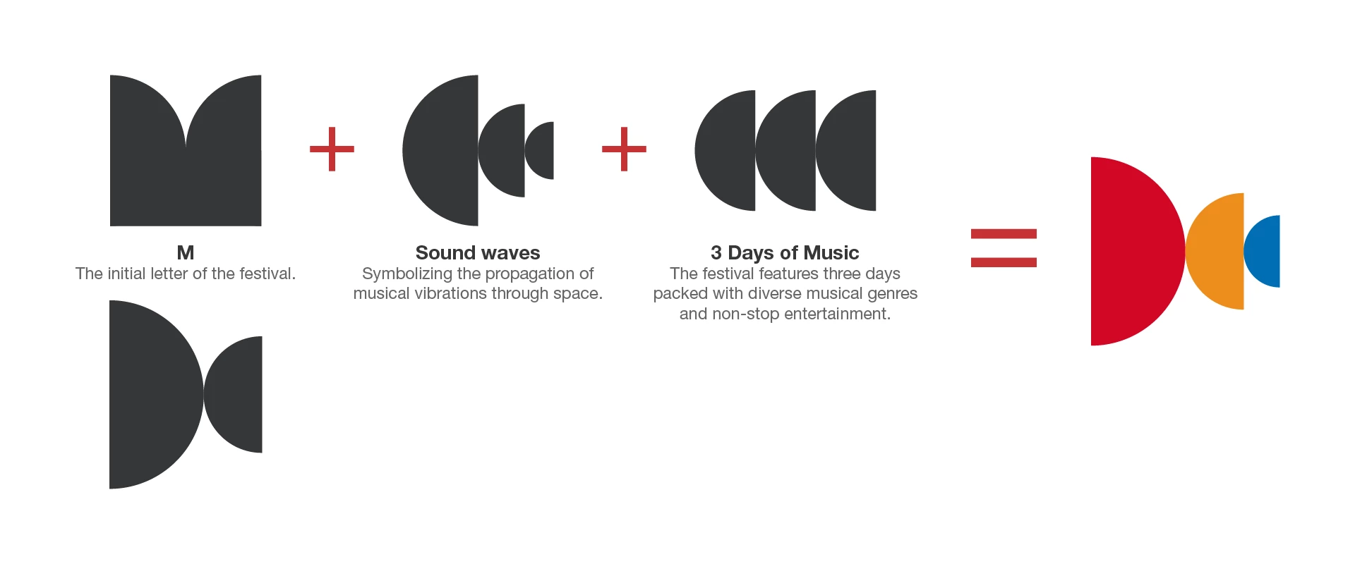
Logo Concept
The logo artfully intertwines the festival’s initial “M,” sound waves reflecting the dynamic flow of music, and a visual tribute to 3 days of diverse genres and continuous entertainment, encapsulating the event’s vibrant spirit.
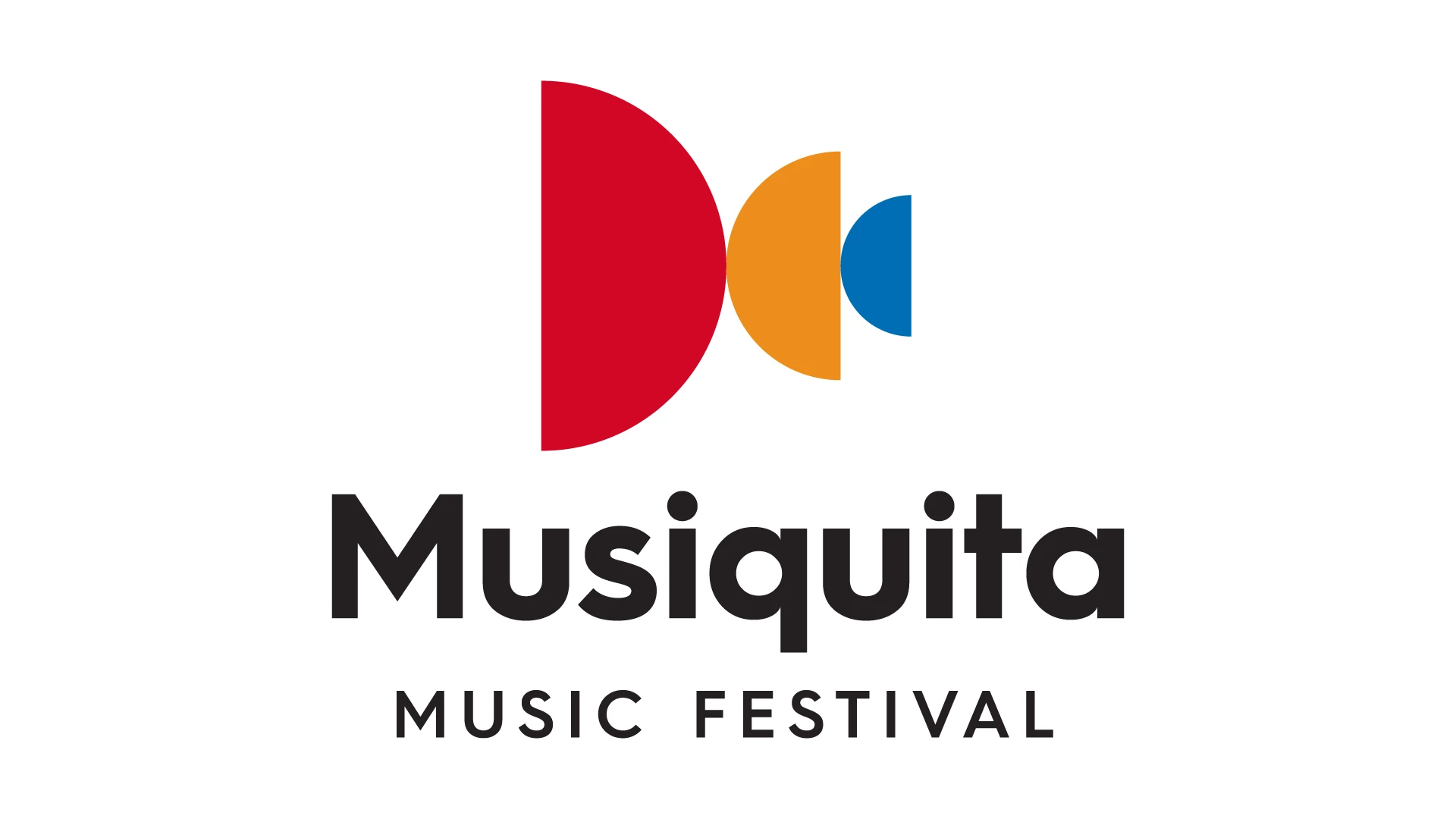
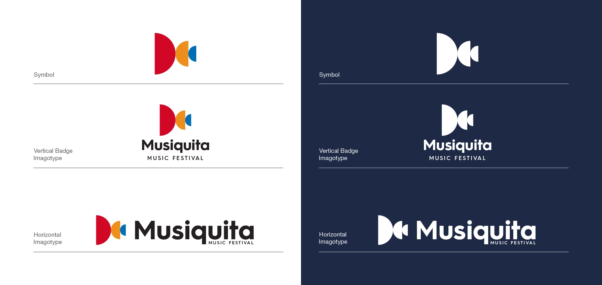
Logo
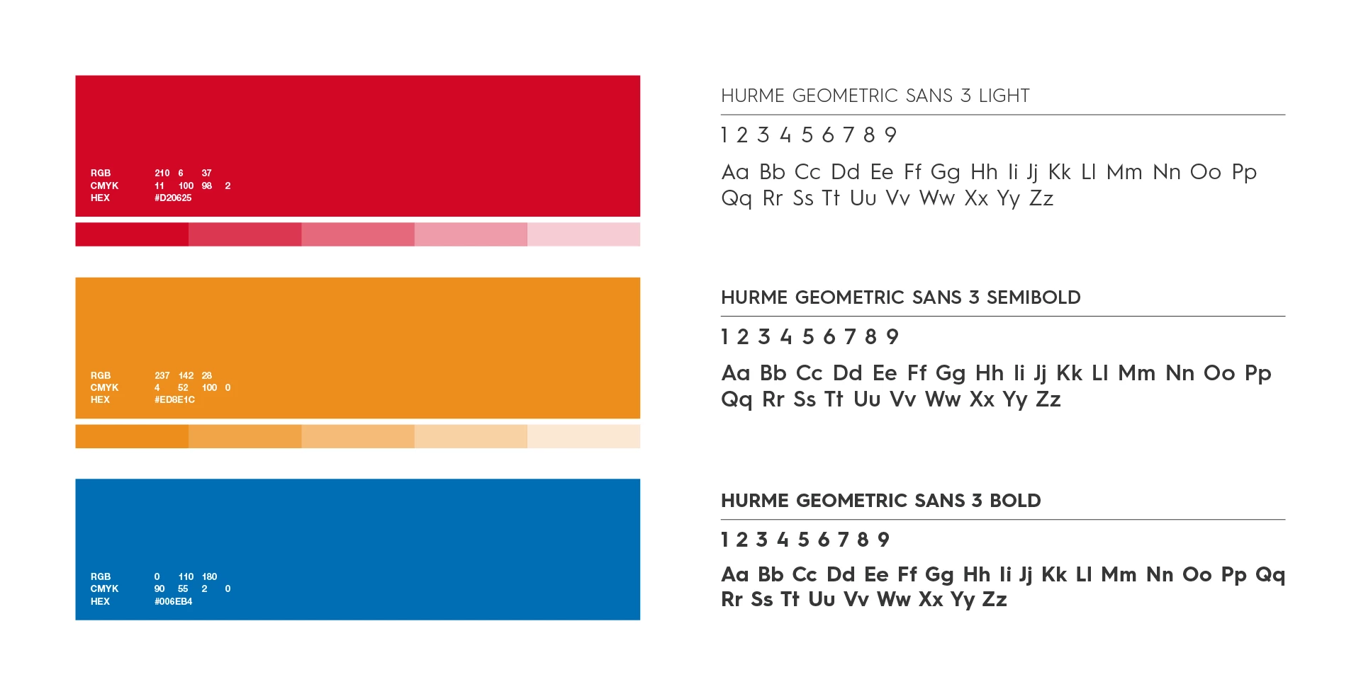
Color Palette & Typography
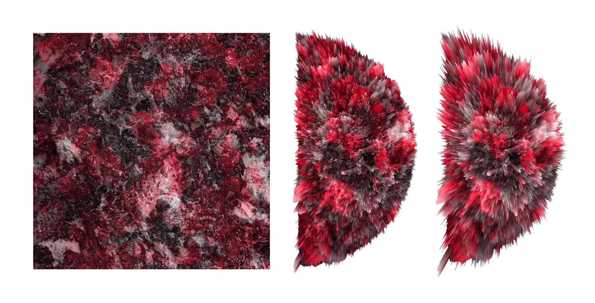
Texture Displacement
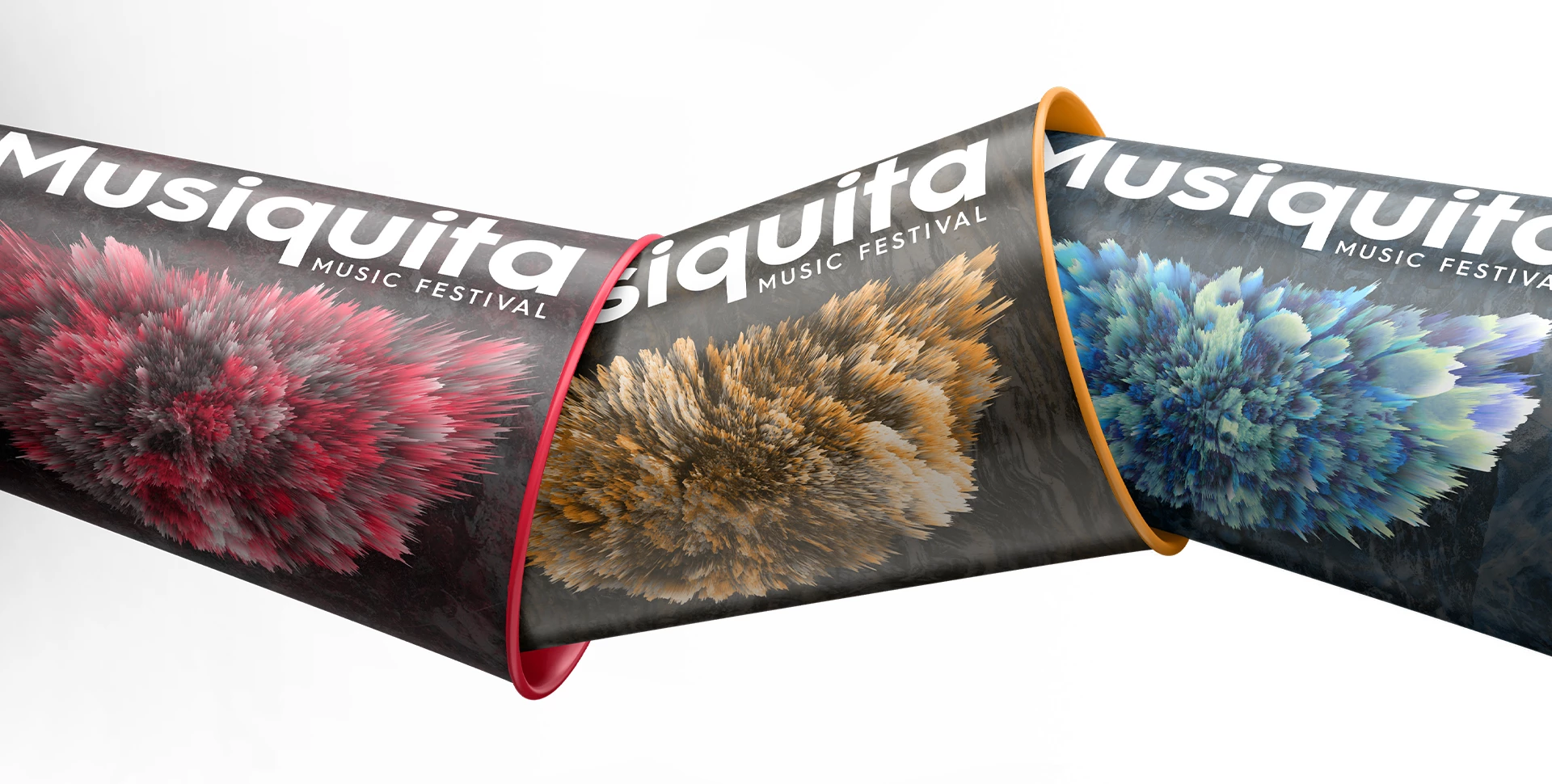
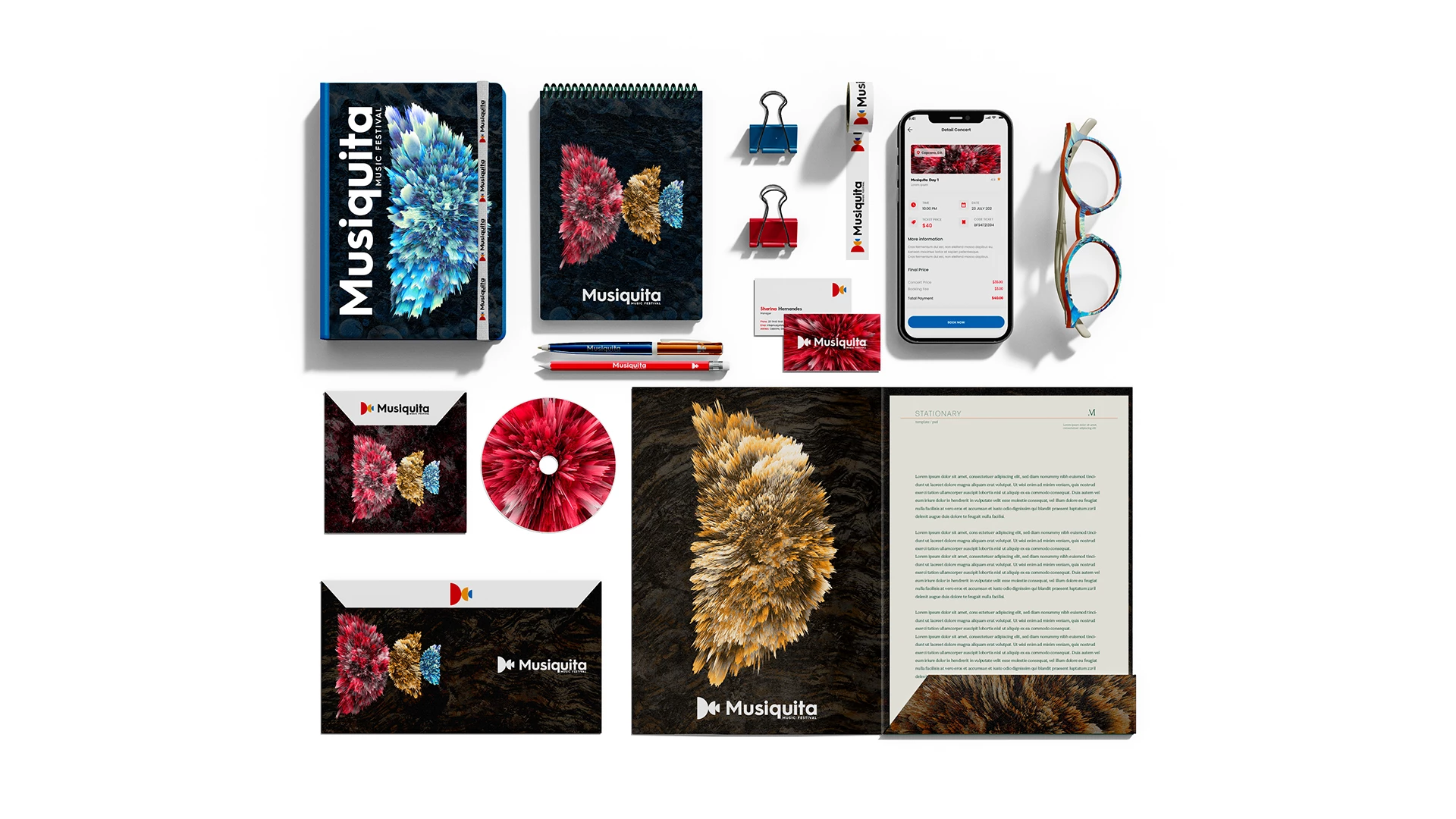
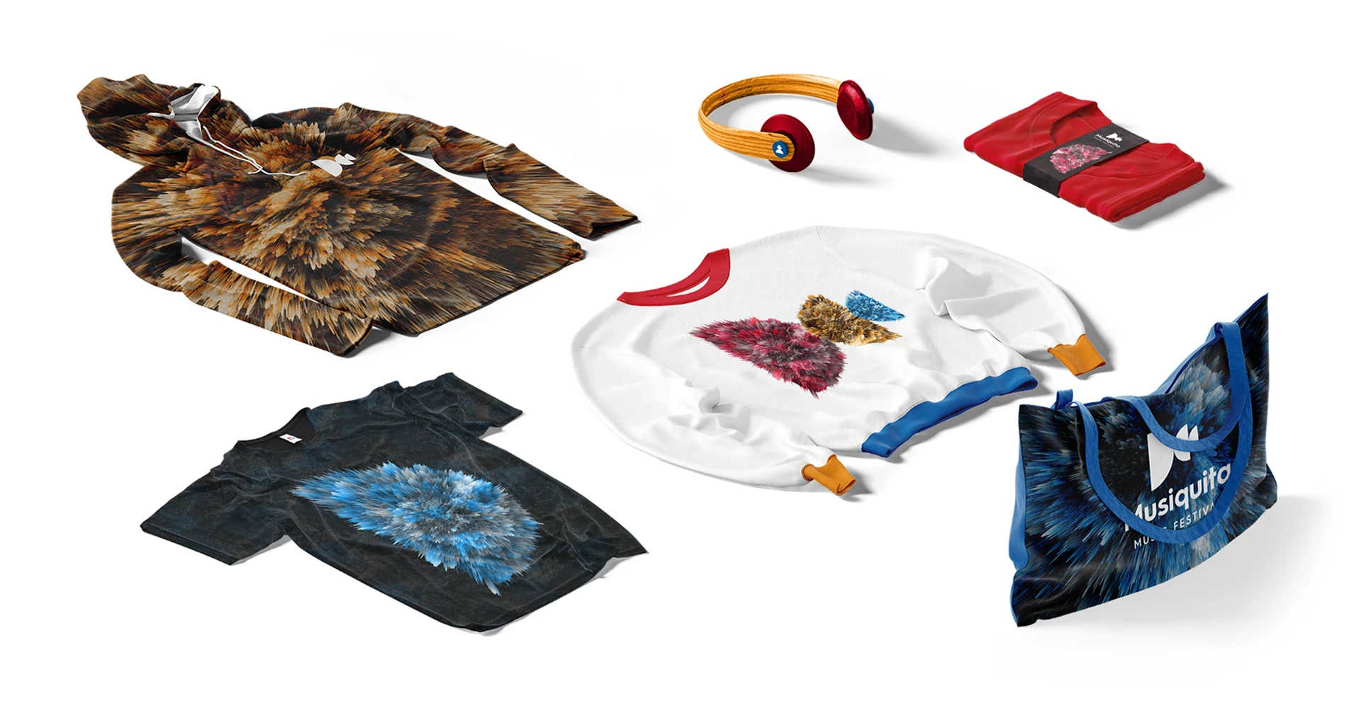
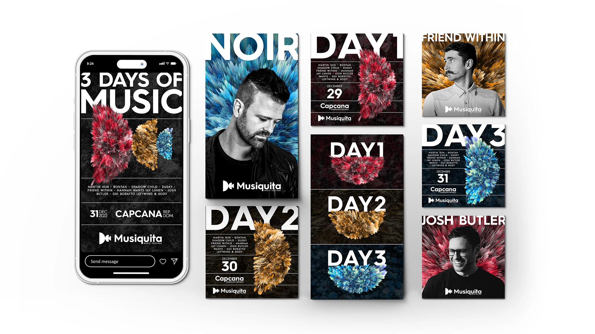
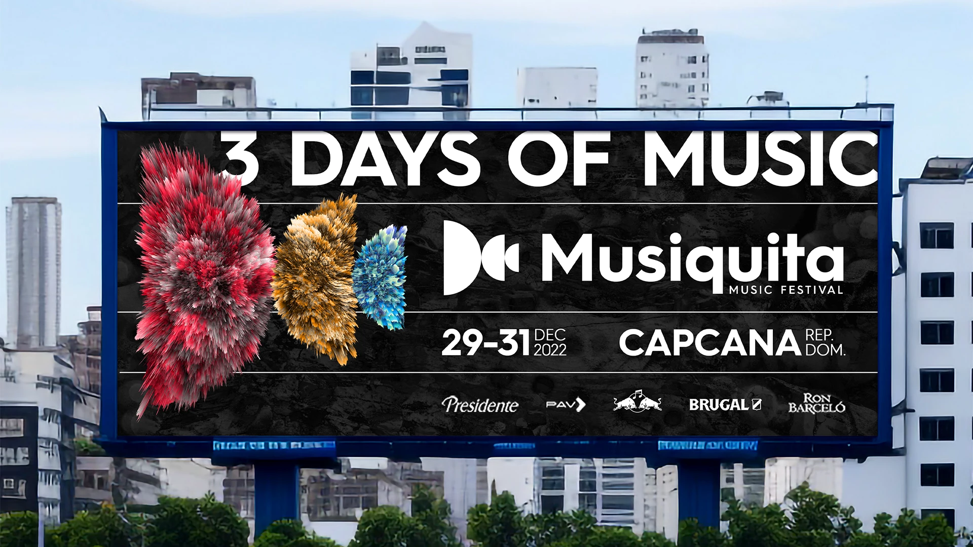
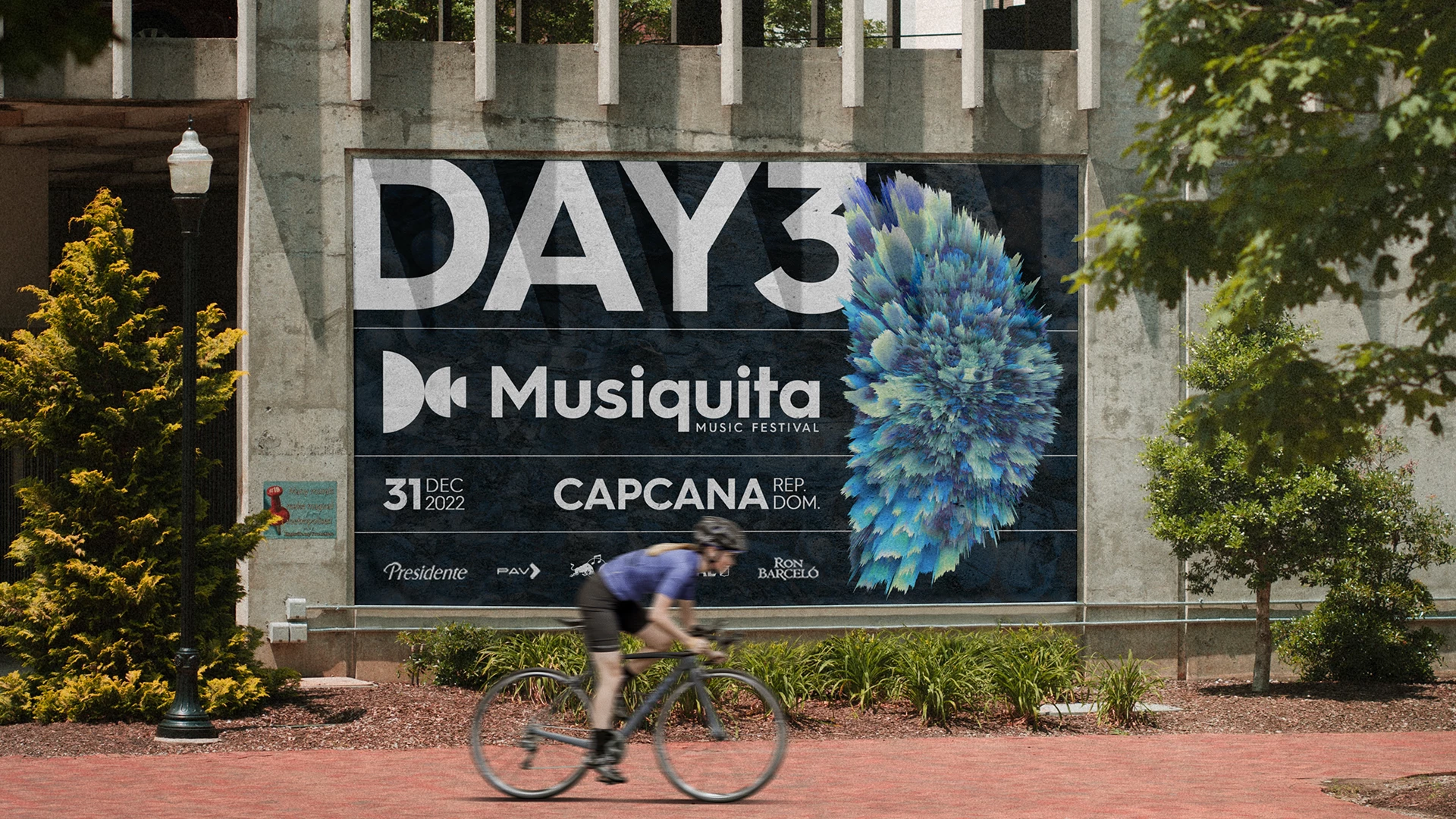
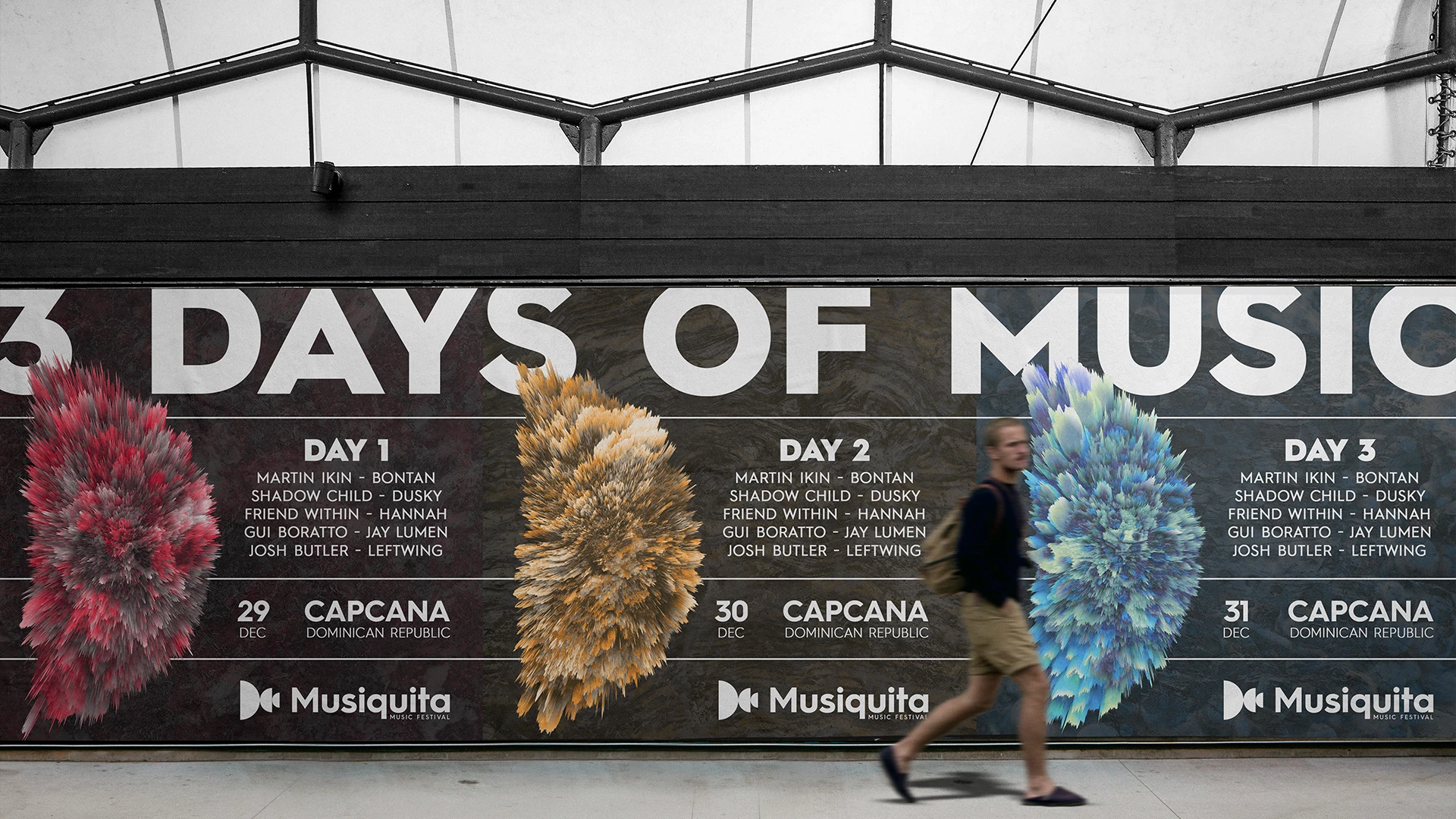
A combination of carefully curated images and mixing them to create textures was used to create a truly unique design that embodies the energy and excitement of the event. The semicircle featured in the design serves as a powerful representation of sound, immediately communicating the purpose of the festival – to celebrate music. 3d displacement effects were used on the textures to add movement and depth to the design, setting it apart from other events.
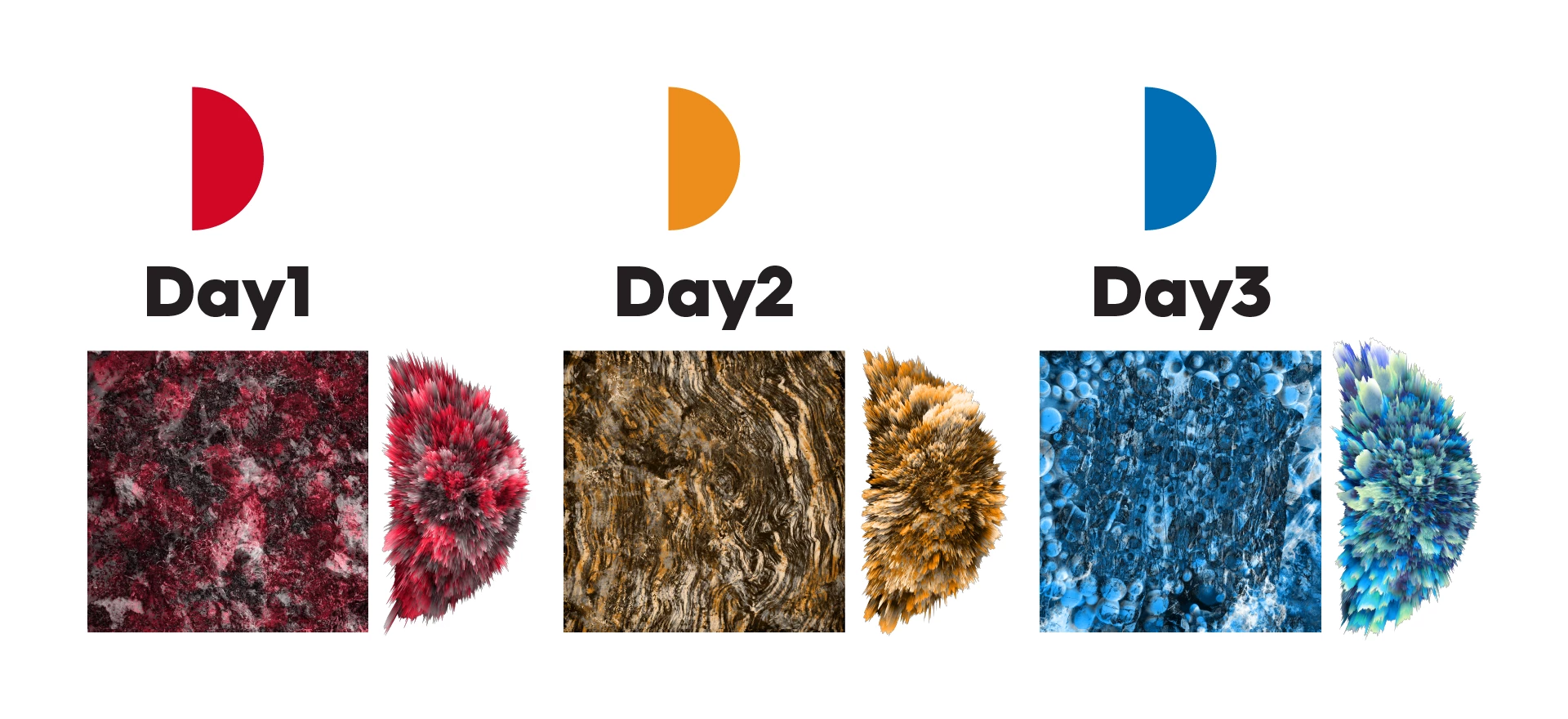
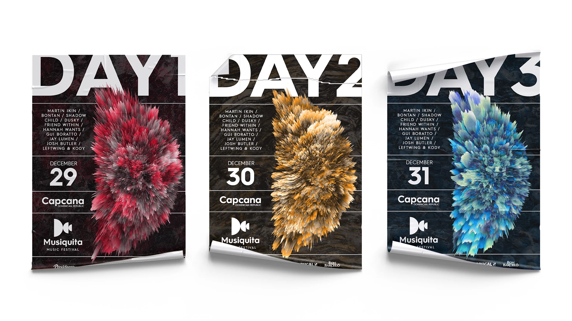
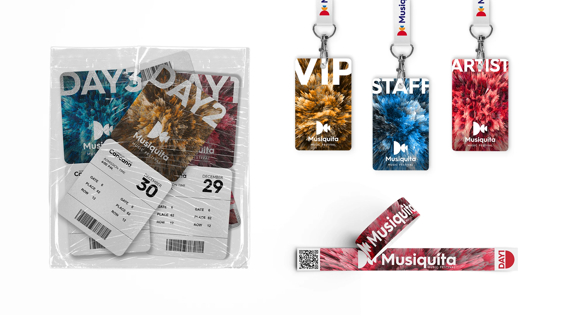
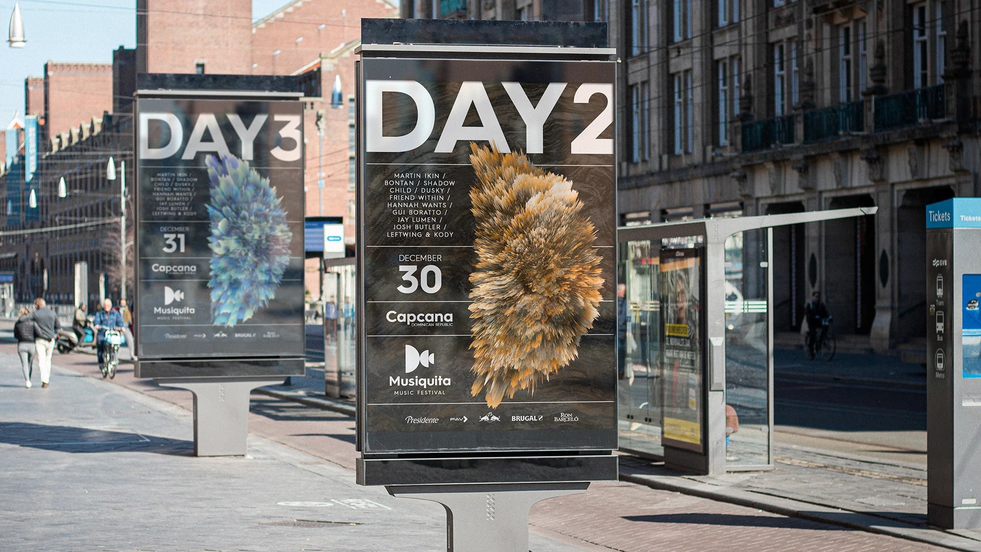
To distinguish each day and create a unique experience for attendees, we incorporated three textures in the design to represent the three days of music. This approach helped tie all the elements of the festival together under one cohesive design, making it a visually stunning and memorable event. At Imagine, we understand that every detail counts when it comes to creating impactful designs that effectively communicate our clients’ message and embody the spirit of their events.
- Art Director Jean Soto